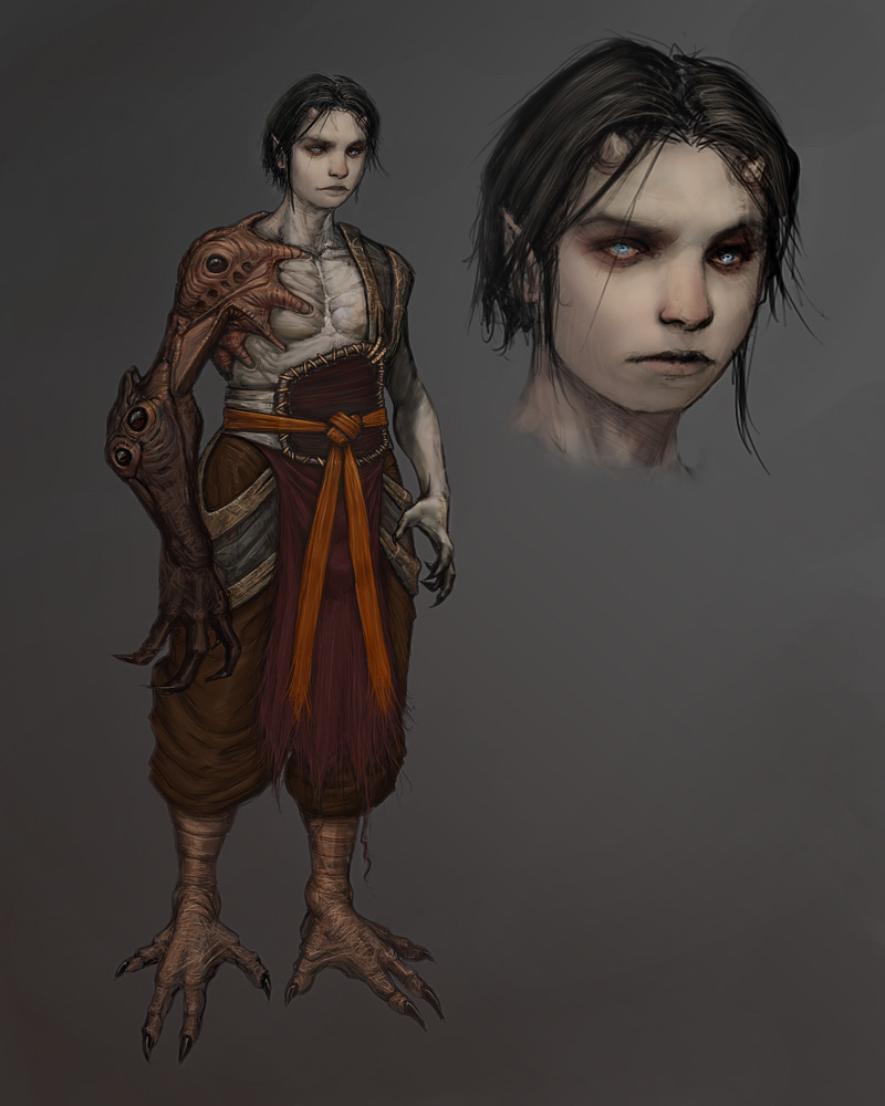
Character Concept Study: Demon Prince
This was a concept created for the Demon Prince Thunder Dome over at conceptart.org

Iron Lore (the company I work for) recently purchased the entire run of analog DVD's from Gnomon Workshop http://www.thegnomonworkshop.com. I just made it through the Iain McCaig set and wanted to create a character study in the same composition he demonstrates in the DVD's.
As far as any other influence with the direction I took, just over a year ago I turned down an offer to work on Prince of Persia Warrior Within. This was extremely hard for me to do because its been a dream of mine to work on a game like that. I just wanted to give him a bit of a feel of that series.
I also got off my ass and updated my website
- BoBo

Iron Lore (the company I work for) recently purchased the entire run of analog DVD's from Gnomon Workshop http://www.thegnomonworkshop.com. I just made it through the Iain McCaig set and wanted to create a character study in the same composition he demonstrates in the DVD's.
As far as any other influence with the direction I took, just over a year ago I turned down an offer to work on Prince of Persia Warrior Within. This was extremely hard for me to do because its been a dream of mine to work on a game like that. I just wanted to give him a bit of a feel of that series.
I also got off my ass and updated my website

- BoBo
Replies
SHAME u turn down POp2, we could of work together and acctualy produce sweeet stuff Lol
Its a nice concept, I realy dig the face, the colors and feeling in it are great, Color scheme are great to, I'd model it AHAH.
b1ll
ye it deffinately stood out techniqually among the t-dome entries. like a friend of mine said it screams "yo im a texture artist", typically superior in the pixel level.
maybe thats where the weakest part is imo - overall its a bunch of cool stuff put together, stitched with good pixel control. as a character concept, its dead. for the design to work, things need to be attached one to another. why does he have this monster arm? why are those shiny bubbles there? why chicken legs? why the belt-pad thing? there's nothing tying things together. its visually striking and appealing on first look, but then what? things could make more sense if you placed him in an environment, but you have left too much for the viewer to fill in.
some suggestions: i think the legs might look better if the pants were ripped/tattered above the knee like a pair of shorts and we could see the transition from human leg to demon feet.
the demon arm seems a little off. maybe if the transistion between human/demon was more smooth or intergrated (ala Resident Evil type creatures like the demon part ripped through the human arm.).
also he seems a little too thick in the waist/hip region. his face suggests a slimmer overall body type.
Other than that that's a nice and very cool execution.
As for your website ...*cough* make more tuts *cough*
That said I really like the symbiont arm, and I kinda wished you'd have done something similar with the legs while making the human bits of him as soft and attractive/elegant as his face.
-Dredg
kickass stuff sir.
Good stuff Bobo.
/me clubs BoBo and makes a pair of seal skin boots.
/me wants a pair of magical seal skin boots of the BoBo.
Hope your keeping well