Rat Man
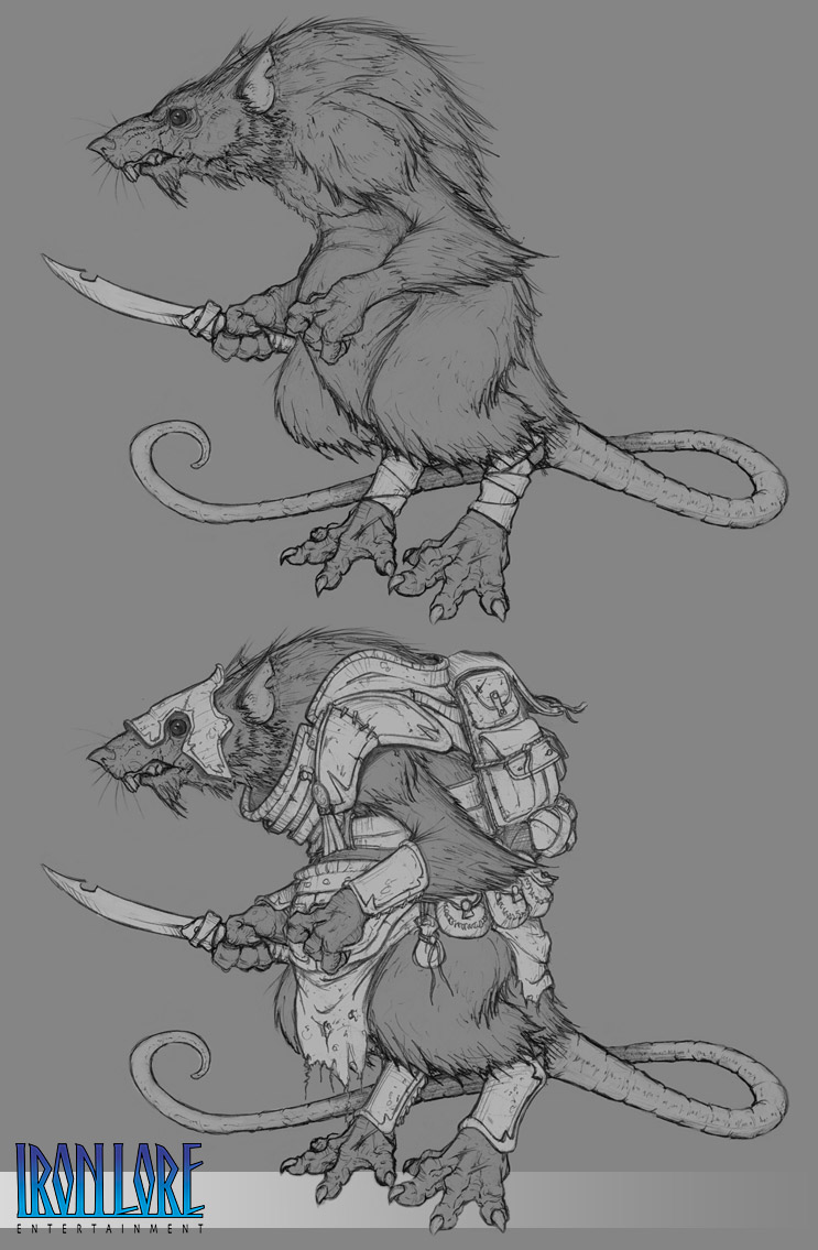
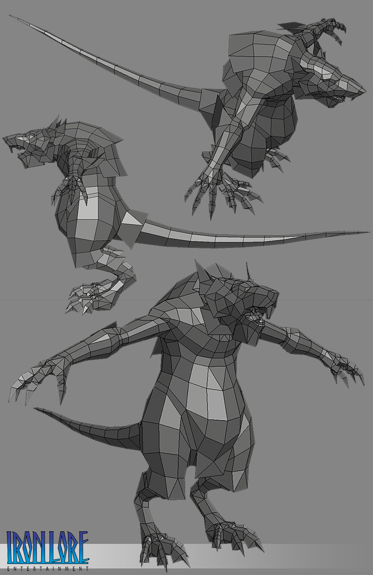
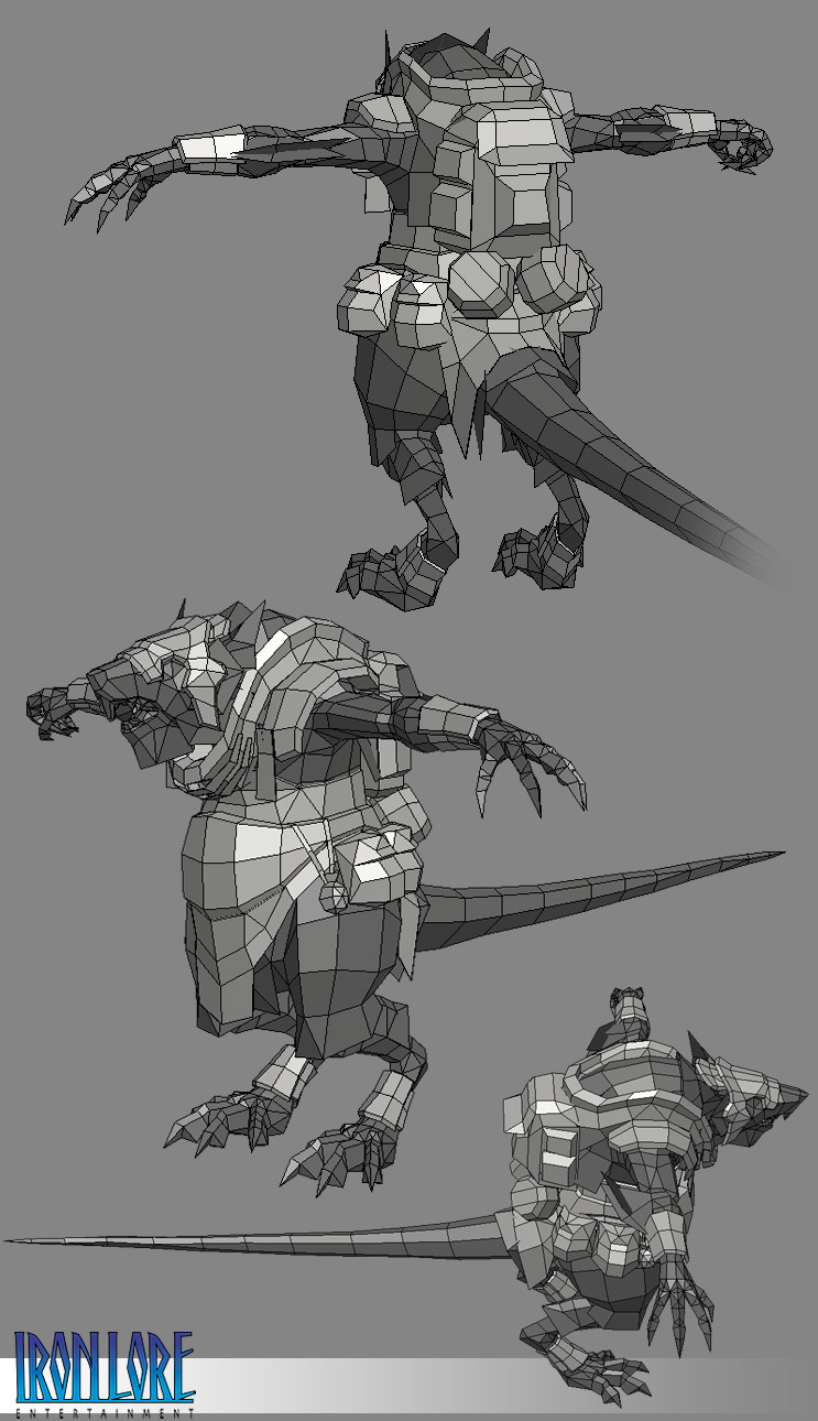
Iron Lore Entertainment recently sponsored Cgchats Comp 28. I was able to get permission to participate with the contestants using an actual asset for our game Titan Quest.
Here is how it turned out:
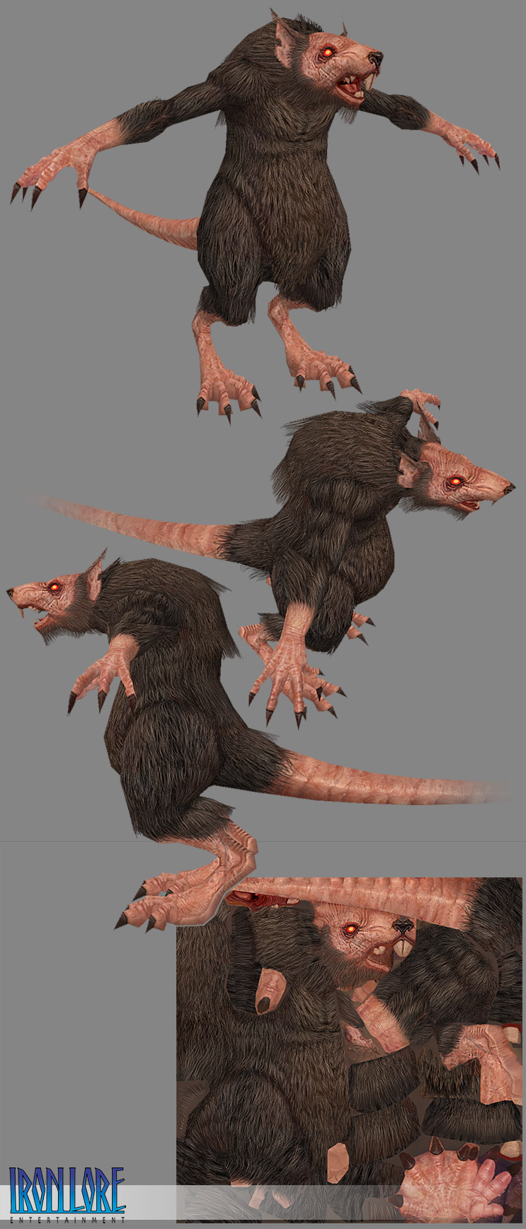
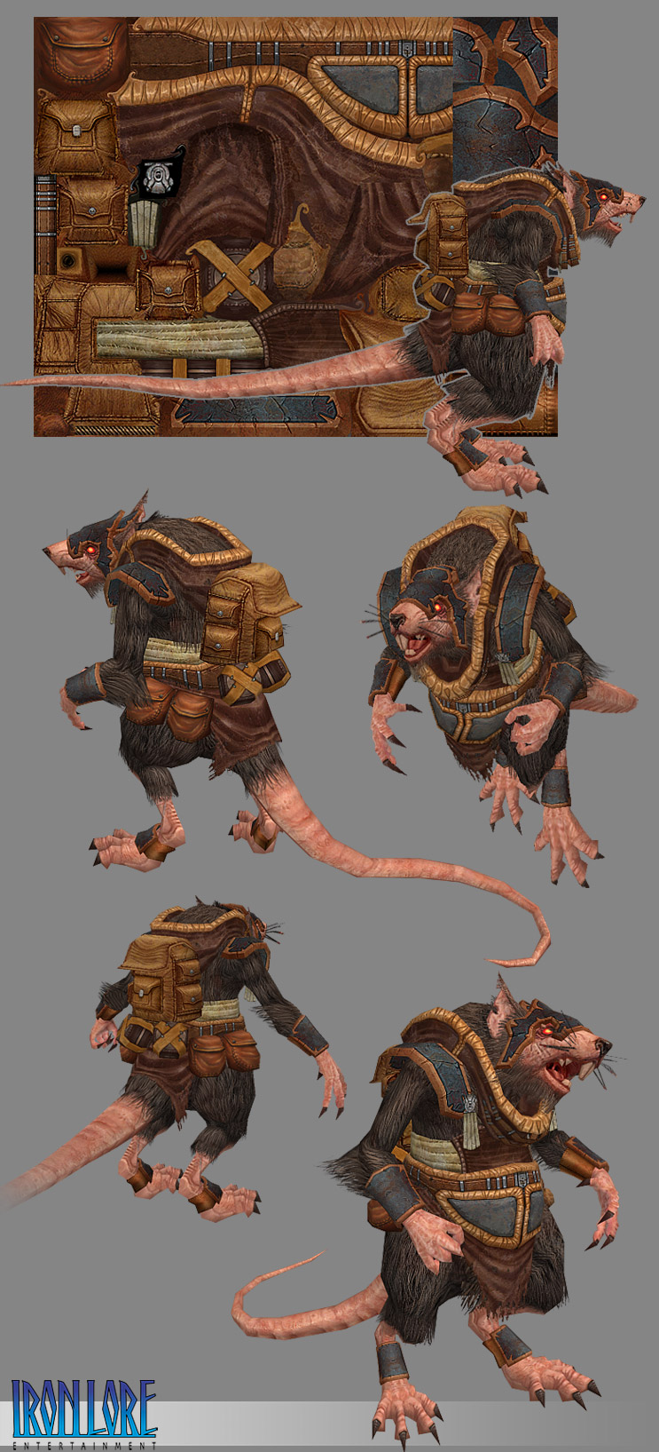
During the course of the challenge I was asked about my technique for texturing hair. I made this Hair Demo to show how I hand painted all of it:
http://www.bobotheseal.com/vids/BoBo_Hair_Demo.zip
Its in .swf format as that was the smallest file size versus quality I could put together. Simply download the zip and open with your web browser (you need Shockwave installed) or with a Shockwave player. Im working on getting an .avi hosted somewhere other than my server.
This was thrown together real quick. Its in real time and simply shows a few techniques for achieving different types of hair and fur with some custom brushes. Its basically the technique I learned from this great tutorial:
http://www.adobe.com/print/tips/phsdigitalhair/main.html
That tutorial also goes into how to create custom brushes.
and for fun here is his run cycle. Big ups to Brian Labore who rigged and animated this guy and to Rich Sullivan for helping me get started on the concept!
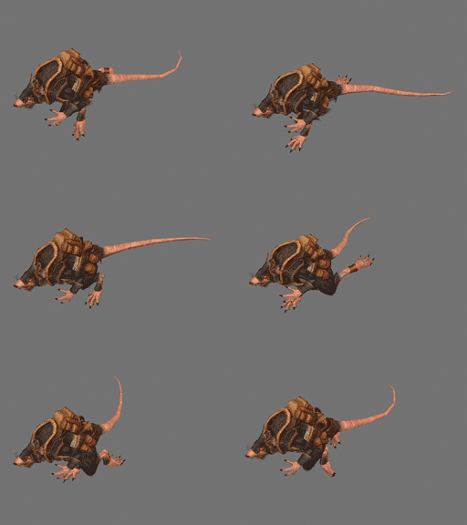
Here is the original work in progress thread:
http://www.cgchat.com/forum/showthread.php?s=&threadid=22308
- BoBo
Here is how it turned out:


During the course of the challenge I was asked about my technique for texturing hair. I made this Hair Demo to show how I hand painted all of it:
http://www.bobotheseal.com/vids/BoBo_Hair_Demo.zip
Its in .swf format as that was the smallest file size versus quality I could put together. Simply download the zip and open with your web browser (you need Shockwave installed) or with a Shockwave player. Im working on getting an .avi hosted somewhere other than my server.

This was thrown together real quick. Its in real time and simply shows a few techniques for achieving different types of hair and fur with some custom brushes. Its basically the technique I learned from this great tutorial:
http://www.adobe.com/print/tips/phsdigitalhair/main.html
That tutorial also goes into how to create custom brushes.
and for fun here is his run cycle. Big ups to Brian Labore who rigged and animated this guy and to Rich Sullivan for helping me get started on the concept!

Here is the original work in progress thread:
http://www.cgchat.com/forum/showthread.php?s=&threadid=22308
- BoBo
Replies
bobo you rock!
thanks for the video
how much control do you have over the production?
often design decisions are made for you, or at least so i am told.
i find the mesh to be very nice.. busy but not too busy.
the head piece of the armor also adds nice features to him.
As awesome as you are though some of the guys in the comp gave even this piece a real run for the money it was a awesome comp I even modeled something but never got time to finish it so I deleted the thread ..anyways hope we have more comps over there with entries of the same quality . I really think it helped to be sponserd by Ironlore !
Your texture packing is so incredibly tight that I'm getting a headache. Any chance we could see wireframes on the textures to show how the hell you got that stuff to fit together??
/jzero
I'm guessing that your basic rat is going to be recycled to wear different clothes/equipment? I assume that is why you didnt paint any AO shadows onto the rad body from his equip.
Also, the hair at the transitionary spots like the wrists, tail ,and knees dont cast any shadows on the flesh. It makes the transition seem unrealistically sharp to me.
Lastly, I'd have probably made the ear interiors a bit more saturated & darker.
A little color/intensity variation on the leather items would have been welcome also.
Mind you, I was trying to find things to crit, as opposed to the usual unbridaled praise.
Any recomendations on the best structure for the hair brushes? The Adobe tut isn't terribly specific.
Totally love that rat! Beautiful and disgusting just like Irritant pointed out
I just feel like the contrast between armor and body was stronger in the concept (light grey/dark grey) than in the finished piece (pink+brown/brown+gold). How would that look if the golden bits of the armor were silver-ish?
Baaa anyways I'm on a crappy scren with a crappy screen atm hence I really can't tell...
LOVING that rat to death
Tnx for the links.
Minor nitpick, it really does look awesome man. Good to see you posting again.
looks great.