Yoshimi Battles the Pink Robots
I told them I'd make it here eventually! And so I have. I've been told that you guys need some more women around these parts anyway. And a hi to all the guys I hung out with at the CA san francisco workshop!
First post, and first actual finished model incidently. I haven't been doing this very long, but I've gotten some great help from MoP and Poop for her.
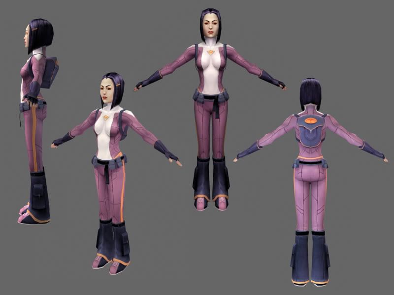
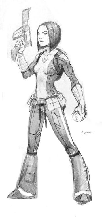
The concept sketch
And a link to the texture
So, crits and comments are more than welcome. Thanks!
First post, and first actual finished model incidently. I haven't been doing this very long, but I've gotten some great help from MoP and Poop for her.


The concept sketch

And a link to the texture
So, crits and comments are more than welcome.
 Thanks!
Replies
Character looks great, the design is modest, which is good becuase its not over the top. the poly layout looks really good, and the texture really works. My only concern is the texture size. Theres a bit of minute detail on the suit that im wondering if it were lost os the size of the texture needed to be shrunk.
But other than that not really any crits at all
I hope you are not done with this model, because there are a few things you could do to tighten it up.
Crits:
The seams in her "Super Suit" could be pushed a bit. I see that you have put a bit of shadow and highlight in them but it is quit hard to see. you might even try making the go out rather than in. Like the seams you would see in stitched leather.
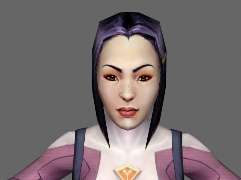
I like what you are trying to do with the face, but the nose uv's dont quite fit with the geometry you presently have. The skin tones need more color variation as well too.
Great model and again, welcome to polycount.
Holy crap, nice work so far! Good to see you onboard the big green space station
Everyones comments I pretty much agree with, so I'll save us time and nod & smile! Awesome stuff!
-Kris
Yoshimi Yokota, AKA Yoshimi P-We from 'The Boredoms'.
design works great.
face could use some more around the nostrils, hairline, and go easy on the black around the eye-line and eyebrows. not only its not really as black but women also plucl their eyebrows anyways
great boobs :P
I've been seing pencil sketches of yours here and there recently and loved that.
Model is looking sweet! I like the smooth shading/lighting you have here. Hairline is a bit harsh tho.
Can't wait to see more!
Welcome to the boards and all that jazz.
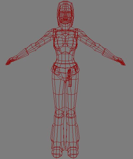
I really dig the concept and the model. From the wireframe, it looks like you could probably collapse a few edges on the forearm, it's a few too many around for the density of the rest of the model.
I think the contrast on her face could be pushed just a tad, and the boxiness of her jaw could be rounded out a bit.
Looking fancy overall, and I hope you're here to stay!
Now get to work on your cgchat collab!
Fortunately it's nothing like the ones off the album cover, I actually think the album art robots are pretty poor... they just look silly and not robot-like at all, really.
Anyway, yeah... you already know what I think, but I'll post it here anyway. It's great for a first finished model and texture, for sure.
Shotgun's right about the eyebrows, and also what people say about the face skin tone is true, it does seem a little bright. I think it's just the angle of that render that makes the nose look weirder than it is, it usually looks fine at other angles.
The hairline could probably blend better, also, but these are all minor points - overall it's very strong work!
Put your newfound knowledge to good use, and model up the pink robot, then make a BATTLE SCENE!!!
ghost_rider: Thanks for the crits! And you do make some good points. If I have some time and the inclination later, I may play around with her a bit more.
Mistercline: thanks
ElysiumGX: Yeah, I'd tend to agree with you there. I'm really more of a painter, and texturing requires a level of finish I'm not quite used to yet.
LegionaireJoe: JOE! Hi
Jackablade: Looks like I was kind of far off... ah well
shotgun: Funny you should say! I was just plucking my eyebrows earlier.
arshlevon: I think I do have a little magic-bodypaint thing happening around the boobs now that you mention it.. but oh well.
pior: Thanks, pior! I've had a look at your new site as well. Great work to be sure.
Poopinmymouth: I'm workin'! New stuff should be popping up on there soon
Steakhouse: Chances are very good, in fact. I actually finished that concept before I finished Yoshimi's.
And yes, MoP...
Thanks for the comments, everybody!
Welcome to Polycount
Nice work so far, definitly a really good 'first' model.
One point I would focus in the future on (for higher polycount models) is getting the mesh to actually follow the form ('flow') of the body. For example the meshstructure (= edgeflow) of the breasts (and the face) should be rounder to represent the shape (and shading) better.
The model is good, but i would echo the same comments about collapsing the geometry here and there, to tidy things up. Shape, anatomy and design are fine. There just needs to be a slight optimizing" of the mesh, because that will make dformations and weighting easier when rigging.
Scott