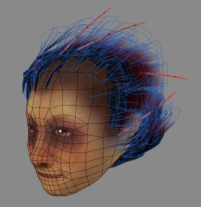
filthy kid
Started that as a quick exercise but it might aswell end up as a complete character... Don't know.


That hairstyle might be familiar to some of you... that's inspired from a famous french singer The guy enjoys sticking wooden sticks in his hair.
Want the kid to look like that :

Yay!


That hairstyle might be familiar to some of you... that's inspired from a famous french singer
 The guy enjoys sticking wooden sticks in his hair.
Want the kid to look like that :

Yay!

Replies
Most of the texture is great, but you know, I think that it's just a bit too "grainy" at the moment ... if it's meant to be dirt then it's not quite looking right yet, but if it's skin pores or something, then it's too harsh and obvious.
It's mainly on the forehead and jawbone/cheek area, that it looks like a "noise" layer rather than any sort of coherent dirt or skin detail.
Apart from that, it's great! Should look awesome with a body
Did I say I love the hair already?
MoP
Wow! Such good work!
I like the style of the mouth, don't know why but it makes me think of Doowie (the lil' boy from the malcolm show)
Wanna see more
Awesome skin tones man ! love the podgy nose etc.
Can't wait to see the next update
And good pick Renaud
Sure Moppy I agree about the texture being on the harsh side. That was more of a choice here but I might need a second look at it. I was mostly going for the overtextured like what can be seen in the Silhent hill series... And yeah its more pores than dirt
Kristian, well maybe thats because they are not separated eyeball meshes? Don't know whats the best route, separatd eyes for animation or one solid mesh/texture allowing more control onver how things blend together. Still have to fully test the separated meshes solution
Quickly slapping a body on him. It's so weird to work on a character when the head is already normalmapped/textured/hair-ed. That plastic doll looks is giving me the creeps!
Still trying to go fast with this one. Simple materials and all that.
Okay time to give him some clothes!
nice one. I really like that you tossed over an overlay and made her look more fuzzy. I dig! There are rumours I would use them myself too much
The arms with the oversized forehands looks awesome. It reminds me very much of Gully from the best comic series EVER, Battlechasers.
Errr, I would largen them even more!
Can we have the normal and diffuse flats?
AND BE ONLINE FOR GOD DAMN SAKE IN YAHOO MSN OR ICQ OR FRENCH MASSANGER OR WHATEVER!! *puh
/me boozed
KDR, the black shoes are I'm sure a stylistic thing, if you check the concept, they are black too. I'm assuming it's vertex colors.
Haha yeah Shim Battle Chasers are so cool. Agreed about the size, bigger could be better! And I'M ONLINE YOU GERMAN! Reach me on MSN, pior_o(at)hotmail(.)com
Hmmm sure Poop that could go with less polies... Would that work if I optimize that even if the nmap is already baked? Still have the experiment.
Ruz that's what I thought too, it's surprizingly easy to convey a surface change with alpha hair. The only thing needed is a gradient towards the end and no 'hairstrands' definition at this place, just color.
Hey I like how some see that as a boy and some see that as a girl, personally don't know myself. I guess a girl would require some sort of microtits right?
On that final note... heading to bed
[edit]
Flatties! Originals are 512s.
Is that blue map the spec map? Love the way you have handled the hair aswell - any chance of seeing the map with the aphas you've used for it? Am I right in thinking that the "strands" of hair are handled only by the alpha and not painted on the diffuse map?
I am wondering how you made the body though.. it looks relatively low rez, but looking at the knees, it has a bend in it which indicates it isn't polygons..
How did you do it?
It's looking good, although I must say this, I don't like those hands very much, they lack any feel of articulation, it could just be a style thing, so I'm not about to gripe about them too much.
Though I don't really know what the map on the bottum right corner is. It sorta looks like a specular map
Though I don't really know what the map on the bottum right corner is. It sorta looks like a specular map
[/ QUOTE ]
*points at the hair and specular eye*
awesome head, pior. gloves need to be bigger!
NG, updated gloves below, and hail to Razor who wins!
I'm done with the highpoly, did an extra detailling pass since then :
Thats a quick mockup on how I want him to look like in the end. I'm baking down the maps atm, will try to make a super simple texturing and then... time for something else
I like how this turned out. You even managed to put your gradient overlay coloring job from your sketchs onto your model.
I have "S" as the hotkey for Edit Poly smoothing, I find it very efficient...
I was unsure about that map, but now I know, haha. It doesn't look as if it has individual eye balls, so I'm going to assume you just have some polys overlaying the eyes for the specular?
Started on the multiple maps texturing on the lowpoly version with normalmap and all.. Still needs material variations and a bit of weathering. I feel like some selfillumination might help in some places, for patterns and reds in general. will see
For the straps, I know that you like the look of the red gradient, but how exactly did he get it in real life? It' might look cool if you actually had each belt a solid color, but they slowly gradiated upwards, maybe not perfectly evenly though. Or make the red speckled to show it's spraypaint or airbrush of sorts.
Looking pretty cool. Liking it. 8-)
the belts againts the lether works very well on the other hand
Regardless of that though, nice work.
r.
Yeah Shot, I actually made a desaturated version of the that gave it a livingdead look, that was intersting but a bit different from what I had in mind. However the final version IS a bit desaturated anyway
Ror that's a nice idea, that would tie things more as you say. At the moment I was mostly relying on the hairstrand end color to make the thing fit but its true that markings would help. But maybe they'de be confused with the ones on the collar/scarf. Will see that if I ever rework it!
Fiart I have to agree, I guess thats what happen when working on something with no clear objective in mind... But all in one it was a nice speed exercise, wanted to finish it before the weekend and its late sunday now, YUS!
Haha Iron me too!
Yes Erol I dropped the blue, I thought it was giving the whole hair a birdie look while I wanted that at the end of the strands only. Also decided to go for a simplistic color theme, red and pure black.
Kay! Some poses. I accidentally used a very long neckbone but I ended up liking the creepy looks it gives when combined with lowered shoulders. Arms also seem short, maybe because of the large cylinders around them? But I like the overall 'secondary character' look anyways
To some extend I feel like multiple map texturing can be faster than 'classic' texture painting. It's less reactive and responsive tho since it requires to tweak two maps at a time... Weird but fun
I still love those arms. I really like the 3rd pose (from left to right) with those eyes and odd look like "What are you staring at?", its really good
He is lookin very cool, though i would get rid of the pure BW look of the forearms...Add some orange tint, or something more out of place like green or something.
I would size zup the loose straps even more to have a more dnyamic and artistic feel to him instead of this "possbile" feeling.
Go mad with glowmaps and other stuff like this. He is simple yet VERY outsranding, push that even more!
My 2 cents of course
Awesome job anyways!
Any chance of a quick runthrough of your workflow? Ie. high poly then low poly in max, normal map generated (in max?).
(would love to hear your workflow on aquaboy too
Two thumbs up! (since I only have two)
Worflow is, I guess, rather generic Lupus. I'm using the exact same technique Mop and Poop explained in their tuts
http://www.cgchat.com/forum/showthread.php?s=&threadid=20424&highlight=normalmapping
http://www.cgchat.com/forum/showthread.php?s=&threadid=22313
For Aquaboy I also used Doom3 commandline generator which is the way to go for that engine, otherwise teh normals would look bad ingame. It's not compatible with other viewers/renderers tho... but it's worth the try since its easy and fun to spawn a model ingame and rotate around. Vahl did a huge tute on that, can't find the link atm
I do most of the poly work with a combination of Wings3D and Max. I simply love Wings for its faster workflow and because its just funnier and more focused on large masses and all. For this one I used my base male mesh as a start. A quick detail pass in Z2 is made if necessary but I could have avaoided that here.
Texturing mostly relies on how to fake dirt and clean, just like with a radiosity render : painting darks/desaturated color and spec where dirt goes. Spec is very powerful and really gives material definition, as opposed to the color map mostly giving a mere 'paint' information.
I also like to add fine detail in the 2D normalmap to avoid unnecassary modeling steps. The faster the better!
There are MANY tricks to make things faster actually. As an example the 'find edges' filter in PS is handy, it'll cherch for material separations for you (where one color meets another) and you can use the result as a 'dirt' since dirt goes where joints are. I also like to have everything in one file, with folders for each map : normal/diffuse/spec/bump, this way I can easily copy layers from one to the other.
The thing I find th emost useful is to assign colors to teh highpoly before baking down the maps. This way these caors are already here when you start to work on the texture and you can use that as selection masks, avoids the painfull process of lassoing stuff!
Hope this helps!