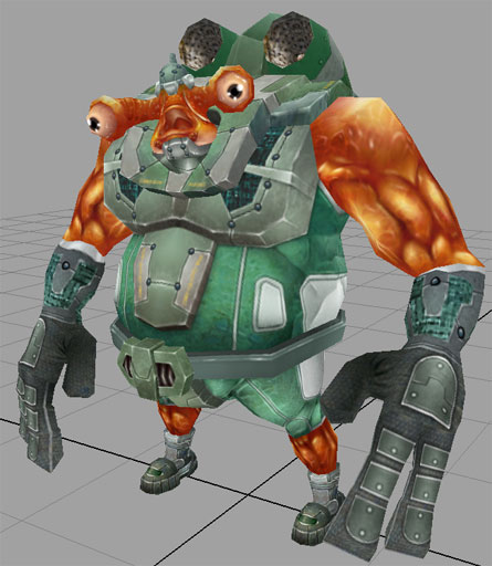
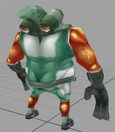
damn that rox dude! Exellent character. Nice/clean mesh and great texture. Proportions are great too. My only comment would be that you could add some additionnal shadows here and there (shoulder/arm join, etc). Forearms/hands parts need more work too (for me).
I dig this. Way exaggerated, way cool. I dont like how detailed the feet ar in relation to the shoulders. I see chunks there at the joint, and the feet are just silhouette. Just keep an eye on that poly distribution, i guess.
Seems the jet pack upper edge could use some sorta of detail? Maybe a trim? Or paint chips from intake? Who knows--just seems to be unfinished there=)
You have some really soft lighting on the cloth/metal and some overblown highlights and shadows on the flesh which i think is kind of backwords and looks pretty bad, your lighting on the flesh is really bothering my like there is no light source at all just that you've painting some highlights and then surounded those highlights with some shadows. I would try toning down that lighting a LOT, and maybe baking out some a simple overhead light setup to get a more natural look to it. But other than that stuff it looks great, its a cool concept and the modeling looks well done but the texture work is falling short in some areas in my opinion.
Great concept, the model seems cool too, it's all very original and fun, so good job there!
I have to agree with EarthQuake on the lighting thing though, there doesn't seem to be a consistent light source, and the material differences (specular brightness and colour, etc.) isn't being handled so well.
I really think the texture would benefit from more shadows painted in, that'd help separate the elements a lot more - at the moment the whole thing is reading as rather messy, different segments kinda blend into each other due to most of the values being in the midtone range.
It'd probably look a lot better if you didn't render it with a fullbright texture, since the gouraud shading on the model would help some of those issues, but I always think it's better if a texture in this style (non-normal-mapped) can work on its own in fullbright.
Any chance of an SDK? It looks like a really fun model to texture
Good work overall, just work on the lighting consistency and material definitions, and it'll be absolutely amazing!
very original, i like the textures , very appelative i dont know but for some reason i cant avoid to imagine that guy hanging out at Manaan on KOTOR lol..call me crazy if u want...
Renauld Galand: Glad to see you like the design! It was mostly made up as I go along, so that's why the hands/forearms probably don't 'connect' well with the rest of it, they'll probably be messed around a bit more.
Stoofoo: Good eye on the shoulders and feet...after simplifying the feet geometry a bit and adding some more geometry to the shoulders it looks more rounded, as well as winding up w/less polys overall. I added a bit more to the jetpack as well, you were right in saying that it looked unfinished.
Palm: Thanks! I was playing with doing something a little nonstandard in the way of heads and it wound up sprouting a body afterwards (again, probably poor planning/design workflow but eh)...I blame the old tex avery/chuck jones cartoons for the proportions.
JO420: HAHAHAHA yeah! I wanted to give him more of a salmon colored skin like Ackbar but...nahhh....
Cheybea: Good to see you! We gotta chit chat sometime
Fiart: Thanks!
EarthQuake: I really appreciate your critique...texturing still eludes me greatly (especially contrast), and most of the time spent so far on this model has been figuring out 'how to texture such and such material' and there's still a lot to learn, and what you're saying is totally correct. That's a great suggestion for the light baking, I'll definately mess around with that. Thanks again.
Mop: Like 'Quake, thanks again for writing that out...good call on the midtones, they're kinda like my comfort zone that I gotta boot my heiny out of...
That's awesome that you're asking about the SDK, I'd love to see what you and other polycounters would do with this mesh (which might leave me green w/envy but it'd be a good learning experience muahahaha). Would a .obj (I work w/maya) and the uv maps for the body and head be enough or is there anything else required/reccomended?
Irritant: Glad to hear you like him!
Johny: YOU'RE CRAZY! If anywhere he'd be on Endor making Ewok shish kebobs
OBJ would be fine, there are free plugins for Max and most decent model viewers, so there's no compatibility problem, I think. Wireframe UV maps are usually fine... might wanna stick a readme in there with contact information, if you feel like it too, although it's not really necessary.
I'm also interested to see what people can come up with for this guy, he's definitely the most original thing I've seen round here for a while!
that rules! Love the colors in your skin too, really work well together i kinda wish the seam at the arm wasnt so pronouced by the shift in materials - you could probably hide it a little more by pulling the sleve down a bit.
kinda makes me think of what Spongebob characters would look like if they were all 'hardcored' out into an FPS game, in the cheesiest way possible (not a negative comment on the design, i love it!).
That's a very cool design, kinda reminds me of Earthworm Jim. The fin between those jet engines is a nice detail I agree that the skin needs some work and his fingers could use more definition - right now they do look a bit blocky. Anyways, great model!
Replies
Anyway, great stuff.
Seems the jet pack upper edge could use some sorta of detail? Maybe a trim? Or paint chips from intake? Who knows--just seems to be unfinished there=)
lookin good..
- Chels
I have to agree with EarthQuake on the lighting thing though, there doesn't seem to be a consistent light source, and the material differences (specular brightness and colour, etc.) isn't being handled so well.
I really think the texture would benefit from more shadows painted in, that'd help separate the elements a lot more - at the moment the whole thing is reading as rather messy, different segments kinda blend into each other due to most of the values being in the midtone range.
It'd probably look a lot better if you didn't render it with a fullbright texture, since the gouraud shading on the model would help some of those issues, but I always think it's better if a texture in this style (non-normal-mapped) can work on its own in fullbright.
Any chance of an SDK? It looks like a really fun model to texture
Good work overall, just work on the lighting consistency and material definitions, and it'll be absolutely amazing!
MoP
Stoofoo: Good eye on the shoulders and feet...after simplifying the feet geometry a bit and adding some more geometry to the shoulders it looks more rounded, as well as winding up w/less polys overall. I added a bit more to the jetpack as well, you were right in saying that it looked unfinished.
Palm: Thanks! I was playing with doing something a little nonstandard in the way of heads and it wound up sprouting a body afterwards (again, probably poor planning/design workflow but eh)...I blame the old tex avery/chuck jones cartoons for the proportions.
JO420: HAHAHAHA yeah! I wanted to give him more of a salmon colored skin like Ackbar but...nahhh....
Cheybea: Good to see you! We gotta chit chat sometime
Fiart: Thanks!
EarthQuake: I really appreciate your critique...texturing still eludes me greatly (especially contrast), and most of the time spent so far on this model has been figuring out 'how to texture such and such material' and there's still a lot to learn, and what you're saying is totally correct. That's a great suggestion for the light baking, I'll definately mess around with that. Thanks again.
Mop: Like 'Quake, thanks again for writing that out...good call on the midtones, they're kinda like my comfort zone that I gotta boot my heiny out of...
That's awesome that you're asking about the SDK, I'd love to see what you and other polycounters would do with this mesh (which might leave me green w/envy but it'd be a good learning experience muahahaha). Would a .obj (I work w/maya) and the uv maps for the body and head be enough or is there anything else required/reccomended?
Irritant: Glad to hear you like him!
Johny: YOU'RE CRAZY! If anywhere he'd be on Endor making Ewok shish kebobs
I'm also interested to see what people can come up with for this guy, he's definitely the most original thing I've seen round here for a while!
Fishtrooper SDK zip (114 kb)
Enclosed is the .obj, .tar uvmaps, and a quick contact readme. Go wild and post what you whip up!
that rules! Love the colors in your skin too, really work well together i kinda wish the seam at the arm wasnt so pronouced by the shift in materials - you could probably hide it a little more by pulling the sleve down a bit.
kinda makes me think of what Spongebob characters would look like if they were all 'hardcored' out into an FPS game, in the cheesiest way possible (not a negative comment on the design, i love it!).