The BRAWL² Tournament Challenge has been announced!
It starts May 12, and ends Oct 17. Let's see what you got!
https://polycount.com/discussion/237047/the-brawl²-tournament
It starts May 12, and ends Oct 17. Let's see what you got!
https://polycount.com/discussion/237047/the-brawl²-tournament
First Pimp - Gladiator
Hey folks, long-time lurker, first-time pimper.
This guy started off as an anatomy study, turned high-poly gladiator, turned low-poly gladiator. He's still very much a WIP, at least for the next couple of days. Armor and weapon have not been started yet. Dirt, grime, and blood are all forthcoming!
Textures: 2x 1024 (armor/body), 1x 512 (face/weapon)
Triangles: 4782
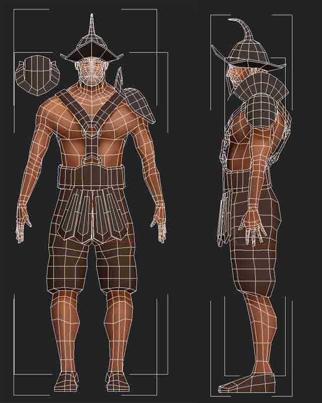
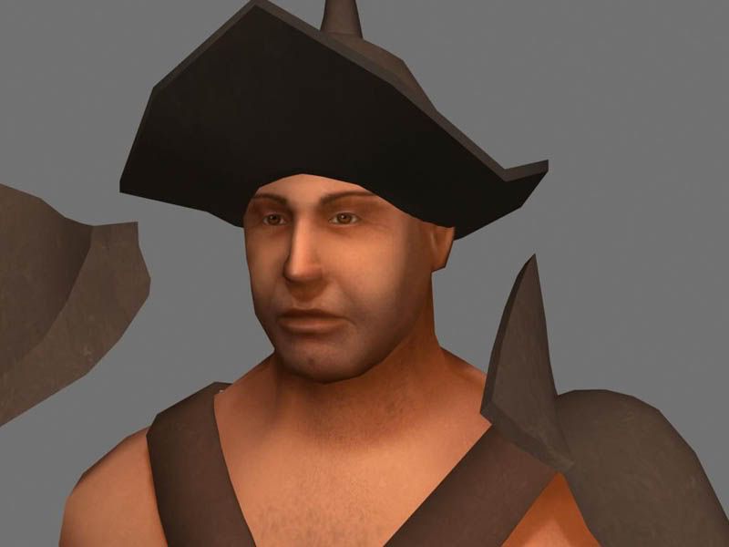
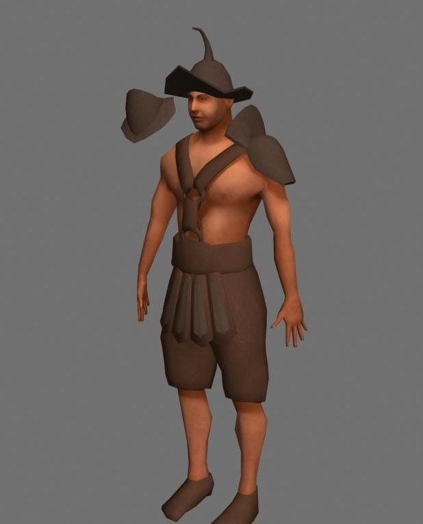
Any comments, crits, advice is appreciated.
This guy started off as an anatomy study, turned high-poly gladiator, turned low-poly gladiator. He's still very much a WIP, at least for the next couple of days. Armor and weapon have not been started yet. Dirt, grime, and blood are all forthcoming!
Textures: 2x 1024 (armor/body), 1x 512 (face/weapon)
Triangles: 4782


Any comments, crits, advice is appreciated.


Replies
For the pretty large mass across the chest that you have there, his arms feel too thin. They definitely need bulking up.
The face is pretty weak. I feel like I could take him on in the ring right now, but it would work better If he had a much more intimidating look I think.
Also his pants and shoe set up seem like they are from a different era, for whatever reason.
Good job on the weathered sunburnt skin pallete, it reads well as a warriors skin. Just try to get more contrast into that.
Changes:
-Thinned out the lips
-Toned down the chipmunk cheeks
-Changed angle on the eyebrows
-Changed chin in profile view
-Added shadow area on cheeks
-Added drop shadow from helmet (separate layer)
-Thickened up the arms
-Changed up the helmet
Daz - Yeah, I kept thinking the arms looked ok but a couple of people have mentioned it so I thickened them up a tad. Thanks for the thoughts about the face, I shouldn't have used Steve Mittleman (http://www.occomedy.com/bio/mittleman/mittleman2.jpg), who rocks by the way, as a reference.
Poop - Thanks a bunch for the comments. I'm torn between going realistic/true-to-life or sticking with the feel of speed and power within the character. I put on some different pants/skirt setups and he lost the athletic look and weight. I'm gonna play around with different setups for the next day or so and see if I can't crap out something that works. Perhaps you have some ideas in mind? My original idea which I used on one of the high-poly versions was this:
I like it but I don't know if the time I have would allow me to go through and model/paint/rig up a skirt to fit on the outside (I've never rigged something that complicated before
Thanks again for the feedback.