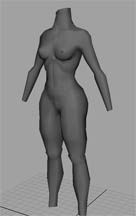
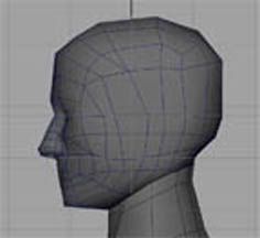
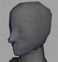
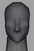
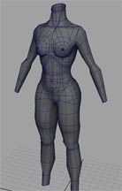
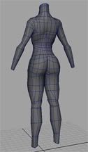
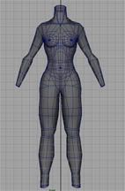
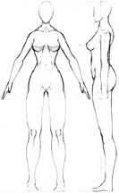
This is my current project, needed to build a chick character. and also needed to learn how to make a cleaner model. I Looked up a lot of pictures of proper polyflow but i think I jacked it up in some areas. Especially around the eyes and hip connections. critiques desired as well as repaints. or if anyone has any ideas as for costume styling let me know, I'm not sure which way I want to go with it r just yet, just somethin to show of her bod Oh and I realize the head is kind of small, I' plan to scale when I'm done
Whats your target resolution? I think you need to go back to basics a little. It's a bit of a jumbled mess in there. Perhaps go back to a lower poly model. It must be getting hard to shift all that geometry around on here waist? For limbs, pick a number for the amount of sides in the circumference, and stick to that number all the way down the length, as opposed to varying it like you are in the thigh there. Talking of which, they're pretty humungous, but you might like 'em like that I dont know
Daz,
Yea, I know it's a mess, I really wasn't sure how to build her and only til I was halfway through, realized she needed a massive cleaning. I started with 8 sides for the limbs, and i think the arms still are. As for the thigh... im never sure how to end an edge so a few from the back made they're way down to the thigh oh and now that you mention it they are rather large...might just start over.
The hips could use some rounding out. Looks like you took out too many polys.
The butt could use some more definition. Currently the butt is just a round shape, but most female butts I've observed, have more of a slope at the top. Kind of a teardrop shape.
notman- yea you're right I went a bit overboard on the reduction.
Small update defined the butt shape a bit more. I plan to resketch out the face and rebuild it, it bothers me currently and i think it's because i started building without a set idea.
Some things you might want to take another look at:
- Shape of the head in the side view, it seems too long from front to back, not a very realistic shape for a skull.
- Shape of the eyes, the inner top corner of the eyelid especially seems anatomically incorrect.
- Superfluous edge ring from the top of the forehead around the side, to the bottom of the chin - you could remove that entire set of polys and not notice a loss of detail.
- Legs seem overly long, even for a "superhero" proportion style.
The mesh flow in the body is looking good though, definitely much much better than it started out as.
I femaled the head a bit, you know thinned the neck jaw and nose while supersized the lips. made the face roll around the head a little more and also added ears. slowly but surely...
MoP- thanks for the crit took your advice about the legs and back of head, haven't gotten around tot he eyes or extra ring yet but its def on the list.
kinda droped this for a while, then picked it back up for a school project. felt it was worth an update for critique purposes. The texturing still needs work, but it was a good learning project. plan to revisit soon and work out the kinks.
if anyone knows what % of self illumination i should aim for as a rough standard it'd be much appreciated.
now i'm off to make a sweet arsh imspired website :P.
Replies
Yea, I know it's a mess, I really wasn't sure how to build her and only til I was halfway through, realized she needed a massive cleaning. I started with 8 sides for the limbs, and i think the arms still are. As for the thigh... im never sure how to end an edge so a few from the back made they're way down to the thigh oh and now that you mention it they are rather large...might just start over.
The butt could use some more definition. Currently the butt is just a round shape, but most female butts I've observed, have more of a slope at the top. Kind of a teardrop shape.
notman- yea you're right I went a bit overboard on the reduction.
Small update defined the butt shape a bit more. I plan to resketch out the face and rebuild it, it bothers me currently and i think it's because i started building without a set idea.
Some things you might want to take another look at:
- Shape of the head in the side view, it seems too long from front to back, not a very realistic shape for a skull.
- Shape of the eyes, the inner top corner of the eyelid especially seems anatomically incorrect.
- Superfluous edge ring from the top of the forehead around the side, to the bottom of the chin - you could remove that entire set of polys and not notice a loss of detail.
- Legs seem overly long, even for a "superhero" proportion style.
The mesh flow in the body is looking good though, definitely much much better than it started out as.
Keep it up!
MoP
I femaled the head a bit, you know thinned the neck jaw and nose while supersized the lips. made the face roll around the head a little more and also added ears. slowly but surely...
MoP- thanks for the crit took your advice about the legs and back of head, haven't gotten around tot he eyes or extra ring yet but its def on the list.
http://img.photobucket.com/albums/v66/pairorat/pose.jpg
http://img.photobucket.com/albums/v66/pairorat/face_wire.jpg
http://img.photobucket.com/albums/v66/pairorat/face_tex.jpg
http://img.photobucket.com/albums/v66/pairorat/face_rend.jpg
http://img.photobucket.com/albums/v66/pairorat/body_wire.jpg
http://img.photobucket.com/albums/v66/pairorat/back_rend.jpg
if anyone knows what % of self illumination i should aim for as a rough standard it'd be much appreciated.
now i'm off to make a sweet arsh imspired website :P.