Home 3D Art Showcase & Critiques

Grungey angel

polycounter lvl 18
Offline / Send Message
MasteroftheFork polycounter lvl 18
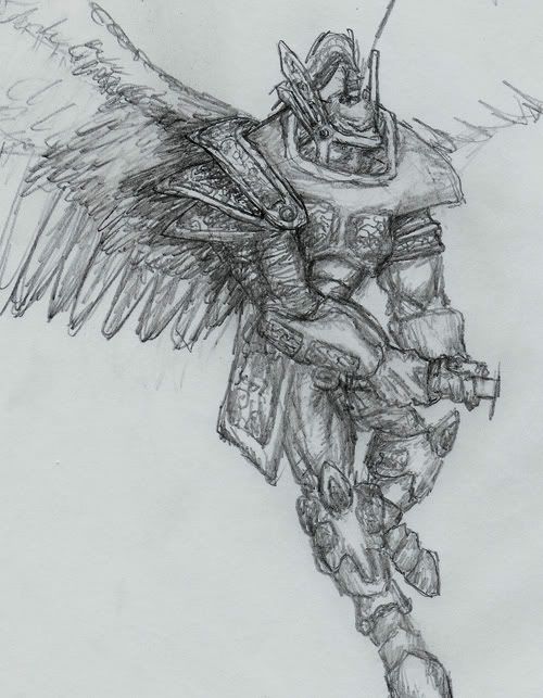
So for my next creating its going to be a grungy, worn-out angel. I'm trying to be under 5000 tris. I'm going to really work on making a realistic texture for this one cuz i've always done slightly chartoony textures in the past.

Heres my concept:
grunge-angel.jpg

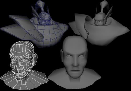
And here is the wip so far. Its at about 1800 tris right now.
grunge-angel_wip01.jpg

Comments and critiques are wlcome!

Replies

  • PeteJ
    Offline / Send Message
    PeteJ polycounter lvl 18
    i think you should incorporate some of the helm desing into the actual head, gives him a more drow like feel. which i assume would be a good thing if he's a big grungey wink.gif
    concept is ok, although i think you need to work out some more interesting details in the actual model.
    keep goin
  • MasteroftheFork
    Offline / Send Message
    MasteroftheFork polycounter lvl 18
    so heres what i've done so far. The drow ideas interesting but I want to keep him relatively human. If anyone know how to do good wings let me know. Right now I'm using 3 alpha planes.

    grunge-angel_wip02.jpg
  • MasteroftheFork
    Offline / Send Message
    MasteroftheFork polycounter lvl 18
    I was a little off task with the abyss demon but i'm back to this now. Here is my progress.

    grunge-angel_wip03.jpg
  • Enix
    Offline / Send Message
    Enix polycounter lvl 18
    The polyflow is kinda messy, but I do like the concept. Reminds me of nightmare from Soul Caliber 2, but with wings tongue.gif.
  • MasteroftheFork
    Offline / Send Message
    MasteroftheFork polycounter lvl 18
    Ya, I always have messy poly flow =/. Is this a big problem or is it just bad when looking at the wireframe? Anyways heres an update
    grunge-angel_wip04.jpg
  • MasteroftheFork
    Offline / Send Message
    MasteroftheFork polycounter lvl 18
    I know I'm working very slowly on this but I finished the model, and finally the uvs (thank god). The tri count is about 4500. Heres a snapshot of my uvs(it going to use 1024), with alot of my work i end up wasting alot of texture space so this time I'm posting it before I texture it. If you can see any places for an improvement plz tell.


    angeluvtest.jpg
  • cholden
    Offline / Send Message
    cholden polycounter lvl 18
    Yes, messy poly flow can be a problem. Clean models always render and uv better. As you can see from your UV's being real shakey edges instead of straight, clean lines. This becomes a problem when you paint the texture, because you'll never be able to get a straight line or anything you paint to look exactly as it should on the model. Notice the snowballing effect here? It can be tedious, but take the time to make it clean, it will get easier with practice.

    It's a bit difficult to crit your model because the images and angles aren't very telling.Maybe front, side, perspective, and wireframe shots would help?

    Anyway, the proportions are pretty good. He does carry a distinct look that is easy to remember. I'm not really sure why you positioned the arms like that. It couldn't have been easier to model that way, and it's definitely not going to be easier to rig. Modeling them straight out, by his side or at 45 degrees is often preferred. I usually go between 90 and 45 degrees. The wings seem a bit boxy and small for his body. It's really tough to tell what's going on with this model based on your images.
  • Bronco
    Offline / Send Message
    Bronco polycounter lvl 18
    I don't mean to hijack the thread or anything Masterofthefork,but I have a curious question.

    cholden,you mentioned the polyflow and the staggeredness of the UV lines with this angel. but Im just curious how you stop that?

    I normally model by using the cut tool as I have alot more control overit and can see exacly whats going on,but keeping line flow dead straight is sometimes a real bitch to do....I do also use he slice plane which has striaghter results but unlike the cut tool doesn't have the same control (and normally cuts through soemthign ya don't wnat it to).

    Is there anyway around this issue or is it just a case of refining the final model?

    Cheers Fork and Chris

    John
  • cholden
    Offline / Send Message
    cholden polycounter lvl 18

    One way is to tediously clean up the model, vert by vert, making sure each edge loop has a smooth flow. For example, yesterday I was UV'ing a glove, and scaled all of the UVs very nice and clean. It took a little work, but now I can draw one straight line that can evenly line up around the wrists or fingers.

    It's also recommended to keep it clean from the start, and uv as you go. For example, one can easily uv a cylindar, but it becomes more difficult once it's a curved pipe wrapped around a character.
  • MasteroftheFork
    Offline / Send Message
    MasteroftheFork polycounter lvl 18
    Ah thanks for clearing that up, I guess for now on I will make more of an effort to make cleaner meshes. About the arms, I was told it is better to make the arms like this for better deformation but you sound like you know what ur talking about, and I respect your skills alot so if you say its better to make the arms straight I'll remember that for the future(its alot easier to model straight anyways).

    Heres some wireframe orthos
    grunge-angel_wip05.jpg
  • MasteroftheFork
    Offline / Send Message
    MasteroftheFork polycounter lvl 18
    An early start on the face texture( 100% self illuminated).

    grunge-angel_wip06.jpg
  • KevinCoyle
    Offline / Send Message
    KevinCoyle polycounter lvl 18
    Not a bad start. you'll want to up the contrast a bit, and reduce the extent of the red around the eyes. Also the eyes look a bit too open, like he's stunned.
  • MasteroftheFork
    Offline / Send Message
    MasteroftheFork polycounter lvl 18
  • MasteroftheFork
    Offline / Send Message
    MasteroftheFork polycounter lvl 18
    heres a start on the armor
    grunge-angel_wip08.jpg
Sign In or Register to comment.