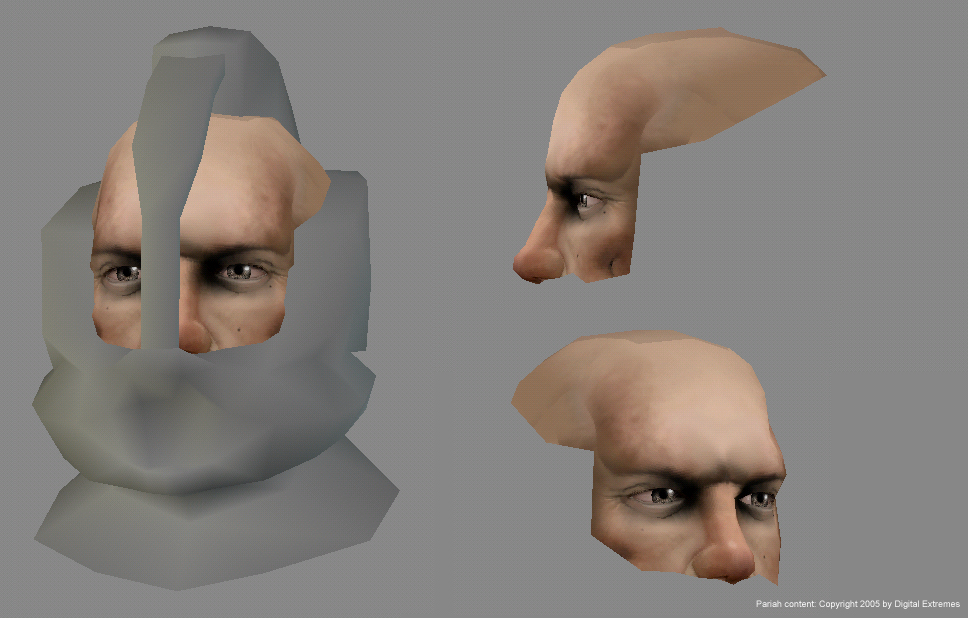
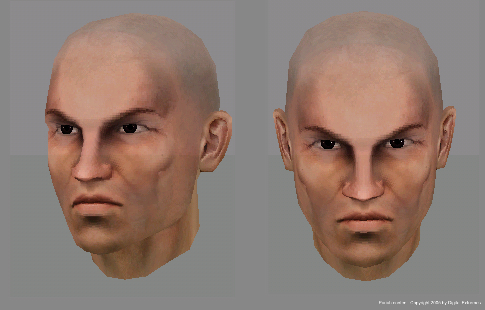
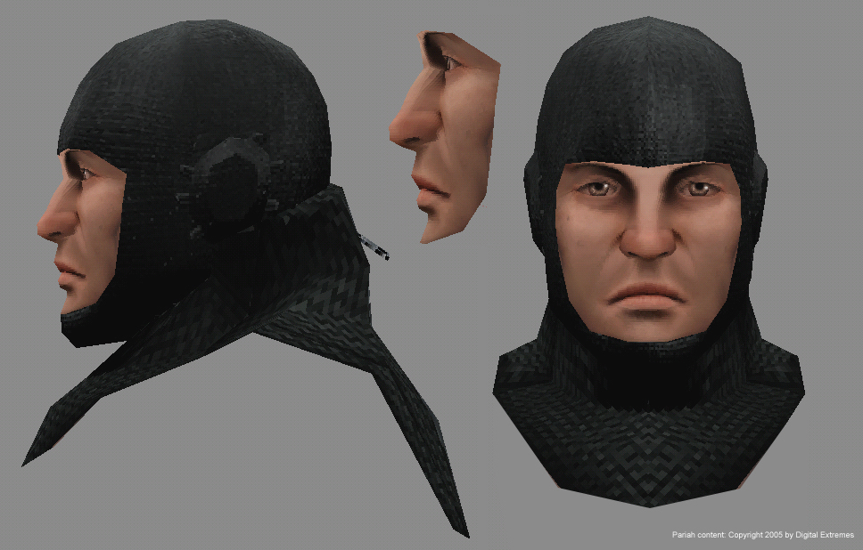
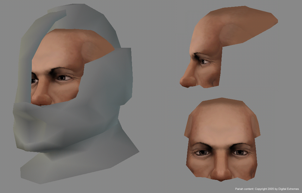
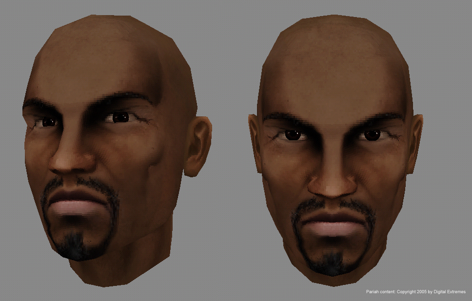
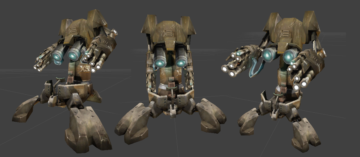
Now that the game has been released I can show the things I did. I haven't had a chance to play Pariah myself, but Vahl is totaly addicted on his X-Box version of the game, so I think I should get it soon. Here is some of the work I did a few months ago. I don't know if everything has gone ingame, but I'll let you know in this thread. I hope to have my website online in a few days too. Greetings
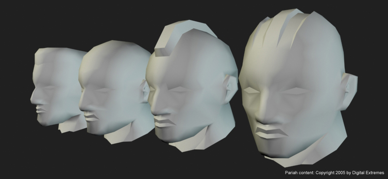
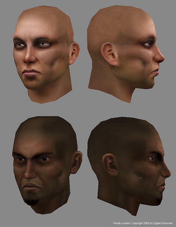
Awesome work man. I think if I had any critique, I would work on your color tones. Some of them are a bit monochrome. I think adding that hard scar-like groove to every persons cheek isn't really realistic. It's cool if it's a stylistic thing that you were trying to keep consistant across the board, but most people don't have that feature on their faces.
I think the underside of the brow ridge is insanely dark. It wouldn't shadow that much and it makes them look like they have eye shadow applied (makeup). It's especially the black color to it, if it was redder, it might make it more believable.
Minor crits really, this is very nice work, and the proportions on the faces look really good. 8-)
I think its pretty decent work, the things that poop pointed out are what makes these faces look so increadibly unrealistic, the ears are so obviously photosourced, you could have cleaned that up a little better on the first textured head they don't even match the skin color of the rest of the face, similar things on the rest of the heads.
I think it looks fine, but nothing special, you most definitely have to get rid of the black color when shading faces, you NEVER see that in real life, other than in some harsh lighting conditions. Like dark shadow is fine, just don't make it solid pure black, at least use some of the skin color in the shading.
Also on the turret, it looks badass from the seat DOWN, like the base and the legs look really cool, I like those alot, but from the seat UP it looks pretty unfinished and inconsistent, you could have probably spent more time on that.
Agree or not, these are just opinions and suggestions, and I could be wrong and maybe its a terrible tragedy.
congrats Jboxmuh, you should be proud to have worked on such a cool title!
You have greatly improved and it shows.
The things that irk me are the cheek dimples, some of the lighting on the faces, and the scatches on the robot like at the top and in the middle.
Looking forward to playing this one!
Btw, how did you land this gig? just curious
Pretty cool work, nice to have it in that game.
I agree with the comments about the black around the eyes, and the dimples in the cheeks, they're not very realistic and don't make much sense.
The turret looks pretty good, but I think that's a fullbright render, I reckon you should have lit it with a 2-3 point lighting rig, since the texture doesn't really hold up (it's destroying the form of the model) when fullbright. I reckon it'd look fine in "game lighting" conditions though. Just seems to lack constrast, and there's not enough separation between the elements, so it just looks a bit busy when rendered with no lighting.
The faces are good, I like the subtle colour variations, but again the black shading around the eyes does look pretty weird and unnatural.
Yes, another Pariah survivor.
popping up like mushrooms after the rain..
Good work jboskma, you have good picky sense of judgement and self critique that will allow you to get far in the future. It already naturally gives you a strong techniqual understanding.
I agree with what has been said so far. Rockstar said it but never can stress this too much: don't shade with black (or, at least, what appears to be pure black). Not only it just plain out sux but you are missing the beauty of light and how light collides with objects in the world. By putting pure black, you are in fact only looking at the 'light' side.. meaning - if there is no light: there is black. But what about the object itself? it takes 2 to tango..
edit: Just for example on this - see how the *third [/EDIT] heads on this page seem to look better? Thats because the flesh has much less pigment in it, its almost white; Therefore, the shadows are naturally very gray. Other faces have a naturally fleshy or tanned (holds a lot of light) skin, that means stronger pigment - and without apropriate colors in the shadows to balance it.
You seem to be developping some habits of pattern in your work. No worries, that happens to all of us . Lips have very consistant elements, for isntance, and most details are done as approximation, they are not sharp. You gotta tighten up and learn where Exactly is light hitting on that face, and off that point you apply the shading. You shading is not accurate enough to support your techniqual skill (which is very nice). Better anatomical understanding is essential here.
Also, I think you could push the highlights brighter on your metal. You make it very shiny, so the highlights must be brighter, more contrast..
Anyways, good job, still much better than some of the crap you see out there on games. Good job then, and congrats ;
Go get that stupid site of your online btw
Thanks a lot for all the good crits, I appreciate it that you guys spend the time on helping me. I've replaced the turret render with some screengrabs from the Pariah Editor. Looks a lot better now
I dunno, theres something about that turret design that makes me wanna attack it with a lightsaber... cant quite put my finger on it. <--
I think cause in many ways it looks like a robot, I dunno if the two turquoise tubes are meant to be cannons or eyes but I think thats what causes that factor
One small thing about the turret (as this seems to be current trend).
try this real easy and fast: You reach in your palette pure white, and pure black. This kills a lot. Just by softening these extreme, to say like 80%, I think you can get a lot better image. You can try this easily as a paintover in ps with the brush mode on darken when u paint the new 80% dark value over the dark areas, and the other way around for the light. Make sure the shadows get some temperture tho, not just 80% grey.
Thanks all. Showster: the cyan barrels are the ammo barrels, which lit up when activated.
The white rounds are the self illumination map. I've used them so the barrelholes (where the bullets fly out) stay black / shaded, and arn't effected by ingame lighting, which would make them look flat and fake.
Replies
and yah ,I finished the SP campaign yesterday, after around 8/10 hours, was good
I think the underside of the brow ridge is insanely dark. It wouldn't shadow that much and it makes them look like they have eye shadow applied (makeup). It's especially the black color to it, if it was redder, it might make it more believable.
Minor crits really, this is very nice work, and the proportions on the faces look really good. 8-)
jeffro: hehe my name isn't shimmer thanks though man
I think it looks fine, but nothing special, you most definitely have to get rid of the black color when shading faces, you NEVER see that in real life, other than in some harsh lighting conditions. Like dark shadow is fine, just don't make it solid pure black, at least use some of the skin color in the shading.
Also on the turret, it looks badass from the seat DOWN, like the base and the legs look really cool, I like those alot, but from the seat UP it looks pretty unfinished and inconsistent, you could have probably spent more time on that.
Agree or not, these are just opinions and suggestions, and I could be wrong and maybe its a terrible tragedy.
You have greatly improved and it shows.
The things that irk me are the cheek dimples, some of the lighting on the faces, and the scatches on the robot like at the top and in the middle.
Looking forward to playing this one!
Btw, how did you land this gig? just curious
I agree with the comments about the black around the eyes, and the dimples in the cheeks, they're not very realistic and don't make much sense.
The turret looks pretty good, but I think that's a fullbright render, I reckon you should have lit it with a 2-3 point lighting rig, since the texture doesn't really hold up (it's destroying the form of the model) when fullbright. I reckon it'd look fine in "game lighting" conditions though. Just seems to lack constrast, and there's not enough separation between the elements, so it just looks a bit busy when rendered with no lighting.
The faces are good, I like the subtle colour variations, but again the black shading around the eyes does look pretty weird and unnatural.
MoP
Red x's.
[/ QUOTE ]
I had a few nitpicks, but those were nailed by scott and Poop, so there's no reason to mention those.
popping up like mushrooms after the rain..
Good work jboskma, you have good picky sense of judgement and self critique that will allow you to get far in the future. It already naturally gives you a strong techniqual understanding.
I agree with what has been said so far. Rockstar said it but never can stress this too much: don't shade with black (or, at least, what appears to be pure black). Not only it just plain out sux but you are missing the beauty of light and how light collides with objects in the world. By putting pure black, you are in fact only looking at the 'light' side.. meaning - if there is no light: there is black. But what about the object itself? it takes 2 to tango..
edit: Just for example on this - see how the *third [/EDIT] heads on this page seem to look better? Thats because the flesh has much less pigment in it, its almost white; Therefore, the shadows are naturally very gray. Other faces have a naturally fleshy or tanned (holds a lot of light) skin, that means stronger pigment - and without apropriate colors in the shadows to balance it.
You seem to be developping some habits of pattern in your work. No worries, that happens to all of us . Lips have very consistant elements, for isntance, and most details are done as approximation, they are not sharp. You gotta tighten up and learn where Exactly is light hitting on that face, and off that point you apply the shading. You shading is not accurate enough to support your techniqual skill (which is very nice). Better anatomical understanding is essential here.
Also, I think you could push the highlights brighter on your metal. You make it very shiny, so the highlights must be brighter, more contrast..
Anyways, good job, still much better than some of the crap you see out there on games. Good job then, and congrats ;
Go get that stupid site of your online btw
Nice!
Cheers
/Palm
Want to check out Pariah but I have too many new games laying around
- BoBo
I dunno, theres something about that turret design that makes me wanna attack it with a lightsaber... cant quite put my finger on it. <--
I think cause in many ways it looks like a robot, I dunno if the two turquoise tubes are meant to be cannons or eyes but I think thats what causes that factor
try this real easy and fast: You reach in your palette pure white, and pure black. This kills a lot. Just by softening these extreme, to say like 80%, I think you can get a lot better image. You can try this easily as a paintover in ps with the brush mode on darken when u paint the new 80% dark value over the dark areas, and the other way around for the light. Make sure the shadows get some temperture tho, not just 80% grey.
The white rounds are the self illumination map. I've used them so the barrelholes (where the bullets fly out) stay black / shaded, and arn't effected by ingame lighting, which would make them look flat and fake.
Very nicely painted textures that fit, allthough I find the use of normalmaps in the game a bit weird.