Just started Max. First environment
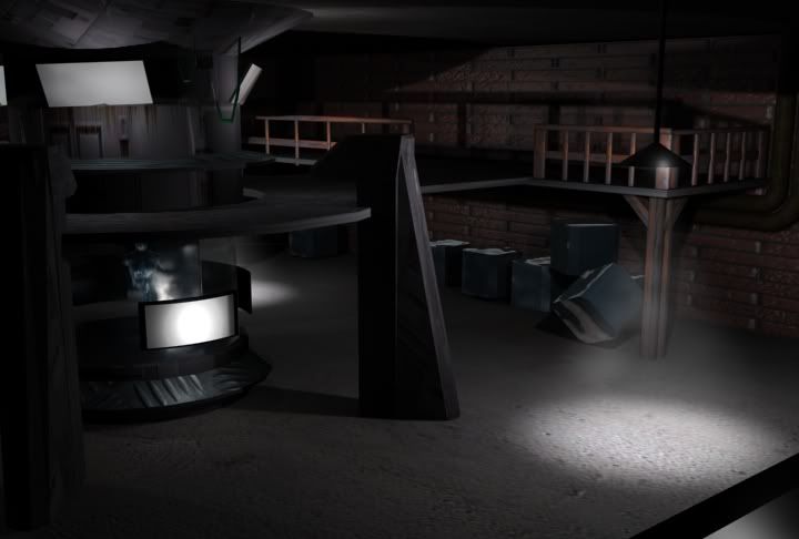
I've been using Max7 for about 3weeks now. I'm currently taking an intro modeling class at AI Washington, but all we're doing is lighting boxes, spheres, etc. I couldn't wait so I started playing around with shapes, lights, stretching and pulling verts, playing with textures in the program and here's what I came up with. Lemme know what u think.


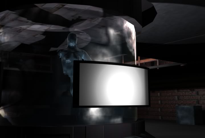
Oh yeah and thank u thank u thank you to Poopinmymouth for coming to the school and lecturing. Seeing him fly around Max and model was mind blowing to me. It may have been nothing to him, but I just started and was just amazed. I started making the broken figure inside the little capsule after his lecture. good stuff. Looking forward to your next one. Awesome stuff on ur page btw.


Oh yeah and thank u thank u thank you to Poopinmymouth for coming to the school and lecturing. Seeing him fly around Max and model was mind blowing to me. It may have been nothing to him, but I just started and was just amazed. I started making the broken figure inside the little capsule after his lecture. good stuff. Looking forward to your next one. Awesome stuff on ur page btw.
Replies
I really haven't much of an idea of what this scene is. Some sort of capsule in someones basement?
Your texture resolutions are inconsistant throughout the scene. To help you with this, when you're UVing your model use a checkered texture (b/w squares). This way as you're UVing the model you'll see where certain faces are at a higher/lower resolution than other faces. A good example of this in your scene are the bricks on the walls. They look too stretched horizontally. Then compare the bricks to you ground texture - which is a higher resolution than the walls.
Also, the canister/capsule thing is just sorta sitting there on the floor. Nothing around it to suggest its purpose or to show that its being held up by something (or is it attached to the ceiling and we just can't tell?).
A main thought to have when creating environments is to keep things consistant. Your texture resolutions, your materials used (you have high-tech devices in - what looks like - a basement). When done right this can be OK, but you need to give more visual information to pull it off properly.
Grit/dirt. Those bricks are too shiney and that floor is too clean. Dirt kicks up and sticks on to the bottom of walls - especially in shady areas like this one. The brick wall has no variation in it, so its very repeatative all the way around. The lighting helps this problem out slightly, but adding variation to the diffuse map (your textures) will help out a lot.
Also, mind posting your wireframes for this?
Keep it up, you're off to a good start!
The biggest thing tough is the texture res. Try getting a checkerboard and UV mapping everything so the checkers are consistently the same size before you texture it. That helps me out sometimes.
(Oh yeah and as for what the first environment is...I dunno. I wasn't aiming for n e thing. It is a product of my first time even opening Max. Whenever I learned something new I threw it in there. Some1 told me it looked like something out of Splinter Cell or Siphon Filter. I'll have a specific aim in mind for the next one).
I'll post a wireframe as soon as I get back to my home computer
Do you guys have n e tips for some1 just starting? I love the program and am willing to spend any amount of time with it to get good. After studying textures i'll try a character model