WEREWOLF CRITIQUE, please :)
polycounter lvl 20
Hey everybody, first post but i'm an avid reader of the site for some time. This is my second character model and my first to actually recieve textures (and soon animation Woohoo). Critiques welcome and hoped for in all areas
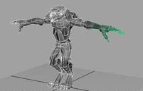
<3000 faces about two weeks model, tex, rig.
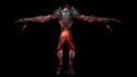
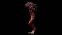
<3000 faces about two weeks model, tex, rig.


Replies
Onto the crits:
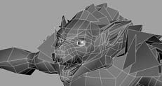
The density of polygons is really erratic, for example there are more polygons in the lower lip than there are in the rest of the head. The entire bottom lip could be defined just as well with extremely less polygons, and could probably have a better silhouette as well. It would be far smoother if you added another horizontal edge on the jaw and got rid of about 6 of the verticals, and then you would have alot more polies to work with, which could go to defining something that needs the extra detail, such as the forearms and the calves, which can very easily be identified as low-poly even in the thumbnails, because they have those ultra-sharp angles on their silhouettes.
The lower legs have alot of vertical edges as well that dont help to define anything, and far too few horizontals, which seems to be a persistent problem, define more shape horizontally, and less vertically, it will utilize all the polies much better.
There are alot of details that would be as effective if they were simply left to the texture, such as the bottom of the stomach and the eyelids. If something is concave then there is no way to see the silhouette, thus nearly all of the detail can be created in the texture, and if you can utilize bump maps then there is even less need for detail in the concave areas, the eyelids have tons of edge-loops and only very few of them is actually helping to define any of the shape or shading.
There are some areas that seem like the density could only possibly be detrimental, such as the crotch, what is the point of that little cluster of polies that doesnt seem to be defining anything (shaped like <>)? If a single vertex has too many edges/polies associated with it, such as those which I just pointed out, then the shading goes stretchy.
The bottoms of the sides of the thighs have way too many useless vertical polies and it is causing wierd stretchy shading in the area also.
As it is, you could probably do something that would be nearly identical with 2000 polies or less.
Never render anything against a back blackground when you are looking for crits, it makes it impossible to read the silhouette and the details. Grey is much better, as most of your pics are.
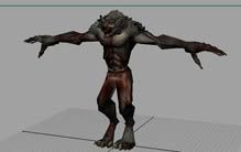
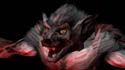
You should post the texture flats and possibly a globally-illuminated pic so that we can tell more about the texture. As it is it seems like you used too much black for shading, but I am not one to give many texture crits, and its hard to tell right now anyway.
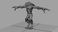
Its a cool model though, have you done high-poly or something before? Seems too good to be a second model and seems like some of the areas are set up for high-poly and you have a pretty good understanding of anatomy.
It's great for a second model, it should just be optomised a bit and the silhouette defined a bit more, as well as possibly a bit of texture work, but its awesome and I'm interested to see an update on it, as well as interested in seeing your third model.
The polygon distribution isn't that bad, the lip comment was bang on, and could lose a loop around the eye sockets.
You could do with another loop around the stomach to help the deformation.
So the morals of story is model with more rings, the silhouette matters most, and dont model interior detail that you can bump. right?
As for the erraticy in the poly density, there were a number of errors that caused it but it all bols down to noobness. some areas (i.e. lower lip/rest of face) I thought i needed to full extend te edges but i def see you what you mean and how that would be much better and lighter. the strng <>s in the pants were where i was trying to model folds in the fabric, which don't really show so they're pointless. wasn't sure what details i should ty to model and what i should leave to texturing,
heres my texure files btw I'm missing the back hair fringe file (on school comp) but its just the same type of color map with a transparancy map on it to shag the ends out. should i have left the darks a little lighter and stayed away from black more?
oh yea, btw yes this is my second character model, created the first following Poopinmymouth's awesome tutorial but I noob'd that one up something bad lol.
I'm terrible at texturing, so I won't say much, but I would add more color to the fur, some brown maybe, but thats just taste I suppose.
Nice model - really good for a 2nd.