Weekly Concepts - Critique
polycounter lvl 20
For an open-ended project class at my university I have decided to start improving my concepting skills. So as an assignment, I've got to do 1-2 concepts a week, mainly character design. The focus is mainly anatomy, how well the concept gets across the idea of the character, and how well the concept itself is technically rendered. If they pass muster, they are to be inked and markered for finalization. So I'm basically looking for critiques on the concepts themselves, and how to improve the current concept, and also improve upon my skills for future concepts.
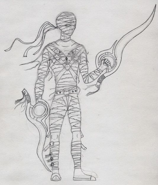
So heres the first one to be turned in, done in pencil... (the scan has been darkened so that its visible enough to show all detail):
...of course its to be penned and markered after receiving approval by my professor.
So heres the first one to be turned in, done in pencil... (the scan has been darkened so that its visible enough to show all detail):
...of course its to be penned and markered after receiving approval by my professor.
Replies
However my main beef with it is, it's so flat! His feet are flat on the ground, his hands look 2-dimentional, the straps across his torso have no curvature, all of this adds up to make this seem really "2d" ... a good concept should jump out of the paper at you - planting the feet on a ground plane in perspective is hugely helpful for this, as is determining a horizon line for eye level, so you know which parts of the figure will be looked "down on" or looked "up at".
His hands are too small, his waist is very narrow and probably too low too, the feet are not really the correct shape, even for shoes. There's no thought to anatomy in the arms that I can see, they just seem to bulge at the halfway points down each bone section.
The head is just resting on the neck, there's no indication of a natural connection there at all.
The design is cool enough, maybe not hugely original, but if you're doing something like this (an idea that has been seen a few times before) you want to make it stand out technically... and it's just not doing that right now.
I was gonna post a link to an image Marko Djurdjevic did, which had a great sense of depth to the view (foreshortening and figure in perspective, feet planted on an invisible plane rather than just flat-on side view), but his site seems to be down. Ah well.
MoP
Good idea with the weekly concepts
Life drawing classes will also be a great resource, too. Sketching people of all sizes and shapes will help you undrestand porportion and the relative sizes of the parts of the body.
I like the detail you have put into your drawing, as well. Good start and good luck with future concepts.
Oh, and I know the character isn't very original, the blade weapon itself was actually the original idea, with the guy being an after-thought for holding it. Going to try improving him as well once I have a firm pose down for the next drawing.
Unfortunately he recently moved to San Francisco from Germany, and I think that's why his website is down, hopefully he'll have a new one up soon.
Here are a few links showing how he does characters and poses... all with interesting (asymmetrical usually) costumes, relaxed and believable poses, plenty of weight and depth. I recommend saving all his images to hard drive, and studying them often
http://www.parasyticmoon.com/dissonance/img/characters/bali.jpg
http://www.parasyticmoon.com/dissonance/img/characters/kianto.jpg
http://www.parasyticmoon.com/dissonance/img/characters/kodha_2.jpg
http://www.parasyticmoon.com/dissonance/img/characters/loa.jpg
...and everything else over here:
http://www.parasyticmoon.com/dissonance/img/characters/
Work on proportions, study anatomy, get a feeling of how the human form changes in space (foreshortening of limbs, deformation etc.) and you will be well on your way to drawing stuff as good as this (with maybe just a bit of practise)
MoP
2nd Week:
Took the original concept, and blended it with my ideas of a dark angel...so here we have an angel of death. The little thingy in the bottom corner is a concept for a cracked mask he will wear over one eye.
Week 2:
Redrawn with a bit of armor, and ideas for armor placement.
All of them have been run through Photoshop to adjust the levels since they were drawn only with a 6H pencil, and aren't complete. However I'm still looking for crits, and comments. And yes I know his torso is slightly elongated, trying to make him a bit more ominous that way.
Edit: I just want to pass out...I've got to condense an hour and a half presentation down to 15 minutes by Friday for the SOURCE conference in NYC. Finish a 3 minute group CG movie in 4 weeks, and another 3 minute movie (traditional) solo project for film class in two...and write two more 3-4 page papers for my writing class...plus finish this guy in color...
...argghhhh!!! /end bitch session -.-