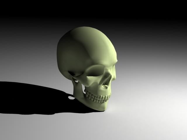
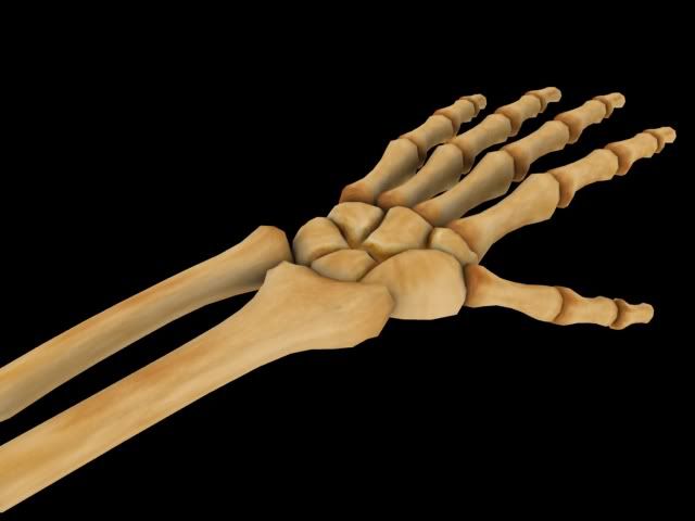
Looks severly overdetailled. The hands have too many polies and could have been solved with a normalmap which you seem to be using going by that skull picture.
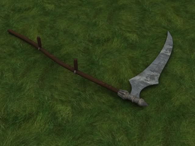
the scythe lacks any real texturing, try to work on that some more.
Swiss_cheese: That kind of attitude will get you nowhere fast, around here. If you're posting images, you should expect critique, and respond appropriately.
The hand looks pretty good, but if you're doing the skull that high-detailed, you should go the whole way and hollow out the inside of the cranium, and deepen the eye sockets, with a hole at the back so they look more realistic.
The scythe looks pretty good too although the texture is weird. Kinda makes the blade look like it was made out of stone.
Grass doesn't usually have that "crop circles" effect, either. Your modelling seems fine, but the texturing needs improvement. Look for reference images and interpret them in a suitable manner.
[ QUOTE ]
People overestimate the power of Source too much
[/ QUOTE ]That skull might not be as high poly as you think and if it is it could always be for a normal map.
I prefer people over estimated it then tune it down, then start off with say quake 1 style graphics and worry about using quake 2 models for source fearing it might over load peoples pcs......
thank you, I'm not going to be doing it that high poly. I created that skull as a spline cage so I could have more control over the curves. I used a surface modifier with 5 steps which makes it over 12,000 polys, but ingame I'm making it at 2 steps which is about 10% of that (1200 polys)
The textures I used for the scythe are not the textures I'm using for the ingame version, just a way to show the model off better than untextured. sorry for the attitude, but its a little annoying when someone shows a model and states that its not done (maybe I didn't make that clear), then ppl complain that it's not done. Thanks for the praise and for the critiques.
They look... plain. I cant really say anything since I don't see the full scope of what you are trying to accomplish. Your attitude needs a check too. They are just trying to help out.
I like tha arm/hand action. Looks nice. Skull, too. Your handle seems a bit short for the scythe.
Oh, and it's nice that you apologized. However, you never state that what you're showing isn't done. All you say is that they are parts of the model. For all we know those parts are finished.
Replies
the scythe lacks any real texturing, try to work on that some more.
The hand looks pretty good, but if you're doing the skull that high-detailed, you should go the whole way and hollow out the inside of the cranium, and deepen the eye sockets, with a hole at the back so they look more realistic.
The scythe looks pretty good too although the texture is weird. Kinda makes the blade look like it was made out of stone.
Grass doesn't usually have that "crop circles" effect, either. Your modelling seems fine, but the texturing needs improvement. Look for reference images and interpret them in a suitable manner.
MoP
Stuff looks cool, I really like the hand. But, what KDR said
edit: mop posted at the same time. What he said too.
People overestimate the power of Source too much
[/ QUOTE ]That skull might not be as high poly as you think and if it is it could always be for a normal map.
I prefer people over estimated it then tune it down, then start off with say quake 1 style graphics and worry about using quake 2 models for source fearing it might over load peoples pcs......
The textures I used for the scythe are not the textures I'm using for the ingame version, just a way to show the model off better than untextured. sorry for the attitude, but its a little annoying when someone shows a model and states that its not done (maybe I didn't make that clear), then ppl complain that it's not done. Thanks for the praise and for the critiques.
Oh, and it's nice that you apologized. However, you never state that what you're showing isn't done. All you say is that they are parts of the model. For all we know those parts are finished.