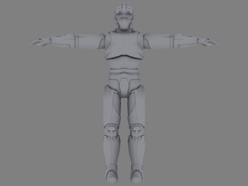
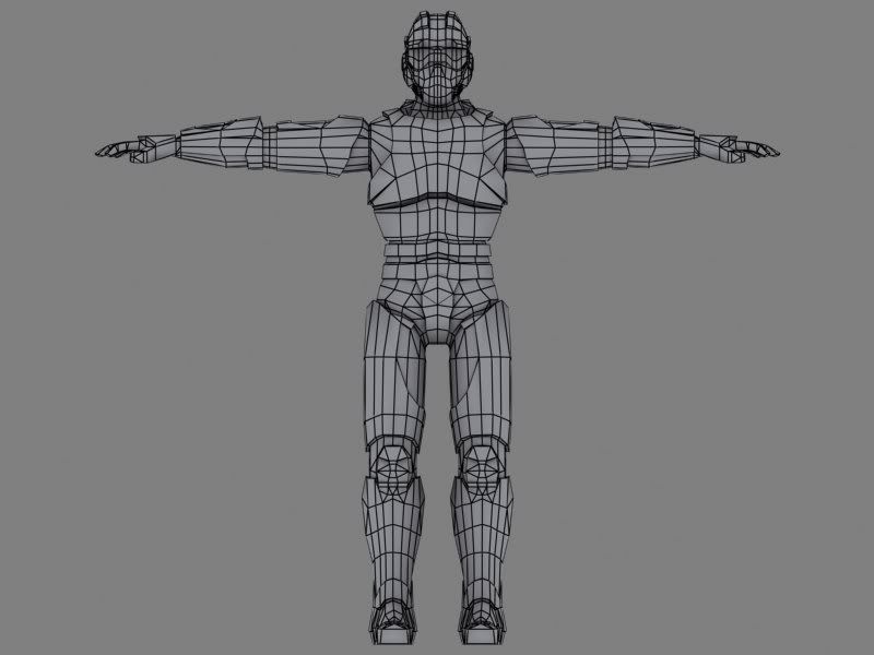
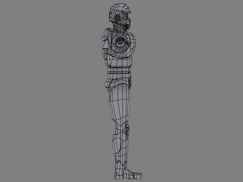
Looks like you used WAY too many polys gusy rounding things out(too many sides on your cylenders) and not nearly enough towards the actual shape of the model and in the ears you need them like the shoulders. Something to think about for your next model because i doubt you want to redo everything with less sides but you can still fix up the shoulders on this one right now they will look very bed when animated.
I used 14-16 sides on the cylinders. I did some quick calculations and found out that I would have more than enough polys with that number of sides. I'm more used with models around 3000 polys so I probably went overboard on this. Thanks, will redo the shoulder, I wasn't sure about it myself.
Better. But as mentioned you have FAR too many sides on those cylinders. You say you did some calculations? Well, calculate this - you dont need so many sides on those cylinders, so you can take those polys out and put them somewhere else
Yeah, but it's soooo smoootthh now . I could move them elsewhere, but I don't have anymore detail to put on it, we got a concept to follow and I can't anything more that needs to be added.
Anyway, thanks for the crits, got a gun underway too, that should be done tomorrow.
Looks good Cubik.
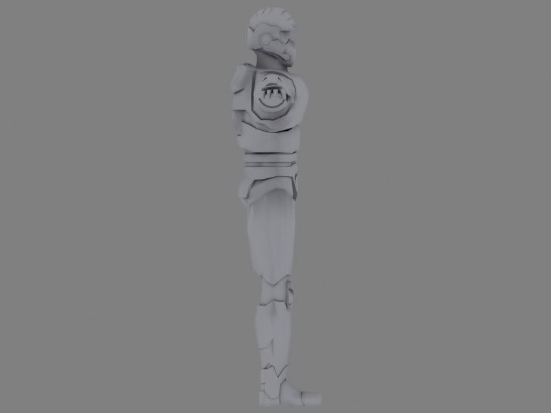
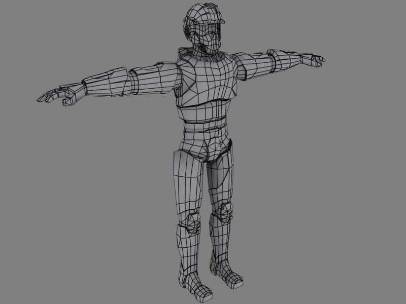
I think the head could be a bit wider looking at the side view. The back of his head can stick out a bit more.
The feet I would make a little bit bulkier. He's really padded all over and his feet look very thin and flat.
LKraan is right, this guy's head looks squashed horizontally in the side view.
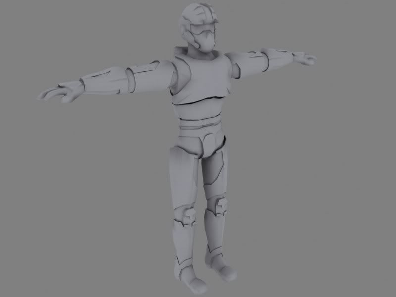
Also his overall pose is really stiff, there's no weight there... I know this will probably be rectified when he's rigged and animated, but I always reckon models look 100% better when their default pose looks like a stance that's holding their mass in a relaxed pose.
If you modelled it based "perfectly" on the shape of the concept, use a little artistic license with the pose, or tell the person who did the concept to draw things a little less rigidly in future
He looks like he'd fall over backwards at the moment.
MoP: I agree. The concept we got is in a very stiff T-pose. One of my other teachers thought that we should model it in a looser pose, elbows bent inwards and down and the knees slightly bent.
The general rule i try to use is 8 sides on arms, and 12 sides on legs... anything else and its not as easy to work with or uv map IMO with 8 or 12 you always know where you are going to put your uv seems and its easier to mirror things.
The grip on the gun is very blocky and you can easily do the indents on the clip you have there with a texture, they will not be noticable in game. Also for the length of the scope the weapon is very short like its a sub-machingune, ie: not very accurate and it looks odd with a high-powered scope on it.... But thats just me being a gun nut, i would make the barrel a lot long so it looks more like a rifle.
That gun looks like it's based off the FAMAS to some degree, the scope doesn't do it any justice IMHO, if you added some features from say the Styer Aug as well as extending the length of the barrel, you'd then have a reason to keep the scope.
Again, this is from a concept, I agree that it looks weird. I'll ditch the groves in the magazine and use those polys on the grip. The scope is from the concept, so I don't really have that much that I can tweak...but I'll make the barrel longer and take a looks at the AUG.
Seeing how this is my third character ever I think that I have progressed a lot. I'm having quite a lot of fun too, but I really would like to finish this soon. Any thoughts on the texture, don't sugarcoat it, I'm here to learn.
I actually think you have a good potential
Can't quite tell if you used photos in this (shoe, neck armor?) but it looks very visually convincing
one thing I havent noticed said here about the model is his wasit.. seem real narrow to me.
So, to focus on the texture and not the model - good job so far. I'd kill the stars symbol and make something up, it's quite cliche.
Unless this gets rendered somehow else, the texture requires some sort of rendering. It's pretty flat right now. Even the low relief isn't strongly defined.
The torso armor seem to be seperated into 2 different parts. Perhaps consider changing the material of one of them, to create some more variety in color and relief.
I think the orange eye goggle thing stands out just by being orange. The model may seem more balanced if the green metal paint is as saturated as the orange. If you do that, it would also help the desaturated, chipped-off-paint areas stand out more
The neck armor is handpainted, but the shoe is a photo of my own boot. Thanks for the crits, positive crits from you means a lot since I think that you do bloody good work. I'll look over the texture tomorrow and see where I can use your suggestions. Green metal paint?
the neck armor and the shoe stand out to me since they do have the contract I was talking about. They also have nice color touches in them - though it may be the JPEG quality.. it does that sometimes
On a very personal note - I'd like to see you continue to update the texture with more of that painterly approach you took on the orange googles and the neck, and less mechanical, perfectly linear designs.
Not me. If I can be said to have any outside influence on my work it would be Bisely, Brom, and Frazetta. Though they may all want to deny any involvement in the crap that is what usually comes out of me.(what is with me tonight?)
nice job! His feet still look too thin and need to be shaped more. They look a little like sticks. And in my opinion you need more contrast in your maps. It's really cool but at a distance you won't see all that detail. Keep it up!
Much brighter, more color, more detail, more contrast, no more stars:
Flat:
shotgun: My next skin will be handpainted, this has to be somewha realistic, since I'm doing it for a schoolproject which has a realistic enviroment.
todman: I not really sure that I agree with you, the flat in the front is a little weird but I think it looks fine.
Better job cubik. I think there's more balance now in color, as a whole.
I was looking forward to see you handpaint this skin, I guess I'll have to wait some more
If you wish, I'll have a little time today I can make a quick paintover and better demonstrate perhaps what I was saying, and how I think you could (have) improved it even more.
I hope this is isnt overkill, even though its pretty sketchy.
I tried to keep it relatively pale and follow the same general design elements I felt you were poking at, without applying too much artificial light.
So: bolder 3d, stop making outline for every edge (you end up with same material relief on everything), pushing colors just a bit and you have more material types. In desing I think it's important to "classify" everything to a material, for which you know exactly what palette you are using so it's easily readable. Some of your greens are more pale, some less, some a little red.. it's a little messy. That's also a way to texture, a calculated mess, but you have to push it further than what I believe is slight, occasional, accidental mess - as in yours. Anyways, hope this explains a little, and sorry I wish I had some more time but I REALLY don't.
I wasn't really aiming for green, more of a yellowish-orange-brown tone. But I'll definatly add the detail and light you have in your paintover. I'll try out the green too, to see how it looks with the yellow. Thanks!
Right now your texture is all small scale detail. It's not helping the model to read well from a distance. It looks like the majority of it is a metal overlay, with some layer effects on top with bevel and emboss, or followed the same rules doing it by hand. Nothing wrong with that technique, it just shouldn't be apparent to me, the end viewer, that is what you did.
Try to show the volume of the surface a bit with the texture. If it looks exceedingly flat on the texture sheet, it probably isn't aiding the model itself. You want to be able to see a bit of volume on the texture sheet itself, as once it's on the model it will help convey the forms better.
Shotguns paintover is good advice. Try approaching it so that the highlights work with the volumes. Right now you treated it as if everything was on a perfectly flat surface.
Also try to get some wear and tear that isn't overlayed on the entire thing. Localized dirt can go a long way. When you overlay it on the entire texture, it lessons the impact. Show a bit of the clean unadulterated areas, and that will emphasize the dirt and rust that much more. I'm not saying to make this thing filthy or rusty, just add some type of dirt or scratches, very slight, that aren't everywhere like the current overlay.
No bevel and emboss, it's all by hand. Need the pratice . What you're saying about the highlights is basically that I need more and bigger (softer) highlights to define where the model curves and so on? I have tried to do that, but I guess I need to put some more time into it.
More localised dirt is on the way, still a WIP (although the deadline is fast approaching).
Shotguns' paintover is a great help, I'll try to include those big highlight of his in the texture.
My computer is starting to strain to keep up with the texture. It's over 300 layers right now and my computer isn't very happy about it .
Will post my progress tonight, thanks for the help guys!
First impression:
Great another Halo2 fan doing their version of Master Chief... Master Chief inspired models are becoming the AK-47 of a few years ago. It would really help to see the concept but really I think we all know what it was modeled after. I can't say I am a big fan of the model. LIke MoP pointed out it lacks weight, all the armor looks as if he is floating is space? Each piece would have to be strapped to his body, it would pull down in places and have weight. The classic T pose is oldschool in my book, I prefer to have the arms at a 45 degreee angle to the body, or half way between T pose and resting. This way you can judge better how the shoulders will bend and minimize on the texture streching. Right now the shoulders are at thier most bunched up. You will texture them, and when you animate they will unbunch and the texture will stretch.
This next part isn't so much about the model, but I feel it needs to be said.
[ QUOTE ]
Yeah, but it's soooo smoootthh now . I could move them elsewhere, but I don't have anymore detail to put on it, we got a concept to follow and I can't anything more
[/ QUOTE ]
But it can be that smooth with less polys... You could move them else where but you are not going to because you feel the model is done, well it's not. Having polys that don't belong on a model is a bad habbit to fall into. Saying "but its under budget, I am leaving them in!?" is worse than having them there in the first place.
I think people get the wrong idea about poly limits on models for games. It is not a license to waste polys up to a certain limit. You should always ask yourself, is this model as low poly and high detail as I can make it, reguardless of the poly budget.
Also an unwillingness to go back and make something better shows me that you would be a pain in my rear if I was your Art Director and asked you to go back and make the model more low poly and higher detail.
In the end it is your model, and you do what you want, just know that people who can put out the same lvl of detail with less polys are the guys/gals that will more than likely beat you out for a newbie position.
Just my thoughts on the thread, I could be way off.
I agree with you now, I didn't then. I've placed a ten-sided cylinder next to the arms and legs and I couldn't really see any difference when it came to smoothness. So I was wrong and I should have rebuildt it then. The reasons I didn't was that the concept didn't have any more visible detail, and that the deadline was much sooner then. It has been moved forward a lot since then. So in the future, I'll be much more aware how many polys I use to smooth an object. However, this model is done, now I don't have more time to adjust it.
All in all, I have learned a lesson and that's always something positive .
And just for fun, this is how the model looks with any basecolors or overlays... I almost like it more (exept the knees, but that is something that's easy to fix)...:
heh every time I see way you textured that visor I can't help thinking he looks kinda tired and dozy, like he's had a reeeally long day at marine hq. I can just picture him slouched at a desk answering complaints about how spacecorps insterstellar comm masts are giving the locals brain damage.
Replies
Old:
New:
Anyway, thanks for the crits, got a gun underway too, that should be done tomorrow.
I think the head could be a bit wider looking at the side view. The back of his head can stick out a bit more.
The feet I would make a little bit bulkier. He's really padded all over and his feet look very thin and flat.
Also his overall pose is really stiff, there's no weight there... I know this will probably be rectified when he's rigged and animated, but I always reckon models look 100% better when their default pose looks like a stance that's holding their mass in a relaxed pose.
If you modelled it based "perfectly" on the shape of the concept, use a little artistic license with the pose, or tell the person who did the concept to draw things a little less rigidly in future
He looks like he'd fall over backwards at the moment.
Oh, and there's too many sides on those cylinders
MoP
Will fix the head, thanks.
Gun in progress, 3h so far, 1920 polys:
The grip on the gun is very blocky and you can easily do the indents on the clip you have there with a texture, they will not be noticable in game. Also for the length of the scope the weapon is very short like its a sub-machingune, ie: not very accurate and it looks odd with a high-powered scope on it.... But thats just me being a gun nut, i would make the barrel a lot long so it looks more like a rifle.
Flat:
Seeing how this is my third character ever I think that I have progressed a lot. I'm having quite a lot of fun too, but I really would like to finish this soon. Any thoughts on the texture, don't sugarcoat it, I'm here to learn.
Can't quite tell if you used photos in this (shoe, neck armor?) but it looks very visually convincing
one thing I havent noticed said here about the model is his wasit.. seem real narrow to me.
So, to focus on the texture and not the model - good job so far. I'd kill the stars symbol and make something up, it's quite cliche.
Unless this gets rendered somehow else, the texture requires some sort of rendering. It's pretty flat right now. Even the low relief isn't strongly defined.
The torso armor seem to be seperated into 2 different parts. Perhaps consider changing the material of one of them, to create some more variety in color and relief.
I think the orange eye goggle thing stands out just by being orange. The model may seem more balanced if the green metal paint is as saturated as the orange. If you do that, it would also help the desaturated, chipped-off-paint areas stand out more
the neck armor and the shoe stand out to me since they do have the contract I was talking about. They also have nice color touches in them - though it may be the JPEG quality.. it does that sometimes
On a very personal note - I'd like to see you continue to update the texture with more of that painterly approach you took on the orange googles and the neck, and less mechanical, perfectly linear designs.
Alright.. keep us updated
Flat:
shotgun: My next skin will be handpainted, this has to be somewha realistic, since I'm doing it for a schoolproject which has a realistic enviroment.
todman: I not really sure that I agree with you, the flat in the front is a little weird but I think it looks fine.
I was looking forward to see you handpaint this skin, I guess I'll have to wait some more
If you wish, I'll have a little time today I can make a quick paintover and better demonstrate perhaps what I was saying, and how I think you could (have) improved it even more.
I tried to keep it relatively pale and follow the same general design elements I felt you were poking at, without applying too much artificial light.
So: bolder 3d, stop making outline for every edge (you end up with same material relief on everything), pushing colors just a bit and you have more material types. In desing I think it's important to "classify" everything to a material, for which you know exactly what palette you are using so it's easily readable. Some of your greens are more pale, some less, some a little red.. it's a little messy. That's also a way to texture, a calculated mess, but you have to push it further than what I believe is slight, occasional, accidental mess - as in yours. Anyways, hope this explains a little, and sorry I wish I had some more time but I REALLY don't.
Try to show the volume of the surface a bit with the texture. If it looks exceedingly flat on the texture sheet, it probably isn't aiding the model itself. You want to be able to see a bit of volume on the texture sheet itself, as once it's on the model it will help convey the forms better.
Shotguns paintover is good advice. Try approaching it so that the highlights work with the volumes. Right now you treated it as if everything was on a perfectly flat surface.
Also try to get some wear and tear that isn't overlayed on the entire thing. Localized dirt can go a long way. When you overlay it on the entire texture, it lessons the impact. Show a bit of the clean unadulterated areas, and that will emphasize the dirt and rust that much more. I'm not saying to make this thing filthy or rusty, just add some type of dirt or scratches, very slight, that aren't everywhere like the current overlay.
More localised dirt is on the way, still a WIP (although the deadline is fast approaching).
Shotguns' paintover is a great help, I'll try to include those big highlight of his in the texture.
My computer is starting to strain to keep up with the texture. It's over 300 layers right now and my computer isn't very happy about it
Will post my progress tonight, thanks for the help guys!
Great another Halo2 fan doing their version of Master Chief... Master Chief inspired models are becoming the AK-47 of a few years ago. It would really help to see the concept but really I think we all know what it was modeled after. I can't say I am a big fan of the model. LIke MoP pointed out it lacks weight, all the armor looks as if he is floating is space? Each piece would have to be strapped to his body, it would pull down in places and have weight. The classic T pose is oldschool in my book, I prefer to have the arms at a 45 degreee angle to the body, or half way between T pose and resting. This way you can judge better how the shoulders will bend and minimize on the texture streching. Right now the shoulders are at thier most bunched up. You will texture them, and when you animate they will unbunch and the texture will stretch.
This next part isn't so much about the model, but I feel it needs to be said.
[ QUOTE ]
Yeah, but it's soooo smoootthh now
[/ QUOTE ]
But it can be that smooth with less polys... You could move them else where but you are not going to because you feel the model is done, well it's not. Having polys that don't belong on a model is a bad habbit to fall into. Saying "but its under budget, I am leaving them in!?" is worse than having them there in the first place.
I think people get the wrong idea about poly limits on models for games. It is not a license to waste polys up to a certain limit. You should always ask yourself, is this model as low poly and high detail as I can make it, reguardless of the poly budget.
Also an unwillingness to go back and make something better shows me that you would be a pain in my rear if I was your Art Director and asked you to go back and make the model more low poly and higher detail.
In the end it is your model, and you do what you want, just know that people who can put out the same lvl of detail with less polys are the guys/gals that will more than likely beat you out for a newbie position.
Just my thoughts on the thread, I could be way off.
All in all, I have learned a lesson and that's always something positive
Flat:
And just for fun, this is how the model looks with any basecolors or overlays... I almost like it more (exept the knees, but that is something that's easy to fix)...:
that aside I really like the texture, reminds me a bit of that awesome skin for Keel by Imperator, called 'Ironclad'. Which is definately a good thing. heres a link if you're not familiar with it:
http://www.planetquake.com/polycount/cottages/thegrinder/skins/ironclad.jpg