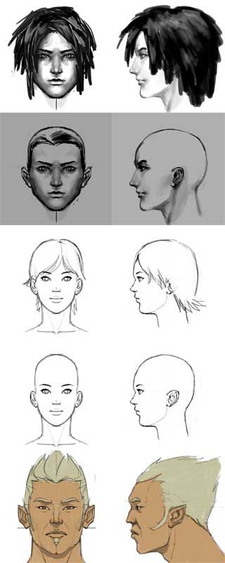
heads - model sheets
Trying to get the hang of making model sheets. Not particularly creative, but that wasn't the point. Not much of a modeler myself, I'd like to know if they are production friendly. I'm not restricting use of these, my only conditions is that you post your results in this thread. The feecback would be invaluable. 

http://img.photobucket.com/albums/v353/chrisdejoya/bp-hair-front.jpg
http://img.photobucket.com/albums/v353/chrisdejoya/bp-hair-side.jpg
http://img.photobucket.com/albums/v353/chrisdejoya/bp-shaded-front.jpg
http://img.photobucket.com/albums/v353/chrisdejoya/bp-shaded-side.jpg
http://img.photobucket.com/albums/v353/chrisdejoya/bp-girl-front.jpg
http://img.photobucket.com/albums/v353/chrisdejoya/bp-girl-side.jpg
http://img.photobucket.com/albums/v353/chrisdejoya/bp-girlbald.jpg
http://img.photobucket.com/albums/v353/chrisdejoya/bp-girlbald-side.jpg
http://img.photobucket.com/albums/v353/chrisdejoya/bp-wakka-front.jpg
http://img.photobucket.com/albums/v353/chrisdejoya/bp-wakka-side.jpg
Replies
Oh and black on white is kinda bad, least in Max edges are white by default and over white background you cant see them.
Shaded options are good, especially lit from slightly off-center, (ie not mirrored). Hair/no Hair options are also good...as said before. When I draw for other modellers, they all have different opinions on how best to translate 2d to 3d! Off white/grey background is also good (damned eyestrain). A good-width single line is important, as it cuts down on guesswork.
Gmanx, thanks for sharing your experience.
neogenesis, looks like you captured a lot of the nuances on that one! the mouth, eyes, cheekbones, and jaw are all looking spot on. Thanks for taking the time out.