WIP: Demon. Please spare a minute. [Mild Nudity]
Hello all! This is my first post on the new boards. Im currently working on this demon, who is supposed to be the main character of a mod in progress. I want it to deform correctly, and i also want the face to be ideal for facial animation.(Hl2 style) But since i don`t have much (if any) experience in rigging and animating, i would love for you to give me pointers on where i need extra polies, where i could get away with less, and so forth. Crits on polygon flow and pretty much anything is appreciated.
It weighs about 3000 polies as it is now, and i plan to end up around 5-7 for the final model. (Its for the source engine.)
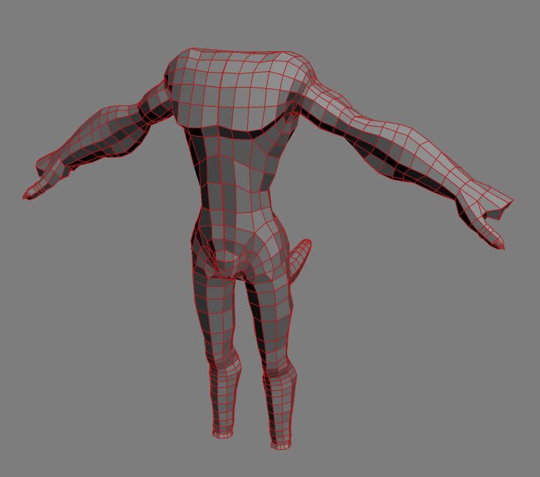
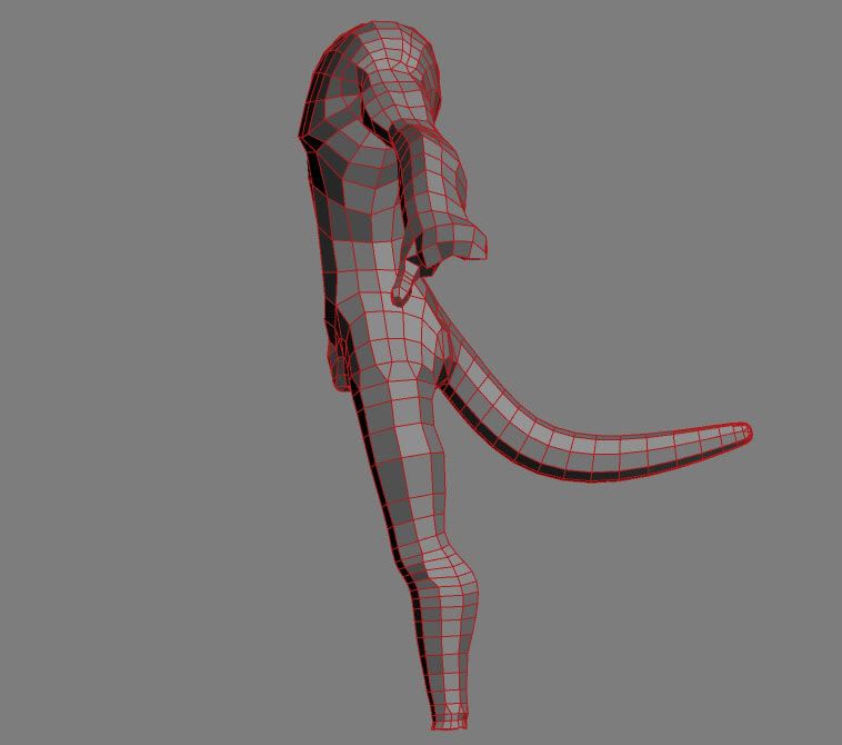
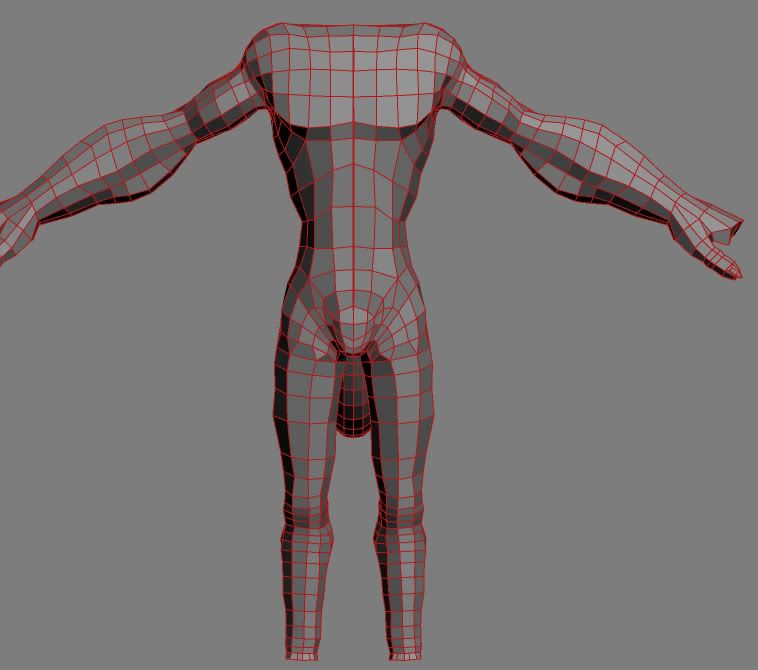
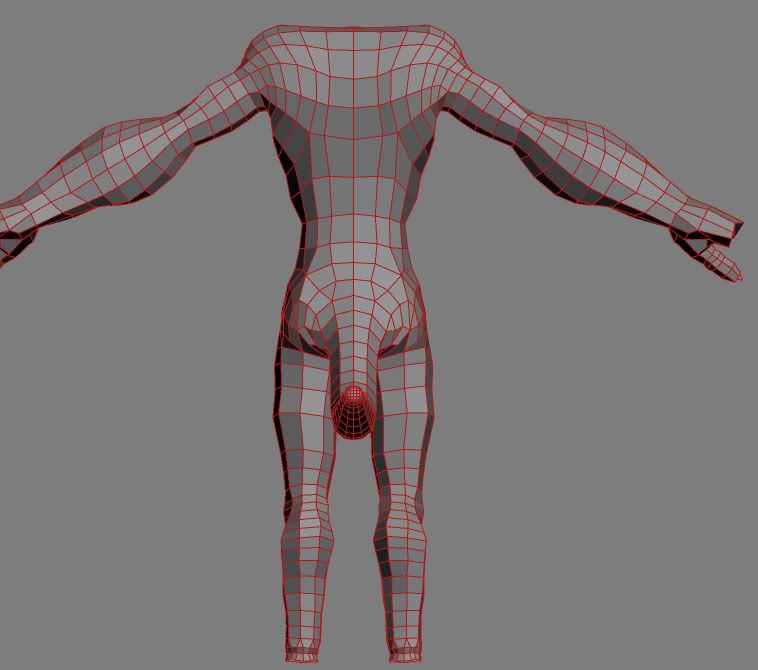
The lower legs have too many polies, i know.. the feet is far from done. Im having trouble with the knees, advise on that particular area would be great. Feel free to do paintovers.
(You might ask where the nudity is.. He doesnt have any clothes. And i used it to get your attention and lure you into this thread.)
It weighs about 3000 polies as it is now, and i plan to end up around 5-7 for the final model. (Its for the source engine.)


The lower legs have too many polies, i know.. the feet is far from done. Im having trouble with the knees, advise on that particular area would be great. Feel free to do paintovers.
(You might ask where the nudity is.. He doesnt have any clothes. And i used it to get your attention and lure you into this thread.)
Replies
I don't think you need all those poly's around the tip of the tail and the lower legs tho. I see a lot of stuff on these boards looking just a good with much less polys in those areas.
And unless the source engine is different from most other engines I've read up on, the model will have to be triangulated before it can go in-game. So imaging taking all your quads and splitting them in 2. So technically you have about 6000 polys if you triangulate it.
I'm sure if you were mesh smoothing this into a high poly character, those quads would come in really handy to make it look really good. but since it's for a game, now that you've got the basic shape in place, maybe you shold start switching over to actully working with 3sided polys.
But I might be totally totally wrong cuz I'm really just a n00b.
Oh and I really like your edge loops, I doubt you'll have any problems when animating.
Although I wouldn't triangulate it, just as long as you know what the final triangle count will be.
That dragon you made, is it for the Unadahm army?
Sparky: Sorry, wrong Slash! (Imposter? :O) Thats kind of funny.. I DID actually work with genocide some time ago.(I think it was for some warhammer4k mod for wc3 that died out as soon as rumours about dawn of war started surfacing. but dont quote me on that.)I am not, however, working with him now. But this new project of his looks promising. Maybe i`ll pop by and lend a foot?
//edit: I had myself a laugh when i saw the emoticon i used. ->
Thoughts?
Started the feet, these, definitely dont like. they looked cool in the concept, but now they look more like oversized bird feet. suggestions?
Its still messy, something caused by the methods i used for creating it, but it looks alot better than it did 2 hours ago...
Well, I`ll take it as a sign that im doing everything right, since noone crits.
Got to work on that mouth. His lower jaw is quite massive, and it looks abit more orkish than the concepts. But i think i like it this way. Any comments on that? I havent really done mouths that are supposed to be animated before, let alone open mouths at all..
I also started on the ear.. These always pose problems for me... I never get them "right", and they are insanely hard to unwrap. On this one i`ll add all the inner ear detail with zbrush. (Did i mention that this bitch will be gloriously zbrushed for normal map generation?)
Here it is:
Oh, and in case noone noticed, i added his horns
//edit: Each of the halves are about 850 tris, sans the eyes. Those are just placeholders anyways!
(You might ask where the nudity is.. He doesnt have any clothes. And i used it to get your attention and lure you into this thread.)
[/ QUOTE ]
You bitch
Considering a castrated being, that's not needed anyway, unless the crotch will protrude a bit or skinned cleverly like this, or used as testes, like this
:P
<Cheapy[L]> gah damn you slash and your false nudity warning
<Cheapy[L]> i was hoping for some nice sweaty demon cock
I have connected his head to his body. The neck is still a goddamn mess, but atleast he`S got one. I`ll fix that later.
I also "fixed" his knees, I think these might do the trick. They look like knees, and im guessing that they will deform correctly. Defined his claw toes a bit more, and rearranged some lines and polies. IMO they look better now.
4944 polies.
... and I dunno why, but the face kinda reminds me of jeepers creepers.
I found the time to work on this baby again. It ended up on about 4800 polies.
First of all, i battled my fear of uvw unwrap, and i dont think it looks that bad. But then again, im a unwrap n00b.
Then i imported the fucker to zbrush, and im doing the highpoly there. I tried to generate some wip normal maps there, and it kinda worked.
Here's where im at on the highpoly:
One more image for those happy 56k'ers:
Here i put the wip normal map and a wip texture into doom3 as a static object. im getting lots of black polygons scattered all over the model. Some parts are darker than others for no apparent reason. Any light anyone might be able to shed on this matter would be greatly appreciated!
After the normal map is done I'll dive headfirst into the world of RIGGING, POSING and ANIMATING. that should be fun.
//edit: if there's any interest i would be happy to release an SDK. I just need a host for the file.
Even in Max, the normal seems to have some problems (very black areas).
also try to make the lowpoly model smaller for the ingame test, this may be a lighting issue, but I doubt...
for more info in rendering normal maps with doom3 (also works with ase files but needs some text-editing :
http://wip.global-illusions.com/d3tut/quick%20Tutorial%20-%20Doom3_PPM.htm
PM me if you need more help btw
there's some wasted space aswell, certainely due to the unmirrored stuff.
The mouth and the eyes also don't look like the concept art that you showed. His face is much more angular in the concept art, and it looks like it's really smoothed down in the model, so that's another thing to consider. It looks much more like Willem Dafoe than the concept's face:
I think if you follow the concept more closely this could be a really great model.
Thanks alot everyone who critted. (Rick: notice how i said "alot".
//edit: in those shots i also threw in a crude specular map, to keep the model from looking too boring.
Normal map came out kind of cool, and the definition is interesting in parts. I hope you finish him up with a proper color/spec/normal, and rig him, so we can see some cool in game shots.