Female pilot (edit: was stiletto heels)
Heya, Set the horse aside for a bit to work on doing a few human models. It's been remarked that there is a glaring lack of them on my site which needs to be adressed  .
.
This is the first throw. Presently at 2030 poly's. Took about a day's work to get to this point. For the time being she's still pretty generic but I wanted to get the general form right before adding clothes (don't ask about the shoes...I have no believable explanation). Possible end results include fashion conscious commando, an amazon zebra lady with a huge affro (Eddy Murphy reference there), naughty nurse or maybe something with armor, we'll see.
Something about the face/head still bugs me. I think I may have gone overboard on the cheekbones. She still needs to be cleaned up some and the Hands (and ears) aren't done yet. Please feel free to point out any other problem areas.
(edit 19-12-2004: Swapped out the renders for more recent ones)
(edit 10-01-2005: Added Textured Renders of the model.)
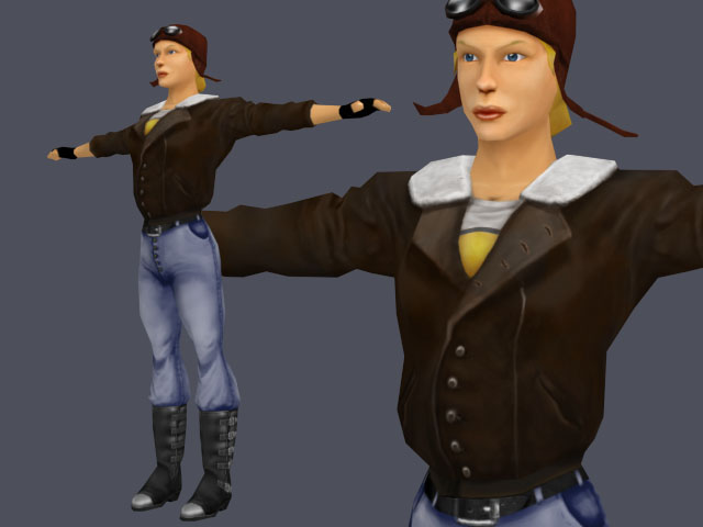
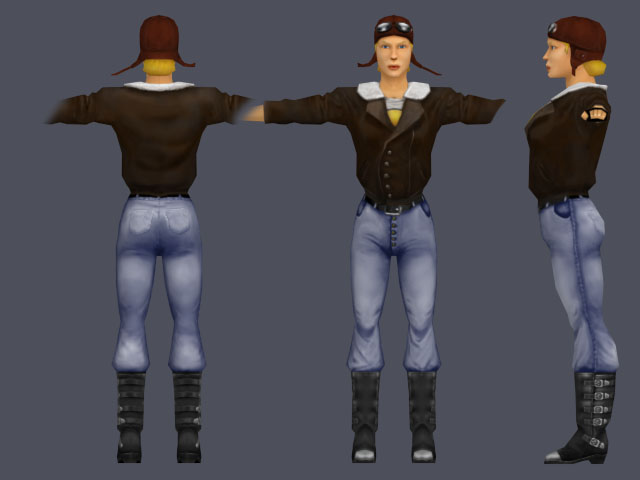
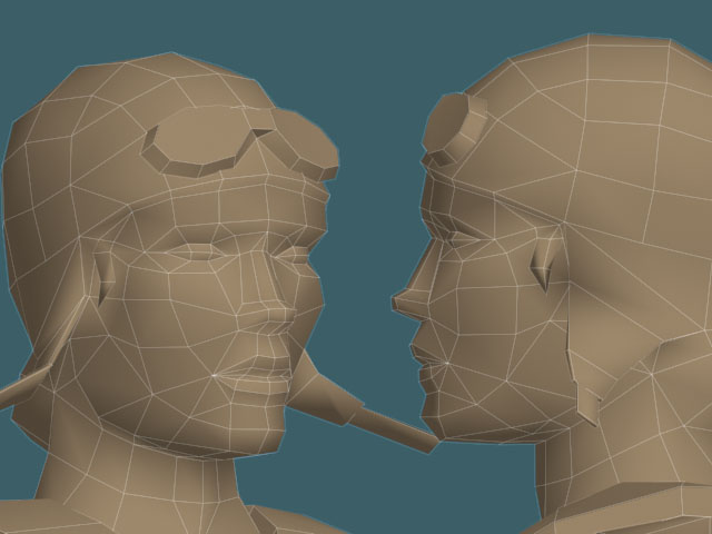
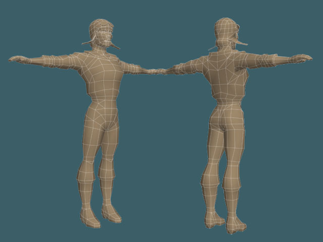
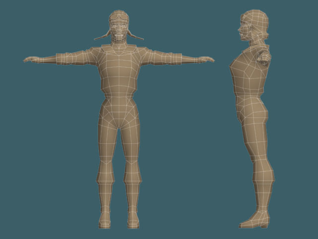
 .
.This is the first throw. Presently at 2030 poly's. Took about a day's work to get to this point. For the time being she's still pretty generic but I wanted to get the general form right before adding clothes (don't ask about the shoes...I have no believable explanation). Possible end results include fashion conscious commando, an amazon zebra lady with a huge affro (Eddy Murphy reference there), naughty nurse or maybe something with armor, we'll see.
Something about the face/head still bugs me. I think I may have gone overboard on the cheekbones. She still needs to be cleaned up some and the Hands (and ears) aren't done yet. Please feel free to point out any other problem areas.
(edit 19-12-2004: Swapped out the renders for more recent ones)
(edit 10-01-2005: Added Textured Renders of the model.)


Replies
To fix the face I think you'll want to bring the eyes, nose and mouth lower down the skull in general, because at the moment the chin is too large and the forehead too small.
Also, the nose is too wide and bulbous in the front view, it should be much narrower for a female.
Also you could probably remove one edge loop from the eyebrows and forehead at this level of detail, you've got polys there which don't seem to be adding to shape or silhouette.
MoP
For the face, it looks like you need some reference. Everything is all right, but not quite all there. All that you need are adjustments, but there are enough needed that you'll probably get the best results from having a guide.
Coolness overall!
/jzero
good start tho
Thanks, you guys were right on the button. The face was way too high on the head. It's amazing the difference moving just a few details around can make. Other than that, scaled down the nose and tightened up her buttox (slightly rounder now) a bit and cleaned up some of the mesh around the eyebrows. I'm not quite decided on how high poly this one's going too be which is why I left in that extra edge loop on the forehead for now. Present count is 1710.
However her chin in the profile view is sticking out hugely, and I fear her lips are too big.
Also her nose is too wide in the front view still, and maybe the nostril area is too high up (personally I think a slightly smaller gap between the bottom of the nose and the top of the upper lip looks nicer).
Here, I did a quick photoshop paintover to outline the changes I personally would recommend. Feel free to ignore them if you want, this may just be my opinion (although some of it is still anatomy issues I fear).
In the side view, I moved the chin and lip line backwards, and changed the shape of the nose to be slightly less bulbous.
In the front view I narrowed and moved down the nostril area (the rest of the nose is probably ok), reduced the size of the lips and gave them a more pleasing shape, also reduced the size of the eye area and modified the shape of the eyebrow line - however the eye size isn't really a problem as a texture could sort that out... still I'd look at it again. I also narrowed down the cheekbone/jawline area a little, I think it looks nicer that way.
I added ears too!
Oh yeah, I also just noticed her neck could be thinner in the side view, and the angle of the front should be changed from / to \ , if you know what I mean.
Good stuff though, keep it up. What sort of hair are you planning?
MoP
I haven't really given the hair much thought yet. It'll depend on the costume. She might also lose the heels depending on the setting, they're a bit too stripperish if you know what I mean.
While you're at the editing again - you might wanna try this for the lips:
Just add a couple of edges in there to round them out and give them a fuller shape, more feeling of volume. It also means the gouraud shading (which she'd get in a game engine, unless she was normal-mapped) looks smoother and defines the form in better way.
MoP
The pics in the first message have been switched to the latest version.
Slight update to the model, had a bit of time to work on it yesterday. Tweaked the face and body mesh some more (including the lips, thanks for the tip !). Hopefully most of the anatomical problems are now taken care of (If not, feel free to point them out
She's presently at 2030 poly. I'm a bit torn between the desire to keep adding small details (goggle straps, pockets etc.) and the urge to keep optimising to hit an arbitrary 2000 poly target.
Going off on a tangeant here, does anyone else get the impression that when modelling or drawing men you can pretty much get away with anything proportionwise and it'll often come across as character or style. But if you're making a woman, moving an edge by so much as a millimeter will automatically make it look like the blair witch, or a guy ?
OMG ! I turned Sandra Bullock into Jay Leno !
Her waist is looking oddly thin at the moment - surely the bulky aviator's clothes she's wearing would pad out that part of her body too? Or does she have a REALLY tight belt on?
Also, it might just be me (as you say, tiny vert movements in females change the whole look really easily), but I think the jawline might be too narrow in the front view? I might just be making that up, or it's preference or something, but it does look a little narrow, or it thins down too fast or something. Try messing around a little more there, see if it improves her features at all.
Personally I'd make the coat's fur collar go further down the chest too, I think it stops too abruptly at the moment.
Looks good though - it's always easier to judge things when they are presented in a "theme" - a random nude woman in stiletto heels could be anyone, but a female aviator - now that's a Character!
With any luck she'll be done in the next few days. Hehe, and the hatstraps are going to come down as soon as she lands
Happy new year everyone.