Home 3D Art Showcase & Critiques

WIP ganny weatherwax (crits wanted)

mikamika
polycounter lvl 18
Offline / Send Message
mikamika polycounter lvl 18
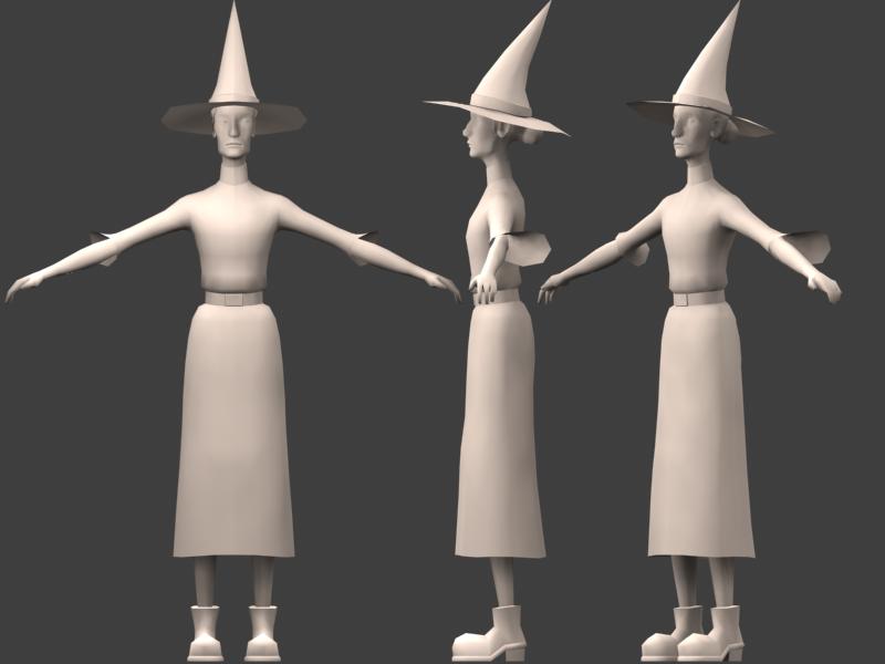
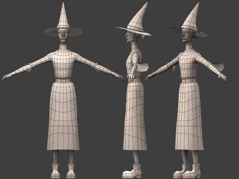
Hi, this is some thing ive been working on over the last few days. just posting so a can get some feed back, the ploy counts about 3500. I'm trying to be a bit more careful on where i put my ploys for animation and better deformations. any pointers anyone has would be great.

mikamika

gww1.jpg

gww2.jpg

gww3.jpg

gww4.jpg

Replies

  • almighty_gir
    Offline / Send Message
    almighty_gir ngon master
    isnt granny weatherwax a terry pratchet character? (if so, remind me which books she is in...(wyrd sisters maybe?)its been a hile hehe) the model looks very good though! i think the texture will bring out the aged look she needs (maybe some bump mapping?)
  • HarlequiN
    Offline / Send Message
    HarlequiN polycounter lvl 18
    Equal Rites, Wyrd Sisters, Witches Abroad, Lords and Ladies, Maskerade and Carpe Jugulum... So far.

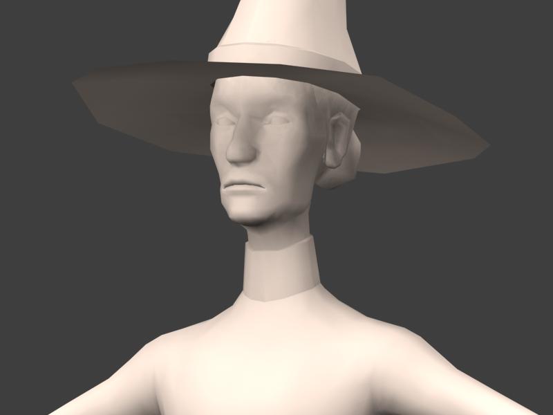
    Looks pretty good, a lot like Paul Kidby's interpretation of her. If I have any complaints it's that A) Her hat is way to straight from the front IMO, and B) I've always envisaged her with bulkier clothes (she's like a rail, but hides her form under her clothes), also, her skirt is too short for much the same reasons.
  • Noisybast
    Offline / Send Message
    Noisybast polycounter lvl 18
    Looks like Granny to me, Mikamika!
    Looks like Paul Kidby's version:
    granny.jpg
  • MoP
    Offline / Send Message
    MoP polycounter lvl 18
    Very good rendition here, i think the face is very good, however I agree with HarlequiN that the hat should be a little more crooked and maybe have more wrinkles in it too.
    Also she does look too thin, even for her...
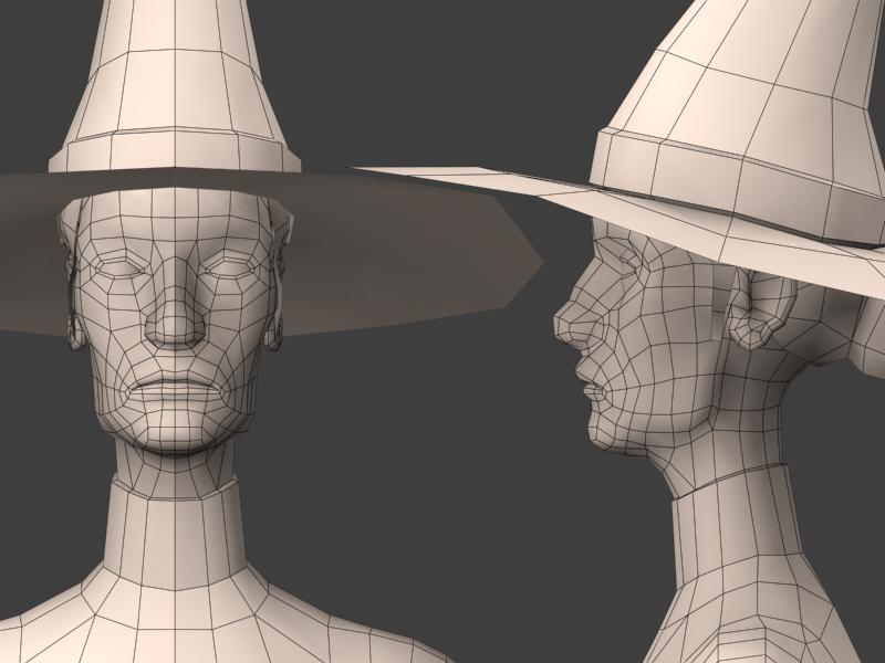
    The shape of the head behind the ear and going up looks wrong - the skull should curve out there but it looks pretty flat on the sides. makes her head look a bit too thin, and anatomically incorrect.
    the face has it, i just think the body needs a little tweaking before it's truly accurate smile.gif
    good work though.
    Kidby's artwork rocks! (As did the late Mr Kirby's) damn similar names, confusing smile.gif
  • mikamika
    Offline / Send Message
    mikamika polycounter lvl 18
    yeah it was made using his work for refrence, i had just bought his Art of discworld book a few weeks ago, and she was calling out to be modeled smile.gif

    HarlequiN, i agree with you she needs a roughenup, she currently mirrored at the moment. So ill be adding that stuff down the track.

    thanks people you given me sum things to mul over. :P

    mikamika
  • poopinmymouth
    Offline / Send Message
    poopinmymouth polycounter lvl 19
    Looking sweet man. I love the face, it has a lot of nice subtle stuff going on. For the hat, if you have the poly's. Give it a brim edge, to make it have thickness. It adds so much. Here is a similar hat I did recently http://www.poopinmymouth.com/3d/me_hats.jpg to show you what I mean. Leaving it a single plane makes the hat look paper thin and flimsy.
  • Steve Schulze
    Offline / Send Message
    Steve Schulze polycounter lvl 18
    I was just thinking today that she'd make a good model while flipping through that book. I'm planning to make something from it too. Haven't entirely decided what as yet.

    You've done a nice job of the model. I think you probably need to exagerate everything a bit more to make it look like Kidby's version, particularly the cheekbones and eyes. Lips could probably be a bit sharper to give her a slightly grouchier look.

    Nice one.
  • mikamika
    Offline / Send Message
    mikamika polycounter lvl 18
    just a small progress update. shes at 3800 ploys now and im a lot happier with her over all look and feeling she gives off. comments, suggestions fire away.

    gww5.jpg
    gww6.jpg
    gww7.jpg
    gww8.jpg
    gww9.jpg
    gww10.jpg
    gww11.jpg
  • Steakhouse
    Offline / Send Message
    Steakhouse polycounter lvl 18
    I always imagined her nose being a bit more hawkish, it would help get across her personality a bit more.
  • mikamika
    Offline / Send Message
    mikamika polycounter lvl 18
    ive finaly got around to texturing the old girl, just wanted to see what people thought. her face is a mix of photosourced and hand painted. I'm kind of aimimg for semi toon feel, i feel its on the right track. oh ignore the lighting on the eyes, there just mirrored at the moment

    mikamika

    update, just changed the 2nd render(was an old version of the texture)also most of the body mesh as has changed from the ones above, the face is pretty much the same.


    granny02.jpg

    granny03.jpg
  • MoP
    Offline / Send Message
    MoP polycounter lvl 18
    Pretty good work on the texture, but IMHO the mesh needs tweaking now that I've seen it with a texture on.
    She's looking too much like a man at the moment. The jaw is too wide at the front, and too angular below the ears. The nose is also too wide and fat, as someone said earlier it would be better if it was thinner and more "hawkish". If the jawline was thinner too, that would help.
    Her eyes look slightly shocked, rather than devious and grumpy as they should be... try just moving some verts on the upper eyelid and brow, should give her a better expression.

    Turning out well so far though, I like the style.
  • Steve Schulze
    Offline / Send Message
    Steve Schulze polycounter lvl 18
    The jaw is a fairly accurate reprsentation of Kidby's, though the corners at the back should be softened out quite a bit- that should be loose skin rather than heavily defined bone. You should probably work on the slackness of the skin all around. She is, after all, a very old lady.

    Looking good so far. with a bit ow tweaking here and there you're going to have a damn nice model.

    I've really got to get started on my Discworld Model at some stage.
  • poopinmymouth
    Offline / Send Message
    poopinmymouth polycounter lvl 19
    I'm gonna disagree with mop on this one. I think the manish features are helping with the character of the model alot. I think it still very much within the realm of femininity, and its nice that she isn't picture perfect (not that she would be being old and all).
  • Thermidor
    Offline / Send Message
    Thermidor polycounter lvl 18
    the colours of the skin are really great, maybe work on the ears some.
  • rooster
    Offline / Send Message
    rooster mod
    fist of all: looks sweet!
    I agree about the comments on the nose though, I'd like to see it go a bit more this way : http://216.180.41.179/pictures/sub4.jpg
    edit: is it me or does that woman look like she really wants to take a chunk out your neck?
  • Steakhouse
    Offline / Send Message
    Steakhouse polycounter lvl 18
    Rooster: Thats almost perfect, the woman in the books had the personality of a bird of prey and the model should reflect that. Of course now that we've hit the texturing phase I suppose it's a little late for it.
  • rooster
    Offline / Send Message
    rooster mod
    I dunno, a bit of vert tweaking here and there could probably bring it pretty close if desired.
  • MoP
    Offline / Send Message
    MoP polycounter lvl 18
    Yeah, I think just moving some vertices on the nose to make it narrower in the front view, and more hooked in the side view, would make this pretty much perfect.
  • Steve Schulze
    Offline / Send Message
    Steve Schulze polycounter lvl 18
    Well if you're wanting to stick with Kidby's concept, she's supposed to have a strong nose, rather than an aquiline one... no on closer inspection is is slightly hooked but not markedly so. More aristocratic than witchy. Its also placed quite high on her face.

    Something I notice you're missing are all the pins in the hat and hair which I think are a fairly integral part of the character.
  • mikamika
    Offline / Send Message
    mikamika polycounter lvl 18
    I think i have to agree with poop about the nose. my impression from the descriptions ive read about granny i feel her to be striking, but not beautiful. ive included links to kidyby's drawings im using for refrence.

    rooster, i think the image you post reminds me more of her evil sister in the series. you can see her in the side pic below.

    jackablade, your right about the loose skin, ill be work on that soon. oh and i didnt forget the pins there on the way too

    thermidor , the ears where pissing me off, and im going to get back to them at some stage

    front.jpg
    side.jpg
  • Cubik
    Offline / Send Message
    Cubik polycounter lvl 18
    Ohh, Pratchett!
    You need a couple of extra wrinkles behind the one running from the nose to the mouth (probably has some name). Check you reference. Also check out poops' tutorial on earpainting. It should help some.
    Not sure if the chin should be that sunken in.
  • rooster
    Offline / Send Message
    rooster mod
    Ah now I see the front/side ref I agree the nose isnt really hooked, so fair enough smile.gif
  • MoP
    Offline / Send Message
    MoP polycounter lvl 18
    Well, I guess if Kidby's wrong, I don't want to be right smile.gif
    Carry on!
  • Daz
    Offline / Send Message
    Daz polycounter lvl 18
    I don't know the original character, but this is looking really promising. If you're going off those front and sides, I think the nose in your model is too bulbous, and should be a little more slender. Also, the mouth creases from the nostrils start too low. They should eminate from the point where the nostrils curl around higher up.
  • mikamika
    Offline / Send Message
    mikamika polycounter lvl 18
    hey guys, finally put some more work into granny. i'd really like some crits on the texture, what do people think of the fabric ? i try to get a slightly shabby, but still prim and proper feel to it. keeping it simple, and purely functional.

    also feel free to comment on colour choices etc, oh and if anyone has some nice examples of black fabric done really well, please point me to them.

    final_granny_01.jpg

    final_granny_02.jpg

    final_granny_03.jpg

    final_granny_04.jpg

    final_granny_05.jpg

    and just for fun a very very quick vert pose, and some funky lights smile.gif

    final_granny_06.jpg
  • MoP
    Offline / Send Message
    MoP polycounter lvl 18
    Turned out very nicely.
    I love the hatpins and the socks!
    Can't help but wish her nose was narrower... that's just my mental image from reading the books though.
  • shotgun
    Offline / Send Message
    shotgun polycounter lvl 19
    for some reason, i have a strange craving for german s&m sex,
    orphinage style!

    think about how this cloth would actually sit on her shoulders. will it -- Can it actually have these kind of folds?

    try giving him some money, see if he changes his mind
  • mikamika
    Offline / Send Message
    mikamika polycounter lvl 18

    Mop: thanks mate smile.gif nice to get some positve feed back now and then. but i guess we will have to agree to disagree on the nose smile.gif

    shotgun: first of all ... ewww. i asume your refering to the cape. I think i was overly inspired by WOW capes there. i may go back over it and have a play and see what i come up with
  • Slash
    Offline / Send Message
    Slash polycounter lvl 19
    I like how this turned out. Time to dig out some discworld. There`s something thats not quite right about the fabric, but i cant put my finger on it. And the pattern on that thing around her shoulders (the thing under the cape.) is a little dark and hard to make out. Try adding some highlight to the pattern. If this is an old garment, i would imagine that some of the black would be a little washed out in some areas. Like the elbows and buttocks perhaps?

    nice work!
  • milla
    Offline / Send Message
    milla polycounter lvl 18
    She rocks. I'm a big Granny fan, so I'm chuffed - good job.
  • poopinmymouth
    Offline / Send Message
    poopinmymouth polycounter lvl 19
    Realy nice work. Turned out pretty nice.

    I think the first crit would be on the socks. They go to an awfully dark burnt color on the undersides. I know it's supposed to be shadows, but it just looks torched.
    I think more wrinkles and undulations in the fabric on her dress would go a long way, and I think the drape, as shotgun has mentioned, looks a bit too perfectly wrinkled and not quite realistic. (vary up the fold thickness and creases)

    Her belt could stand to be darker and a bit less saturated.

    That face morph is great, really top notch work on that one.
Sign In or Register to comment.