Bounty Hunter game character an' stuff :)
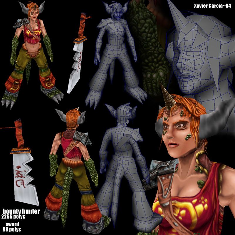
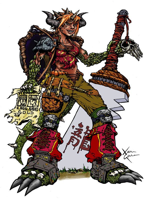
Hey, It took me a bit longer than i thought to get this one done (haha, this always happens) and eventhoughshe still needs more work im sure I figured its a good time to get some feedback on her. Oh yeah, the colored drawing aint done yet, so... ahem, yeah.. but its getting there 
One big problem I had with this is that the model kinda looks like the mid life crisis version of the drawing, I dunno if its a texturing issue, a modeling issue, or mabbe both, any ideas?
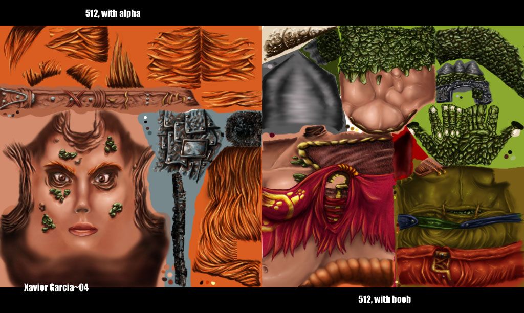
Ah, and i dont think i should add it, but if anyones interested the sword is textured on a 256 map, althoug maybe i should have gone smaller than that? i wouldnt know, first weapon and all , haha
So yeah, hope you like it, any feedback is appreciated


Replies
She looks like she could use a nap, those are some killer bags under her eyes. The hardedge from the base of her horns to her hair could use to be broken up so it doesn't look so harsh. IMO, the sword doesn't look nearly as interesting as the character - takes away from her style. I absolutely love the cartoonish style you put into her texture - great job with that. So yah, love it overall. Very cool character, great job!
Side note: Can anyone else see the penis in the texturemap on the right?
sigh... now I can
A sword with no edge to cut? or is it just hidden in those shots?
In all honesty the blade's texture doesn't look like a 256 but more of a 128. Sharpen those handle wraps up.
The texture has a nice painterly feel to it. A bit on the cartoony side.
great concept drawing!
Otherwise it's looking good.
Side note: Can anyone else see the penis in the texturemap on the right?
[/ QUOTE ]
Are you talking about the elbow texture of the arm? If so, yeah, me too.
At first glance, I thought this was a teen boy. I think getting rid of the eyebags (like Brome said) would help to stop that. Unless that's what you were going for.
I had a little, quite offtopic question though. the sword in the concept art the sword has Dragon written on it in blood. But in the model, you've taken away the right radical of the character, leaving the character that's on it meaningless... why did you choose to do this? Just because the texture wouldn't allow it? because if it wouldn't you could've used the other character for dragon, no it doesn't look as cool, but at least it fits :P
On the skin, you might not want to make it all quite so defined. Women, even when well muscled, arent that hard edged, they have a nice smoothness to em.
I do love the texture work tho, really nice style, and fun to look at. I think you just need to push the model and texture to closer match the concept.
adam: a penis you say? how the hell did that get in there?? yeah.. that was a total accident... I hope, hahaha The thing with her eyes is that I really wanted her to look.. not stressed but more like she is carrying a lot of weight ass a character you know? I didnt mean to make her look attractive and maybe what i did with her i should have taken to the rest of the face... but I definitely see where youre coming from, thanks! agreed on the sword and horns, ill try to work on them
jdinges: one side is dull, one is sharp.. but yeah, from the shots ive given you cant see the sharp edge, sorry bout that. Youre right about the handle, i shouldave paid more attention
zeldrik: good tips, ill see if i can get them to work
jkim: haha, oh shit, now that you mention it....
phoenix: yeah youre right about the kanjis, truth is i just kinda cheaped out and i considered putting both characters in there for the texture wouldnt fit ina way i wanted to. One of the reasons why is if I put two characters in there it would become even more aparent that the texture is mirrored on the other side. Good job pointing that out :P
poop: thanks for the muscle tips, i find my textures really hurting whenever i dont draw out the details though, as if im not good enough yet to define muscles only by tones... but Im agreeeing with you anyways, so ill try to improve on that. ha, you liked the boots? weird, honestly is my least favorite part of the design, haha. Basically ive been getting a lot of comments about how cartoony my stuff is, and how i should try to go for more "realistic" proportions, so thats why I kinda backed out on more exxagerated features.. but I think it kinda ended up on no mans land by the end of the day as far as style goes... bleh... but yeah, hopefully i can start getting those damn models to ressemble the drawings sooner than later
thanks for all the feedback!
Just finished coloring the illustration, so here ya go