The BRAWL² Tournament Challenge has been announced!
It starts May 12, and ends Oct 17. Let's see what you got!
https://polycount.com/discussion/237047/the-brawl²-tournament
It starts May 12, and ends Oct 17. Let's see what you got!
https://polycount.com/discussion/237047/the-brawl²-tournament
Generic Fantasy Creatures
Well I noticed that Arcise thing on the front page and I figured I would take a break from the elemental and see if I could make a buck or 2, so these past two days I quickly made some generic monsters. I made a cyclops and a mummy, skinned, normal mapped (Cause the thing said they could be) and made some quick spec maps. The mummy still needs an alpha map though. The Mummy is 1840 tris, and the cyclops is 1848 tris, they both have 1024x1024 maps, I figured if the people take them, they could optimize the texture sizes if they wanted to.
Here are the pics
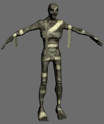
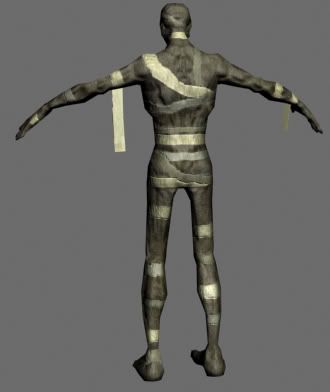
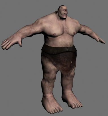
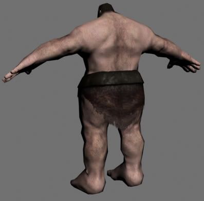
Crits and Critques are welcome. Though I already know they are very generic looking, so no need to point that out
Here are the pics


Crits and Critques are welcome. Though I already know they are very generic looking, so no need to point that out

Replies
Mummy looks great and unsymetrical because of the bandages. The skin is a little bit too grey for my taste. I don't know if it's possible to add some sort of a color to spice things up. Although it's old ass corpse so it has probably lost all color
The skin for the cyclops looks really good. His legs and upper arms look a little bit lumpy. Dunno if that is the model or the skin but I would try to define muscles a bit more.
The only I see is that the hangy down bit on the mummy's arm is going to be hard to keep from intersecting the arm itself when it's in a more natural pose and animated. But then again, if it's animated in the generic arms outstretched zombie walk then it's not a problem. Otherwise, I'd keep the dangly bits closer to the extremities.
either way, looks great.
Razorbladder, Mummies rarely show much decay flesh wise, I mean usually the only parts gone are the cartilage and such. They usually look more dried out than decayed, though some were preserved very well, I mean take Ramsees(SP?) for example, that mummy is old as hell and still has his nose, ears and bits of his eyes. I think I am gonna add some veins to the cyclops, and the head is intenionally that small, it adds to the size of his body.
FatAssasin, I will be doing 2 more most likely, not sure what the other 2 will be yet, here's a List of the other creatures this game is needing, Im thinking maybe a troll and a Ghoul. Though I never thought about the hanging bits on the arm, I guess I just assumed that they would use the stereotypical zombie walk with that arms out, maybe I'll add some more to it's torso and shorten the bits on his arms so they would look less noticable.
Sectaurs, I had added more bandages before, but it didn't look right to me for some reason, like actaully orginally had it being bandage less, then I added a lot of bandage then took away a bunch and I liked the outcome.Personally I don't think the same could be used for a zombie, like I said, a zombie would look more decayed and fleshy.
Comments and crits are great so far, keep them coming please
I'm still working on it, and I'm not sure how to make that mist around his lower body look right, the cylinders look are way too visible. So some help/suggestions would be nice
As always C&C is weclomed.
I also updated the Mummy, I shortened the bands haning down from the arm, and alpha'd in some tears so it looked better. Though it's not really needing a picture at the moment.