Elemental - Neo God - Earth/Fire/Water
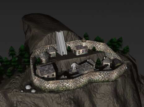
Well I'm finally getting around to posting some updated pics, I've normal mapped his body now and also changed the way the town sat on his back, it looks more natural. I also added in a cave in his back, though I still need to make the little huts in it for the Cave Dwellers.
Yes, as of this moment it is looking less like an earth elemental and more like a crap elemental, the texture I'm making for the body will look much different. I actaully strayed from the concept while making the normal map for the body, in Shimmer's concept it looked like it was composed of huge hard rigid stones, and it seemed to make it look less massive, I wanted it too look like it is a huge bulky mass composed or rock and dirt, with indentifiable anatomy, but not that identafiable (Does that makes sense?).
Anyway here are the new pics
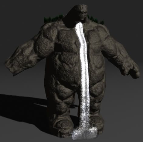
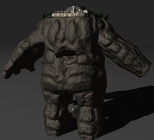
I will most likey redo the water fall, the texture and alpha layer seem to look a bit off, and I'm also going to do something about the cave in the back, it's fairly hard to see.
Crits and such are appreiciated!
Yes, as of this moment it is looking less like an earth elemental and more like a crap elemental, the texture I'm making for the body will look much different. I actaully strayed from the concept while making the normal map for the body, in Shimmer's concept it looked like it was composed of huge hard rigid stones, and it seemed to make it look less massive, I wanted it too look like it is a huge bulky mass composed or rock and dirt, with indentifiable anatomy, but not that identafiable (Does that makes sense?).
Anyway here are the new pics


I will most likey redo the water fall, the texture and alpha layer seem to look a bit off, and I'm also going to do something about the cave in the back, it's fairly hard to see.
Crits and such are appreiciated!
Replies
though i have to wonder if the cave in the back is even needed. it doesnt look quite right. and even though he is made of rock i would expect to see some sort of 'spine' there. maybe something like mine shaft supports.
try pulling the very tip of the church steeple a bit higher. so that i breaks out of the shilloute a little bit. i think it will also make the church look a bit older, where churches were ALWAYS the tallest buildings around, noone was 'above' the church.
move the cave a bit lower, and have lava come out of it. make him drip from both ends!
i love the 2 level affect of the village , now it needs a path running down the middle
Sectaurs, I'll see about moving it down, I'm not sure if I can cause now I have the normal on it and such and it may distort a little. though I will be painting a little detail in there so it doesn't look so strange in there, like it's actaully a nice sized peice missing from his back. And I was goingto put a small stream in there, cause most of the lava resides in his right arm.
Steakhouse, I will be adding much more detail to the diffuse map, the one in those pics is just a plain brown, and I will be adding a nice amount of grass on his upper body, but as it goes more towards his feet it will be more rocky.
Jerome, well do you want pics of the high poly arm or the low poly? I don't think i could tell you how I made, cause I suck at teaching, haha.
Thermidor, Well I'll be putting a nice amount of grass in the area, so there will most likely be a nice path running around, I'm, thinking of actually making like cobble stone but that might make it look to busy and cluddered.
Oh yes, and Thanks for all the comments and crits so far!
all you have to do is say like if you use a cylinder, and then howmany stacks and slices, then what next and so on
it doesn't have to be detailed stuff
progressional pic'd be ok
However, what hes missing is "weight". He looks like a big huge fluffy ball to play with. Not want to be too evocative, just that you fully get it:
He is old, made of stones, water is coming out his mouth he has a village to carry. He should be more cavernous but should still have the power. really hard to explain if you have questions, just ask. Im here for you, feel free to call me daddy
Still lots of little detail to add. Plus I think I may re-color the trees, that green seems to brilliant looking now. I also still want to redo the waterfall.
Shimmer, it's nice to know that you are kinda proud of it, and not like "You destroyed my vision you bastard!" Though I've tried so many different methods on getting him to look rigid, and finally gave up and decided to shoot for a more mountainous look, though I think I'm gonna try to paint a normal map closer to the legs, because I wanted to make it as if as it got closer to his legs the body would be more stone and less dirt and grass.
Jerome, sorry for not getting you the wireframe shot of the arm, but I notced you asked Fat Cap aswell, so I guess he can get you it...
C&C Still welcome!
I agree on the trees looking too "green".
The waterfall looks slightly too solid near the "mouth".
Great stuff though.