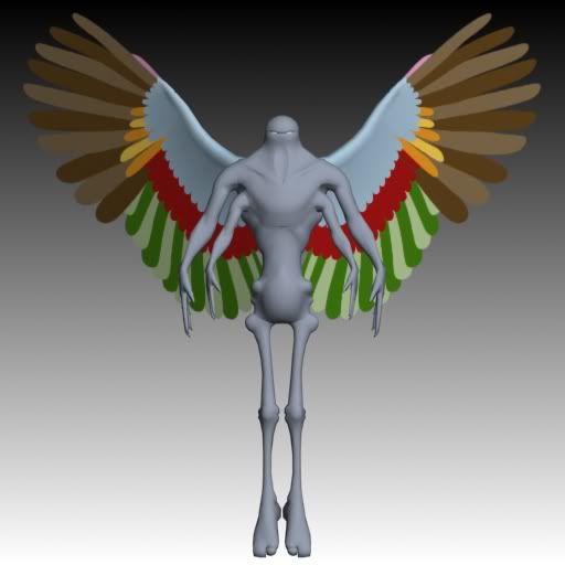
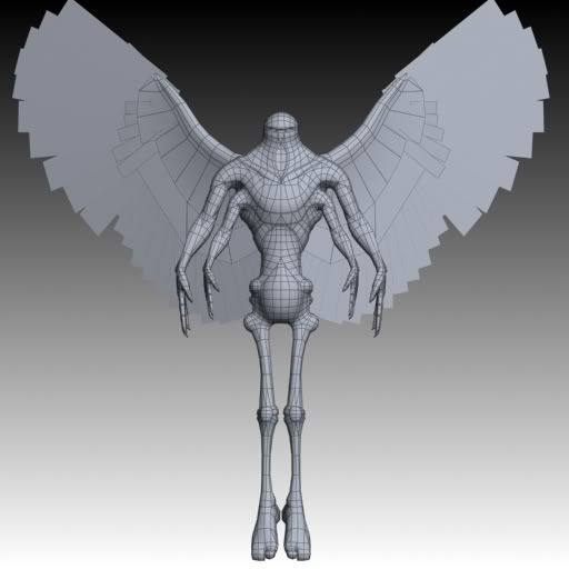
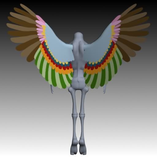
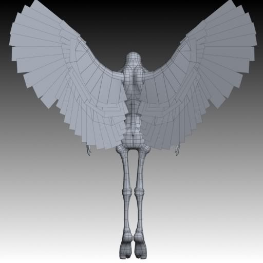
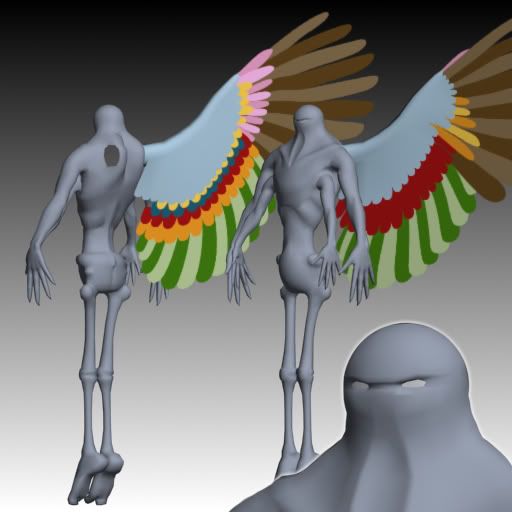
sweet model. love the wings. heh, that's a lot of alpha mapped feathers. yikes. i think the eyes add a lot of character to it that was missing before. gives it a real omnious appearence.
but aren't the feathers at the tips of wings supposed to be long than all the others?
Are the colors on the wings there to help you tell the feathers apart? I somehow didnt really envision this guy having a lot of color, let alone warm tones.
oh, yes, i should have mentioned that. colors are strictly to keep me from going insane.
snemmy: i thought so, but the high-poly version of these wings (which i based the alpha map on) was made over a picture of a real wing. so at least i know it matches one wing in the world.
yep, lot of alpha planes, all tilted to over-lap correctly. that was fun... each wing is only 268 tris, i think.
easier? most definately. but i don't know how that would look when the wings were animated. this way the bigger feathers can all slide over each other pseudo-realistically allowing him to fold his wings more believably.
i'll see how the wings look scaled up a bit, but he's not composed exactly as a human is, the elemental nature of air with which he is infused allows him to be deceptively light despite great strength and agility. or something. plus, he saves a lot of weight by having atrophied legs.
more and more i look at it, this character some how reminds me of the Mass Production model from Neon Genesis Evangelion. If your still up in the "air" about where to go with the texturing, I think it might look cool if you made it more futuristic rather that natural or ancient looking. Maybe like semi armorish/tech/uniform.
not sure if futuristic is allowed in this particular comp, but after googling some images, there is a resemblence, yeah. fine by me, thats a pretty cool looking model (the mass production).
anyhow, one day left, working away. here's a small update.
Looking pretty sharp. Something fresh each time I look at this thread. Now for the crit.
I think he needs a few more dense patches of the splotches, semi irregular shapes like those around the eyes, to help give the various sides of him a bit more punch. Currently he seems to have the light sided belly and dark sided back, similar to amphibians and sea life. You could play this up further by haveing the eye lines ride the spine a bit longer and flare out to consume the area around the wings, as well as the base of the wing itself. Also a patch on the shoulder would help put some quiet strength there as well.
He really needs some color on the legs too, maybe have the green come down it a ways; it doesnt have to cover the entire thing. Also maybe a darkening of the green color around the knee and elbows? Human joint edges usualy have a redness to them to imply heavy use, the same could work here on this guy.
The Normal map is coming along very nicely. It's really adding some interesting detail to his fishy underbelly. Keep it rocking man!
Replies
but aren't the feathers at the tips of wings supposed to be long than all the others?
snemmy: i thought so, but the high-poly version of these wings (which i based the alpha map on) was made over a picture of a real wing. so at least i know it matches one wing in the world.
yep, lot of alpha planes, all tilted to over-lap correctly. that was fun... each wing is only 268 tris, i think.
I wasnt aware that animation was part of the contest requirement, that does change things.
[/ QUOTE ]
I don't believe it is...
great stuff ..
i like the green, but i doubt i'll be keeping it as i'm not sure how 'air' it is.
extremely early WIP:
(sung to the tune of Jeremiah was a Bullfrog)
i'll see how the wings look scaled up a bit, but he's not composed exactly as a human is, the elemental nature of air with which he is infused allows him to be deceptively light despite great strength and agility. or something. plus, he saves a lot of weight by having atrophied legs.
anyhow, one day left, working away. here's a small update.
can't wait to see the finished product
also playing around with the self-illumination map.
I think he needs a few more dense patches of the splotches, semi irregular shapes like those around the eyes, to help give the various sides of him a bit more punch. Currently he seems to have the light sided belly and dark sided back, similar to amphibians and sea life. You could play this up further by haveing the eye lines ride the spine a bit longer and flare out to consume the area around the wings, as well as the base of the wing itself. Also a patch on the shoulder would help put some quiet strength there as well.
He really needs some color on the legs too, maybe have the green come down it a ways; it doesnt have to cover the entire thing. Also maybe a darkening of the green color around the knee and elbows? Human joint edges usualy have a redness to them to imply heavy use, the same could work here on this guy.
The Normal map is coming along very nicely. It's really adding some interesting detail to his fishy underbelly. Keep it rocking man!
one last update, i'll post my final thread tomorrow when i get up.
NVM...lol this is what I get for checking here before checking the submission thread...looks bloody ace Sec