Fire Extinguisher | Flying Missile Breakdown
Hey guys! First post on polycount! I Wanted to share this piece, I hope you like it!
Introduction
I love games like Dead Island or Requisition VR. For this portfolio piece I wanted to get inspired by the crafty, impossible yet believable weapon designs of these games. What better than C4 attached to something like a football, or a fire extinguisher? Nothing.
I present to you the CO2PFM™ (The CO2 Powered Flying Missile).

Before I continue, I want to thank @Javibcln, he’s been an amazing mentor throughout each step of the process.
References
References are key for me to understand my intention. In this case, I’m creating something coming mainly from my imagination. I’ll use reality to help ground my ideas into reality, while I try to maintain some distance from them to ensure my vision remains within this impossible yet believable realm.

And while it’s good for me to leave some room for my imagination to do its work, I made sure that my references weren’t too different from each other to avoid mixing different details and proportions to create an unrecognisable frankenstein of a prop.
Storytelling & Design.
In this world, survivors craft weapons to defend themselves. What if our survivor found a military supply drop? Of course, the sane thing to do is to craft a CO2 Bomb, duh.
Our survivor needs something to keep the hose steady, he finds a dog collar the same colors as the C4 bricks, how convenient! Right?
Well, In my head, this was narratively unrealistic, but also a good way to keep the color palette consistent. This picture shows the difference between blindly following "realistic" colors, and leaving room for creativity.

Same goes for proportions, the pressure gauge had to be twice as big, the handles too, and the hose could be thicker. This way, it blends better with the rest of the elements.

Learning to let go of these invisible barriers was a milestone for me, as it made me focus on making the final result look as good as it can be, which is, after all, the main goal.
Blocking
For the blocking, I build the main shapes that will form the bomb. There’s no need to go bananas here, just enough to get the feeling of how the composition is gonna look. I focus on shapes, sizes and balance between elements. Let’s leave the details for the high poly process.

This is also a good time to brainstorm about potential ideas, like these metal wings or this dented bottom.

Those ideas were good and I liked them, but I ended up discarding them as I felt they saturated the design too much. It’s OK to sacrifice some good ideas in the name of consistency. If I had a soup made of all the foods that I like, it would probably taste awful.
High poly
Here comes the big boy. In this step, I don’t normally care about polycount or optimization, just making the model look as good as I can with the tools I find fitting: sculpting, sub-d modelling, modifiers, etc.
Always being reasonable, flooding the mesh with millions of vertices will only slow your PC down and won’t look better.

As mentioned earlier, I used a lot of techniques for the high poly, but this one takes the cake by combining a couple of them:
https://www.youtube.com/shorts/DwVevWhvWTMIn this video I also show how I build the low poly of this part, but let’s get into detail, shall we?
Low poly and UV’s
Technology has evolved in the last few years and, contrary to popular belief, low poly does not need to have PS2 geometry to be considered as such. My objective with the low-poly mesh is to keep it fully optimized while preserving a clean, smooth silhouette without noticeable faceting.

With this in mind, I optimize the mesh by reducing geometry on smaller loops, as they don’t require as much detail to properly work.

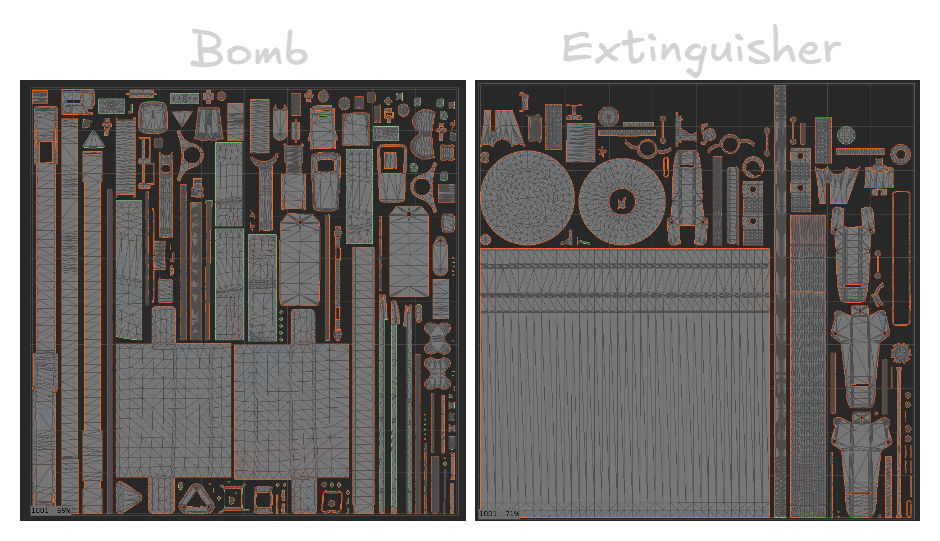
For the UVs, I separated the mesh into two texture sets: the extinguisher and the bomb. Some of the extra elements took a bit of back and forth to decide where they fit best, which helped avoid wasting UV space while keeping texel density consistent. This image shows how everything is separated.

And here are the UV’s. What? You thought I wasn’t gonna share them? You must be crazy…
Looking back, the extinguisher texture set could have been better optimized by splitting the long UV island that conditions the others. I noticed this late in the process, and fixing it would have required rebaking and reworking the Substance file, which wasn’t worth the minimal visual gain. It’s something I’ll keep in mind earlier on future projects.
Baking
Ah yes, baking. But instead of a fresh loaf of bread, you get a fresh, optimal and beautiful normal map, I couldn't decide which is better…
I used Marmoset 5 for this process, mostly because of its Bevel shader, so I didn’t need to bevel every hard edge on the high poly.
While baking, I realized that some parts didn’t need to be baked, as thin cylinders are already well shaded directly in the low-poly.

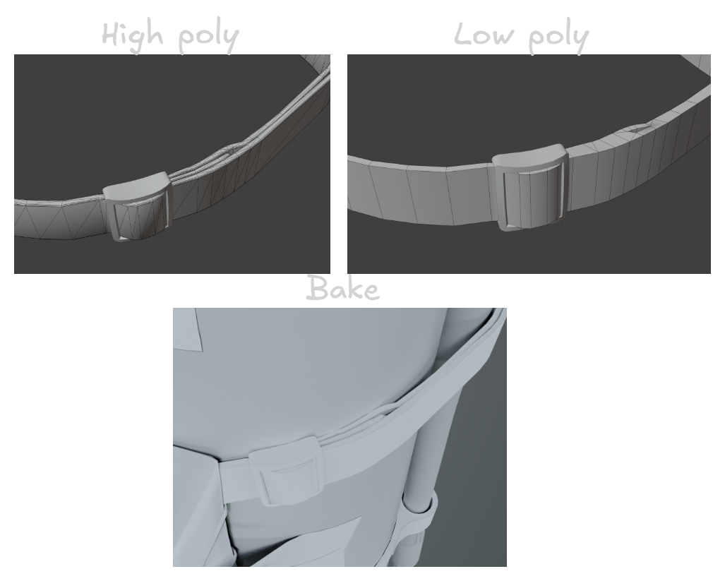
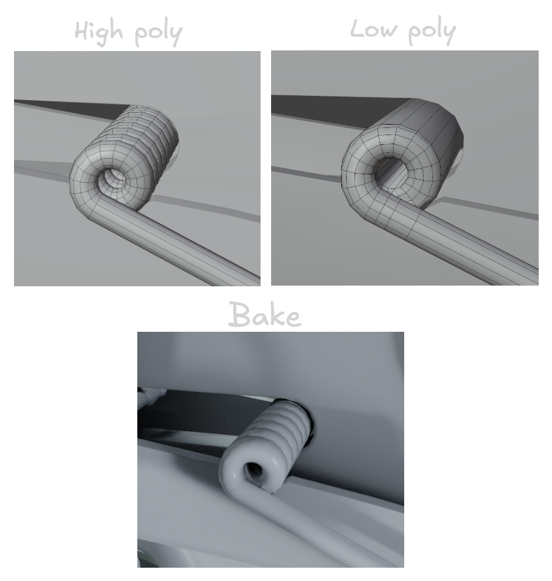
There were some interesting parts I really liked how the bake turned out, as they had a certain shape on the high poly that was really appealing on the bake
There are some cases where baking AO or normals can be more harmful than helpful, especially for parts that are meant to be animated or moved out of place. But fear not, I can use an option in Marmoset 5 that makes the bake affect only the object itself, without projecting onto surrounding pieces.

I find this easier than separating every piece by hand. I bake two versions, one with this option on and one off, and then apply them where needed in Substance.

See the difference? It’s especially noticeable where the wall mount would be. With Ignore Groups enabled, there’s much less AO, but it’s not completely gone.
Texturing
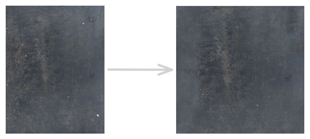
For texturing, I focused a great part of this process to projecting images, which gives a very neat result. Definitely a workflow I should look more into. The only catch (more like a minor inconvenience), is that the textures I found weren’t tileable, so I made them tileable.

Another example on this rubber texture taken from textureninja.com
Substance automatically makes a grayscale you can use for masks, roughness, height, etc. I find this specially useful for roughness maps. With a few tweaks I had this base roughness map for the rubber.

But I didn’t just search for textures and alphas on the internet, I went OUTSIDE looking for them. - I know, incredible, right? - Nice textures can appear in every corner, you just need a sharp eye and the 3D artist’s curse of seeing references and potential alphas everywhere.
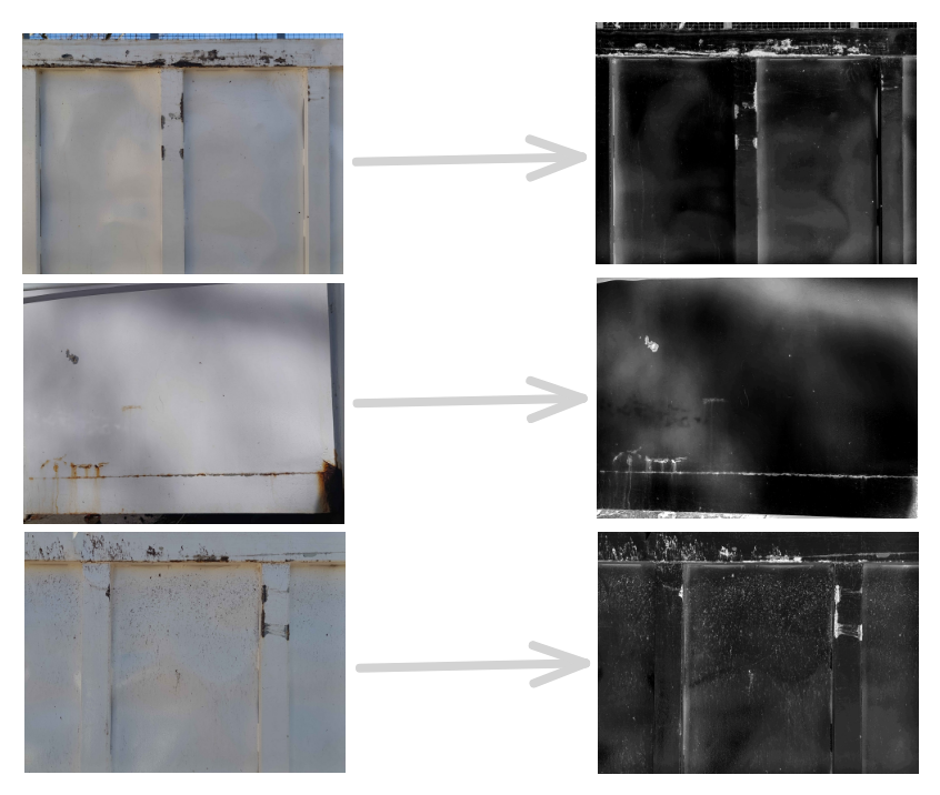
Sometimes I’m not even looking for textures and I come across nice pieces, in this case I was throwing out the trash, and the curse did its job on this container. An old woman looked at me weird while taking pictures, and I don’t blame her, such an activity might be suspicious, but it’s worth it.

And I mean it, just look at this detail right here, I like it a lot, it makes me melt. Thanks random container!
But not all my problems were solved by the internet or inanimate benefactors, there were times I had to make some alphas manually.


Mostly little icons and titles, they’re not out of this world, but gives the asset uniqueness. I also added an easter egg in honor of the most beautiful dog of all times, may you rest in peace, Tarita.
Anyway, let’s talk about my texturing process, it’s quite simple actually. I divide my layers into materials and height fixes, plus some extras. It can be a little messy at times. Every part of the object gets a folder with their own textures, but there’s also parts that share the same texture, there’s nothing bad with recycling work if it looks good.

This is the final layout. I usually follow a simple process: first making sure the bakes look good, then creating the base materials, adding extra details, and finishing with a storytelling pass where I introduce wear and imperfections in a way that feels natural and interesting.
Here are some parts of the texturing process from start to finish:
This one is a good demonstration of how it is possible to create believable materials from scratch, without projecting images
This one is the exact opposite, everything here except the ripped paper and the string are projected images.
Here I do a mix of both, with the rubber parts being projected, and the fabric done manually. Both workflows can coexist giving – if I may say so – stunning results.
To sum up
This was my first time creating something with this level of detail, and it pushed me further than I expected. The project helped me grow both technically and personally. Using the image projection workflow more extensively was a great experience, and it also reinforced how important strong fundamentals are.
There were many moments where patience was key to push through that extra bit of work that truly elevates the final result. At times I wasn’t sure I would be able to finish it, but learning to trust my skills helped me push through. Finishing this project gave me a lot more confidence as an artist and I feel ready to tackle whatever challenge comes next.
Thanks for reading, make sure to check the final results on my ArtStation!
Replies