Home 3D Art Showcase & Critiques

Tachikoma (GITS SAC Season 1 Design)

polycounter lvl 16
Offline / Send Message
ScottHoneycutt polycounter lvl 16
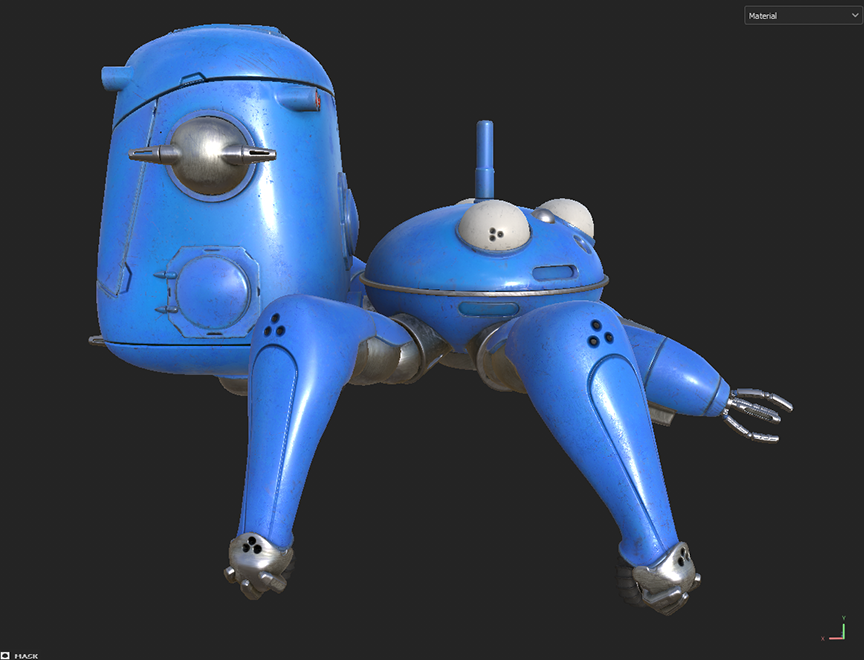
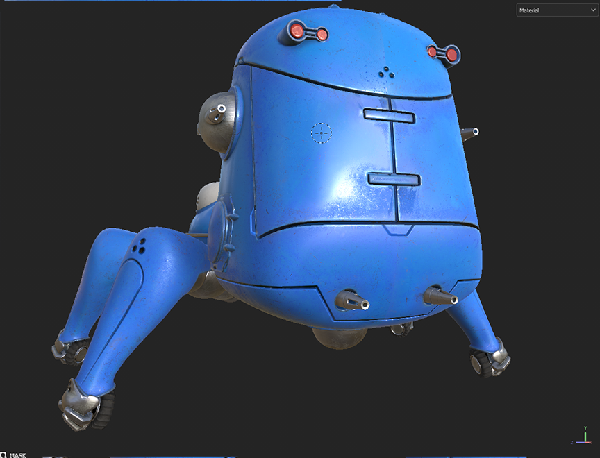
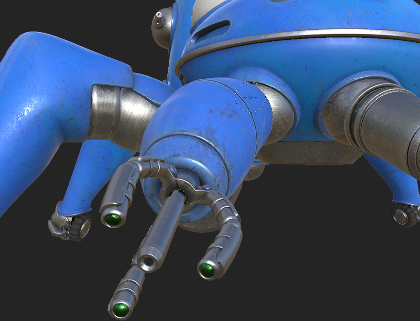
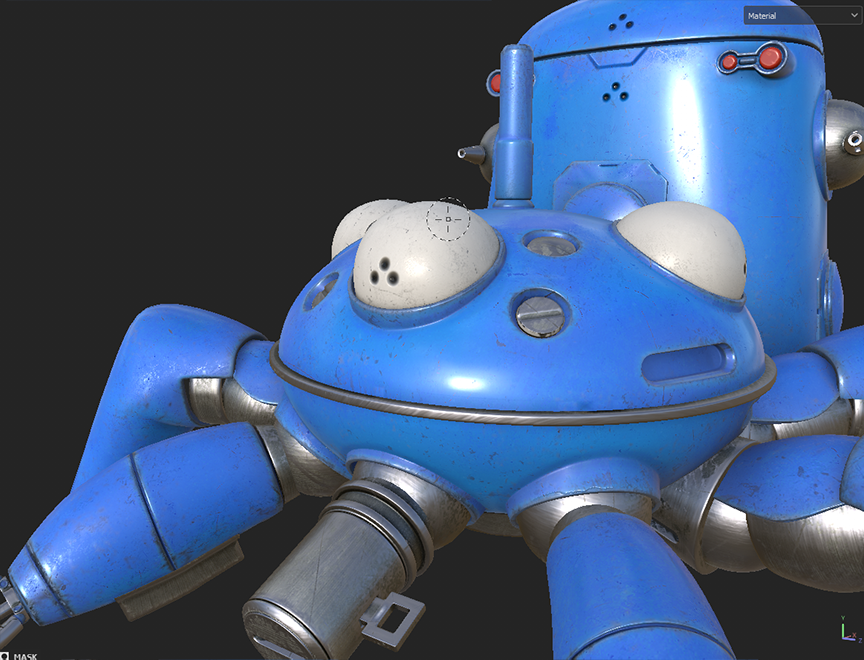
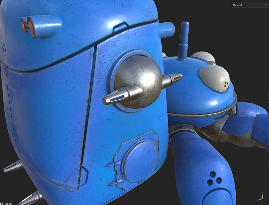
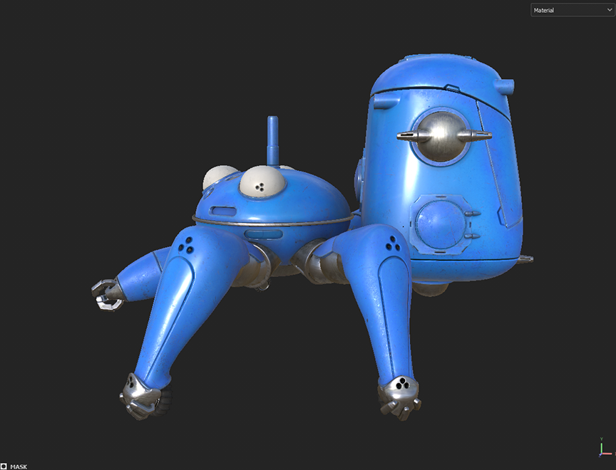
Tachikoma from Ghost in the Shell: Stand Alone Complex Season 1. 

Started in 3ds Max, then finished in blender, Bake in Marmoset Toolbag, and textured in Painter. Below are simple screen grabs in Painter with basic viewport settings. Thoughts are welcome on anything but I am far more concerned with material definition than modeling. 
Replies

  • sketchem
    Offline / Send Message
    sketchem polycounter
    Good foundation but I would say just spend more time refining the materials and hand-painting in some wear/damage. It looks a little uniform and lacks character right now. Think about what level of wear you want, and maybe ground it into storytelling/environment. Is it supposed to be heavily damaged? Is it just normal field wear? Has it ever been shot (bullet holes/dents)? Has it been sitting in the garage for years? Basically use the textures to tell us what's been going on with it. 
  • ScottHoneycutt
    Offline / Send Message
    ScottHoneycutt polycounter lvl 16
    sketchem said:
    Good foundation but I would say just spend more time refining the materials and hand-painting in some wear/damage. It looks a little uniform and lacks character right now. Think about what level of wear you want, and maybe ground it into storytelling/environment. Is it supposed to be heavily damaged? Is it just normal field wear? Has it ever been shot (bullet holes/dents)? Has it been sitting in the garage for years? Basically use the textures to tell us what's been going on with it. 
    Thank you for sharing and nudging me a bit. Appreciate it. I'm going for standard game asset, normal wear, meaning how it would look going into battle or in your inventory. It's been used in battle before for years, but not very recently per se. It should have evidence of being a vehicle for heavy use, but still clean enough to look maintained. 

    Texturing has always been the thing I need to refine and get critiqued on the most. I've had tendencies over the years to ether under texture to the point of looking plastic, fake and cg, and over texture so it looks noisy, random and undefined. Between those extremes I'm shooting for subtle details that don't scream at you but are rightfully placed. I think good texturing can be very subconscious look a great film score or design layout. that way you don't see clean or dirty, but just a good asset.
  • ScottHoneycutt
    Offline / Send Message
    ScottHoneycutt polycounter lvl 16
    Here are the updates, with explanations. I believe this is much better. Going for subtle details that aren't too much, not too dirty, but enough to look believable. I placed some intentional scrape marks where things would have happened in the past. it's a large, round vehicle so the big thing in the back would get hit, but it's been cleaned and maintained. Making the blue render as metal helped. The edge wear is much more refined. A little dirt is placed in the underneath areas for more variation.


  • Lamont
    Offline / Send Message
    Lamont polycounter lvl 17
    Ohhh damn. Love me some GiTS.
    I understand the metal wear and tear, but my personal opinion would be to not have it on the "eyes". The back cab should have some traffic damage since people get in and out of there.
  • Lamont
    Offline / Send Message
    Lamont polycounter lvl 17
Sign In or Register to comment.