Home 3D Art Showcase & Critiques
The BRAWL² Tournament Challenge has been announced!

It starts May 12, and ends Oct 17. Let's see what you got!

https://polycount.com/discussion/237047/the-brawl²-tournament

Feedback – Finished Blockout / Early Set Dressing

triangle
Offline / Send Message
rafiii triangle

Hey everyone,
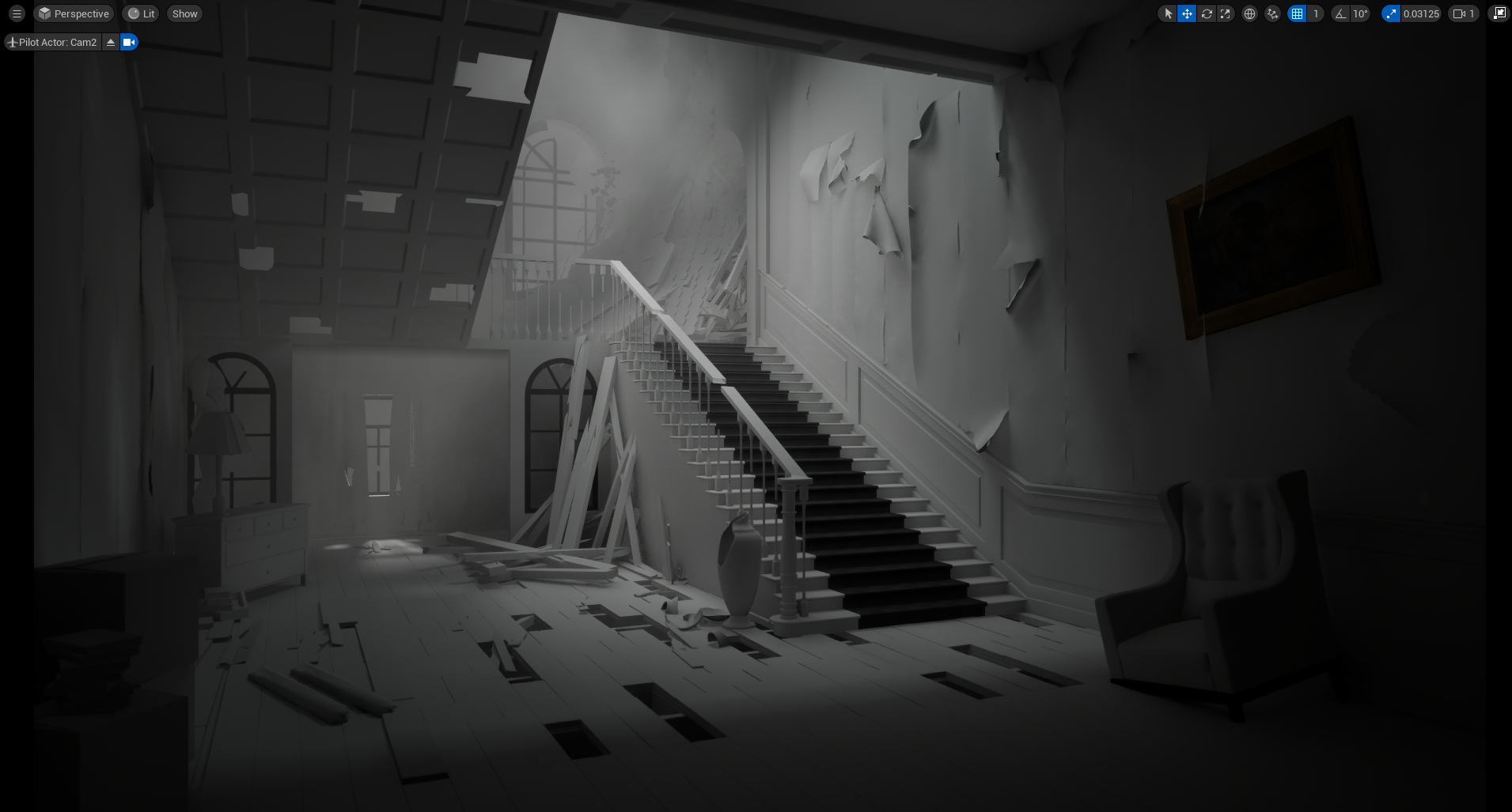
I started this environment for a Polycount challenge a while back but couldn’t finish it because I got busy. I’ve picked it up again and I’m currently at the finished blockout / early set dressing stage.

I still need to work on a few props—some of them are just placeholders for now. I also haven’t done a proper lighting pass yet; I only set up some quick mood lighting to get a sense of how everything is looking.

Before I move on to detailing, materials, and proper lighting, I’d really appreciate some feedback.

What I’m looking for feedback on:

  • Overall composition

  • Scale and proportions

  • Prop placement / set dressing direction

  • Readability and scene flow

  • Anything important I should fix at this stage

I’m also considering adding some ivy or greenery—would that be overkill for the scene, or should I keep it simple?

Still early enough for me to make changes, so honest critique is welcome. Thanks!

Replies

  • Eric Chadwick
    One nice little trick to examine composition is to blur the heck out of it, then you can focus on composition rather than getting lost in the details.

    Besides the lack of color (which is an important consideration in its own right) your piece seems to be lacking the focus of the strong spotlight in the center of the concept. 


    It helps to think about how your eye moves through a piece, what do you focus on first, and where does your eye tend to want to move? Leading the viewer's eye is an important part of composition.

    We have a few good resources for thinking about composition here:
    http://wiki.polycount.com/wiki/Concept_Fundamentals#Composition
  • rafiii
    Offline / Send Message
    rafiii triangle
    One nice little trick to examine composition is to blur the heck out of it, then you can focus on composition rather than getting lost in the details.

    Besides the lack of color (which is an important consideration in its own right) your piece seems to be lacking the focus of the strong spotlight in the center of the concept. 


    It helps to think about how your eye moves through a piece, what do you focus on first, and where does your eye tend to want to move? Leading the viewer's eye is an important part of composition.

    We have a few good resources for thinking about composition here:
    http://wiki.polycount.com/wiki/Concept_Fundamentals#Composition
    Thanks, I will have some look at it.
  • FrankPolygon
    Online / Send Message
    FrankPolygon grand marshal polycounter
    The proportions in the concept are fairly consistent when it comes to aligning decorative and structural elements.

    On the upper staircase the stringers and mill work land almost directly on top of where posts would go on either side of the opening in the wall assembly underneath the second floor. The panel work covering the underside of the staircase also lines up with where each stair stringer should be. 

    Both staircases are roughly the same width and the space between the staircases matches the width of the sidelight panels on either side of the opening. Which visually constrains the player's view to the window in the adjoining room.

    The right side of the frame has a lot of really nice raised panel details both on the walls and wainscotting around the stairs. A quick search for additional reference images shows that this was often continued around the room and really only dies off into other trim elements that typically line up with structural elements such as doorways, exposed beams, windows, etc.


    Something that looks slightly off in both the concept and block out is how thin the upstairs floor assembly is.

    The second floor doesn't really have much visible thickness in the concept. Which, along with the extremely tall opening to the adjoining room, creates this sense of unresolved space that's distracting from the focal point at the top of the stairs.

    There's some thickness to the second floor in the block out but assuming the rise on each stair tread is about seven and half inches then subtracting about one and half inches for the sub floor and hardwood and another inch for the lath and plaster on the ceiling below, the floor joists in the block out are about four to five inches tall.

    Which is more realistic than what's in the concept but still way too short for something with that kind of span and weight. Looking at a span chart and estimating the size of the rooms in the concept image: the joists should be a minimum of eight to ten inches tall and the whole floor assembly should be around twelve and half inches thick.

    There's different ways to frame a structure, so what's 'correct' really depends on when and where something was built, but the concept feels like the grand staircase of a Victorian or Edwardian mansion. Which kind of suggests that it's built with older materials and techniques. Here's a rough approximation of just how much structural material is behind the plaster and mill work. Not counting the lath and other structural blocking elements.

    All of this material adds a certain amount of visual weight. Especially when clad with the final layers of lath, plaster, and trim. Even the broken staircase in the concept has a particular weightiness to it. Whereas a lot of the shapes in the block out feel a bit newer and less substantial.

    It isn't necessary to model all these details but it is helpful to think about just how much structure is inside the walls and how this structural framing dictates the size and shape of rooms and adjoining features and spaces.


    A lot of the debris on the floor in the concept looks like it may have come from the ceiling, since most of the floor boards are still in place. The visible lines between the individual floor boards is more representative of wood movement from cupping and crowning due to water damage.

    In places where the floor boards are cracked or missing chunks there doesn't seem to be much depth. This makes sense because higher quality wood floors were often laid over rough sawn sub-flooring that runs either perpendicular or diagonal to the floor joists to increase the sheer strength.

    Given the size of the rooms, if sections of the hardwood flooring and sub floor were pried loose or cut out, there would still be a LOT of floor joists visible. Same for damage to the plaster on the ceiling and under the wall paper. Representing those layered details in the final version of the project could be an interesting artistic and technical challenge.


    Overall the right side of the frame feels more developed than the left side. Both in the block out and the concept. The area around the opening that connects the main foyer to the adjacent room feels visually underdeveloped and cluttered at the same time.

    One possible way to resolve this is to carry over the wainscoting and paneling details throughout the entire room. This would be more in line with what's typically found in reference images and create a more unified visual interest that isn't completely overwhelming. A lot of these details could be created as modular mesh elements or trim sheets.

    A visually heavier handrail with thicker balusters and several newel posts is closer to what's in the concept and adds a stronger, almost oppressive, sense of structure.


    All of the stiles and rails on the trim work should also line up with the adjacent structural elements in the staircase and walls. The more detailed panel sections can simply die off into wide trim that provides visual separation between the weighty wood structures and the open fields of uninterrupted plaster that acts as a natural visual rest.

    The unresolved feeling of that rectangular opening below the staircase could also be further minimized by using the same rounded arch on the sidelights to soften the opening and further constrict the player's vision in that area without fully blocking it. Which also acts as another visual indicator that the area there is secondary to the main focal point at the top of the stairs.

    Alternately, the opening could be kept square and the top filled in with a wooden lattice or spoked archway that's curved to match the tops of the windows in the sidelight panels.


    The rest of the environmental details look good. It's just a mater of figuring out what you want out of the initial composition, adjusting some of the proportions, setting up a compelling lighting rig, then moving those smaller decorations to where they work well with the lighting and add to the environmental storytelling.

    Keep up the good work!
Sign In or Register to comment.