Home 3D Art Showcase & Critiques
The BRAWL² Tournament Challenge has been announced!

It starts May 12, and ends Oct 17. Let's see what you got!

https://polycount.com/discussion/237047/the-brawl²-tournament

[WIP] Stylized Island (for portfolio)

Offline / Send Message
Pinned

Hey whats up Polycount,

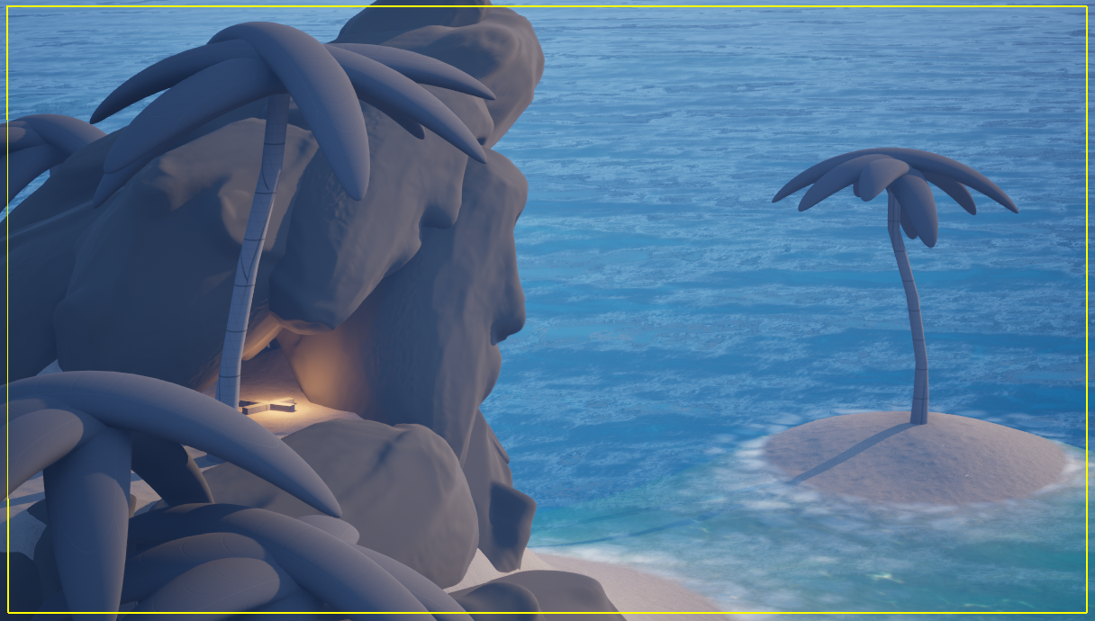
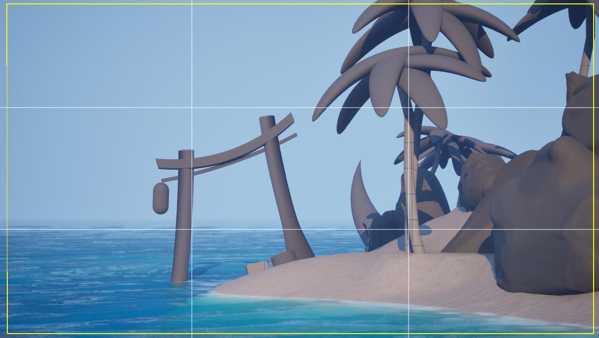
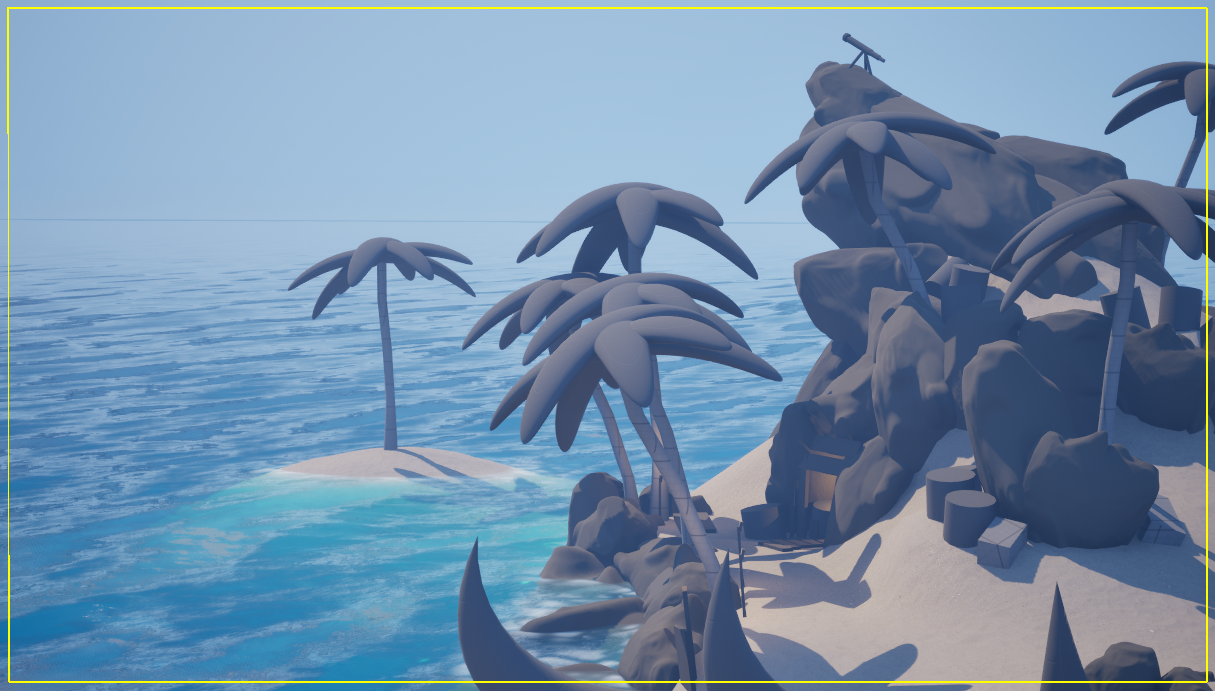
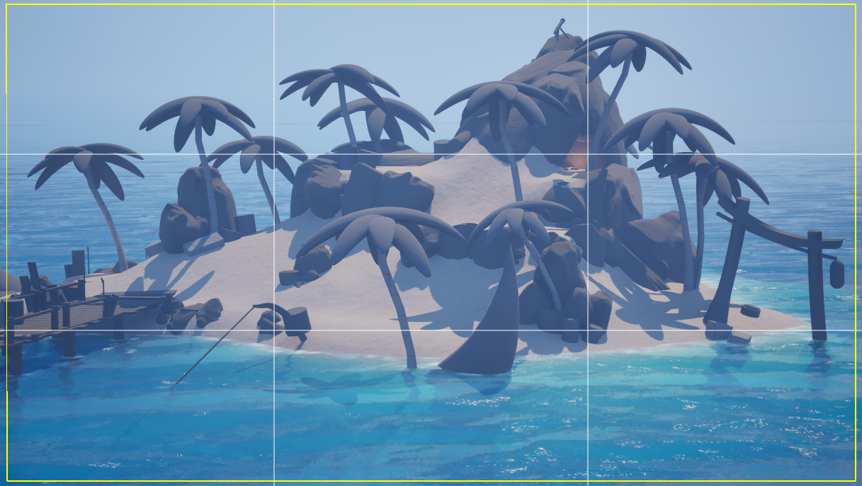
I’m working on a portfolio piece — a stylized island environment. (inspiration, sea of thieves) I’ve been focusing on blockout, and overall playability for the past couple of days. scaled to SoT

I’d love feedback on:

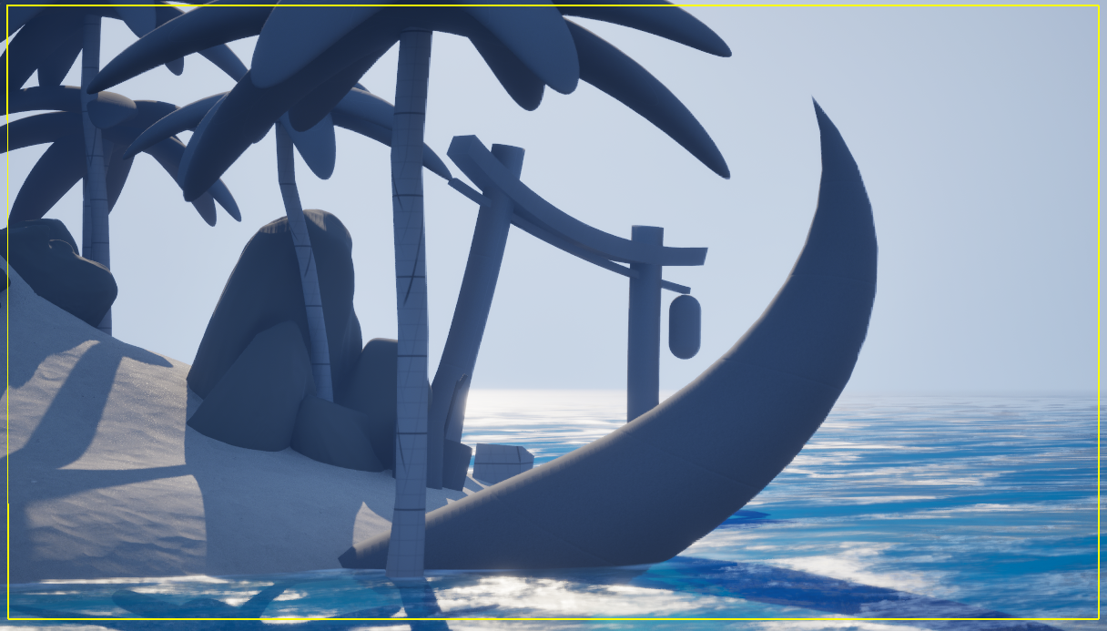
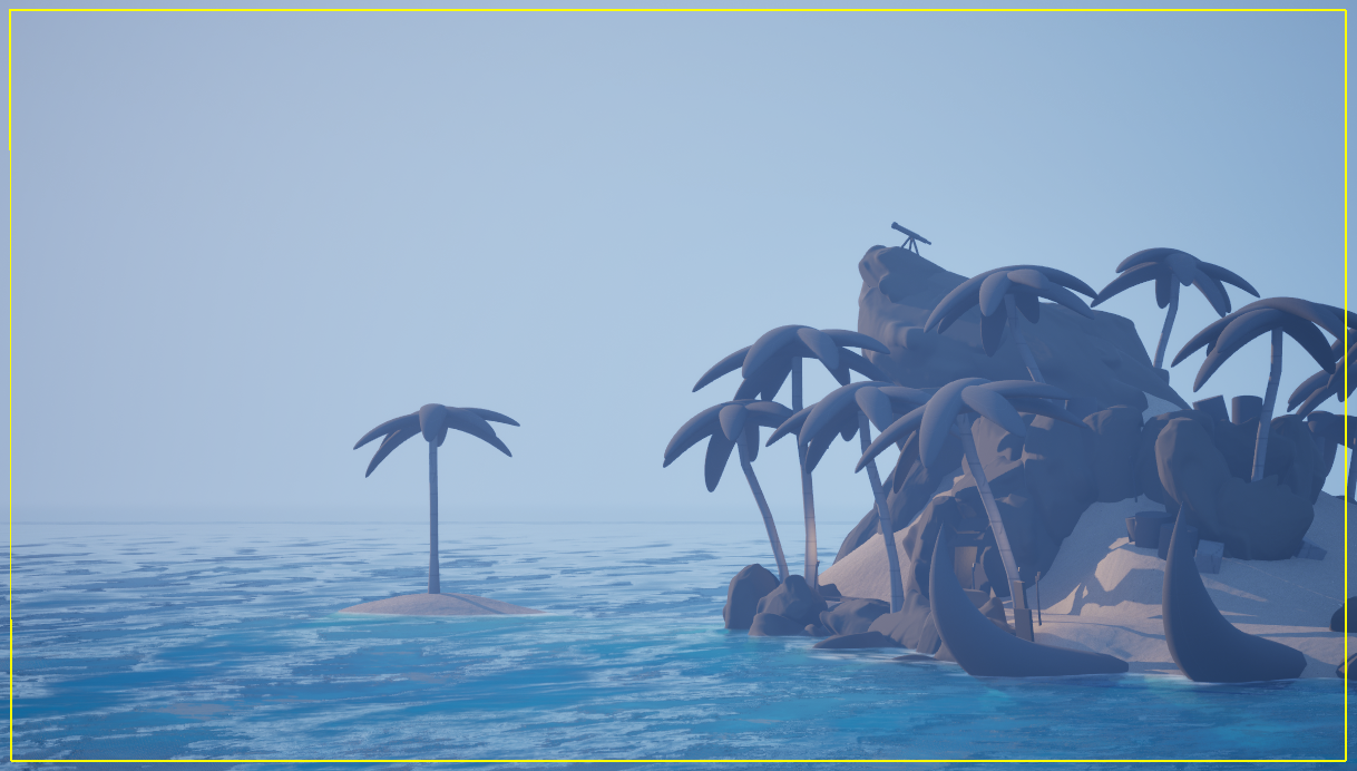
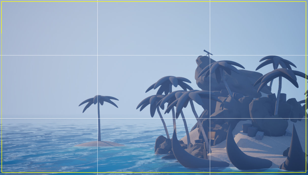
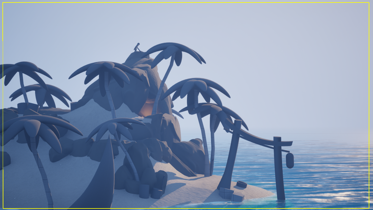
Shot composition (do any of these even look ok) I feel like im going crazy or missing something. not sure how to shoot an island for presentation in a portfolio. 

Focal points & balance advice?

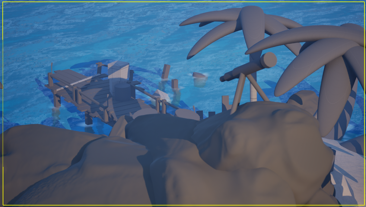
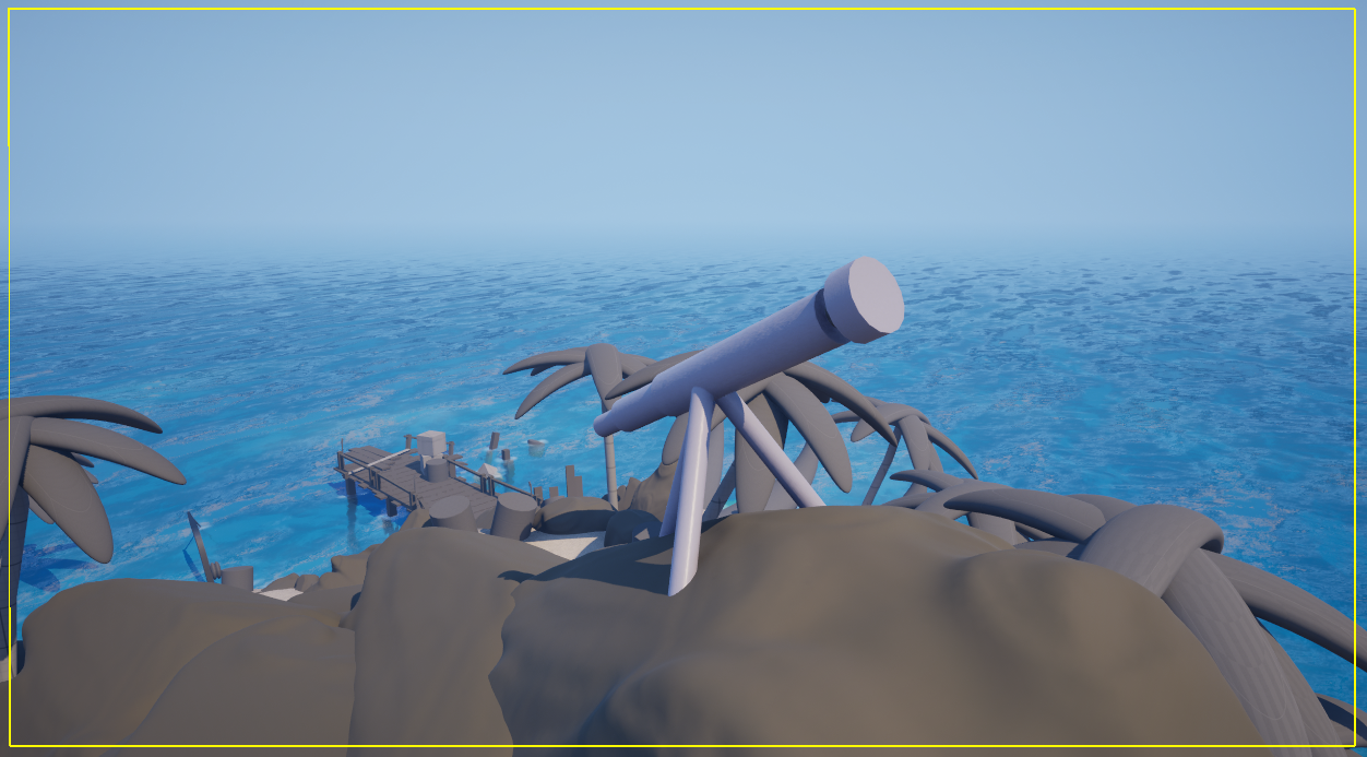
Here are some quick view port screenshots. Any thoughts while I get to modeling would be super helpful!

I just seam to be lost in the sauce of shooting an island ( anything else that sicks out? let it rip please! ) 
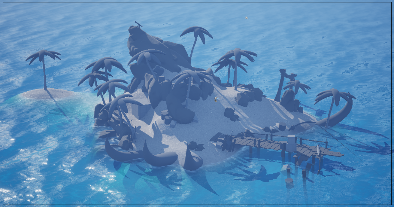
Thank you a ton! 


Replies

  • Vastra
    Offline / Send Message
    Vastra triangle
    This is looking great! =) I really like the feel of the island, the shapes and overall composition read well. The large thorny/spikey elements stand out nicely, but it’s hard to judge whether they’re too dominant or just right without knowing your final intention.

    Are you aiming more for an exaggerated stylized look (Sea of Thieves style) or something a bit more grounded? Knowing that would help give more focused feedback.

    Looking forward to seeing where you take this!  :)
  • Eric Chadwick
    Agree this looks pretty good so far.

    What are the curved spikes on the beach?

    The torii gate is oddly placed, for better placement I would suggest reading more about the symbolism behind these gates.

    Some of your props are placed alone, which creates an uncomfortable feeling. Probably not what you intended. We have an Art Bible here that has a good explanation of how to create rhythm in prop placement, see "Allods Online - Creating a World in 7 Days" http://wiki.polycount.com/wiki/Art_Bible 


  • HolySour
    Vastra said:
    This is looking great! =) I really like the feel of the island, the shapes and overall composition read well. The large thorny/spikey elements stand out nicely, but it’s hard to judge whether they’re too dominant or just right without knowing your final intention.

    Are you aiming more for an exaggerated stylized look (Sea of Thieves style) or something a bit more grounded? Knowing that would help give more focused feedback.

    Looking forward to seeing where you take this!  :)

    Thank you for taking the time to reply! 
    That actually is a spot im hung up on. However, either some large Horns ( maybe from some mythical sea beast ) or some spikes ( both conveyed as a warning that this place is hostile to visitors, or once was ).
    And "Sea of Thieves" yes! that's exactly what im shooting for!

  • HolySour
    Agree this looks pretty good so far.

    What are the curved spikes on the beach?

    The torii gate is oddly placed, for better placement I would suggest reading more about the symbolism behind these gates.

    Some of your props are placed alone, which creates an uncomfortable feeling. Probably not what you intended. We have an Art Bible here that has a good explanation of how to create rhythm in prop placement, see "Allods Online - Creating a World in 7 Days" http://wiki.polycount.com/wiki/Art_Bible 
    Thank you for your time!

    The spikes are either going to be large Horns ( maybe from some mythical sea beast ) or some wooden spikes ( both to convey a warning that this place is hostile to visitors / once was )
    Id like it to feel in disrepair, that maybe there "might" be a soul inhabitant. however they are no where to be found. 

    I understand you on the Tori gate for sure! do you think using it as a way to show disrepair/abandonment would read well? 
    10-20 years of not being cared for. similar to the busted dock?  
    For me its more of a personal reason " to take care of yourself or be swallowed " but i know that might not come across to others. so i am totally open to changing it. 

    lastly this art bible is awesome! thank you for sharing it! I see what you mean, i need to get more clustering around the large natural pieces, more rock "debris" for example? 


  • Emace
    Offline / Send Message
    Emace polycounter lvl 8

    Cool idea for a portfolio piece, and you’re smart to worry about shots this early – the island itself can be great, but if the cameras are weak, all that work gets lost.

    A few concrete things you can try:

    • Pick one main story angle. For example: “approaching the hostile shore”. Place the camera low on the waterline, looking up toward the torii and the spikes/horns so they form a clear triangle around your focal point.

    • Cluster props instead of leaving them alone. Barrels, rocks, debris etc. work best in 2+1 groupings – two close together and one a bit off – instead of single objects stranded in space. It keeps rhythm and makes the island feel “lived in” without extra meshes.

    • Use one “rule of thirds” shot and one “down-angle” shot. For the down-angle, imagine a camera on a mast or cliff, looking diagonally across the island so players can read the whole layout in one glance.

      Since you mentioned Sea of Thieves: they usually keep about 70–75% of the frame filled with strong, chunky shapes and leave the rest as calmer water/sky. If you do the same and push your warning spikes and torii into that “busy” zone, the mood (hostile, abandoned, maybe one last inhabitant) will read a lot clearer, even before you add final lighting and polish.

Sign In or Register to comment.