Sketchbook: Kaitlin B.
Hello Polycount ") My name is Kaitlin or Kaitie (you may also see me go by Cosmo in other online spaces), I'm mainly an illustrator but in the past year I've gotten the chance to branch out and learn 3d. I'm open to comments, feedback, and any critique on the work I post here, I'd love to hear it.
My name is Kaitlin or Kaitie (you may also see me go by Cosmo in other online spaces), I'm mainly an illustrator but in the past year I've gotten the chance to branch out and learn 3d. I'm open to comments, feedback, and any critique on the work I post here, I'd love to hear it.
To start off my sketchbook, I'd like to post some of my previous 3d projects!


Now we'll get to see how much my work improves from this to whatever the most recent post is
To start off my sketchbook, I'd like to post some of my previous 3d projects!
Now we'll get to see how much my work improves from this to whatever the most recent post is
Replies
I was partially inspired by the game Stray for the overall color scheme, but I decided to go for a little more well lit space as lighting is something I've struggled with in previous projects. There's also a somewhat consistent layer of grime in Stray that I wanted to add to give a worn down look to contrast the plant, candles, and soap showing that the place is still lived in.
I searched this game and found what I hope is a representative image:
This game looks really cool, great inspiration!
It's important to note that this uses lighting and post-processing to change the "look" of the assets. I think they are using PBR workflow to make these, that's the current standard for making 3d assets and their textures and materials.
So for your assets, you should learn about PBR standards. How dark and how light to make textures, what the color/rough/metal inputs should be, etc.
These limits will allow your assets to look great, no matter what the lighting and post-processing choices.
For example your red tiles are really intense, very high contrast. Look at the brick street in the game, and how low-contrast that texture set is. All the richness comes from the lighting. What would the brick color map look like, without all that fancy lighting? Try to analyze the reference image, to subtract the fancy lighting, and get back to what the color map would be.
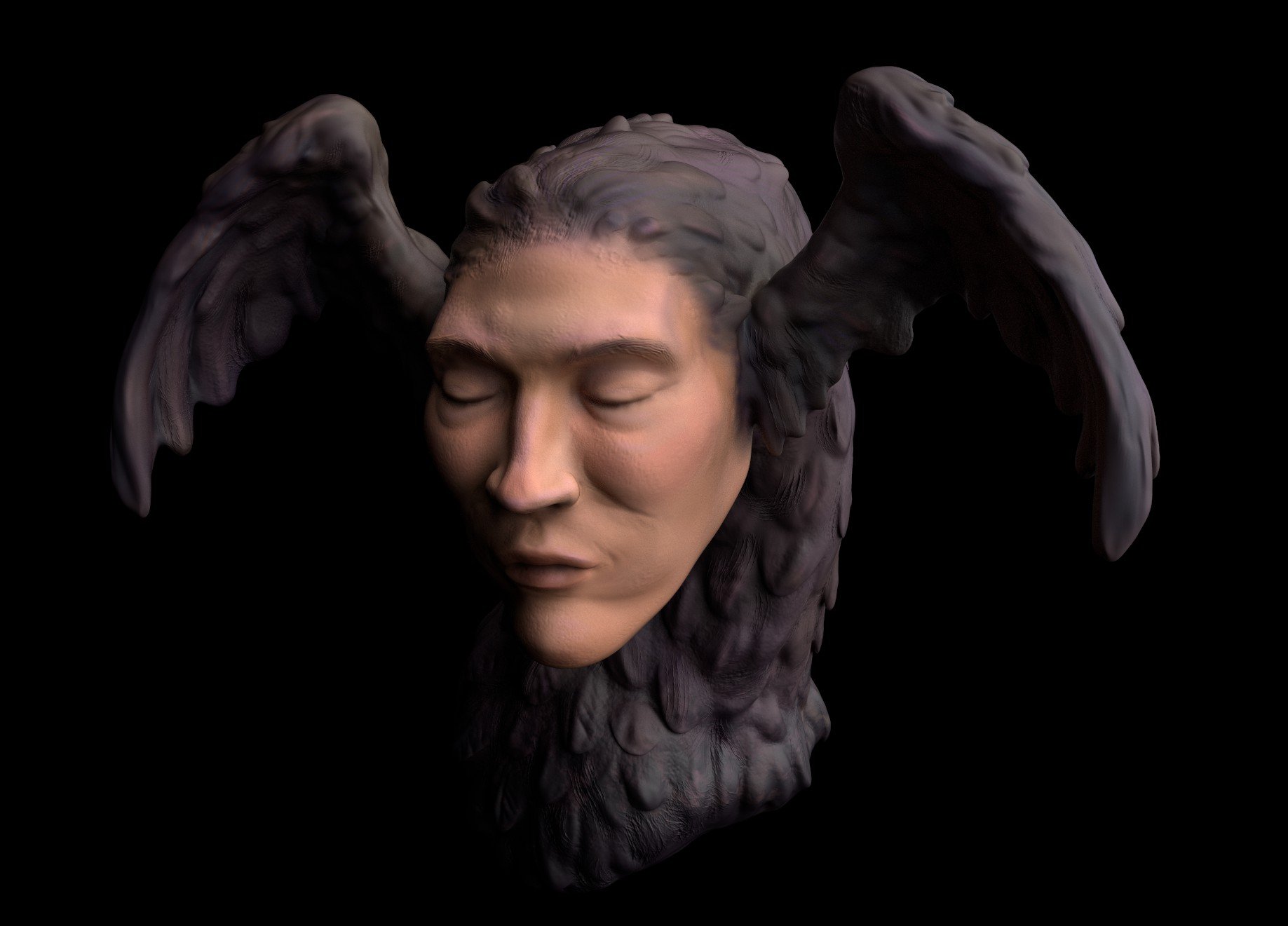
Maya, Zbrush, Substance Painter, and Unreal were used.
I think I could keep making miniscule changes forever, but I'm pretty happy with how this has turned out. Now I feel like I have a solid grasp on some things that I was wobbly about before, so I would call this a success.