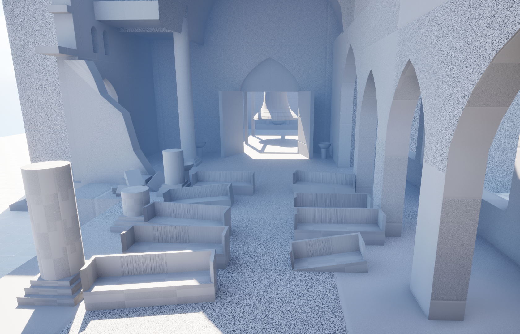
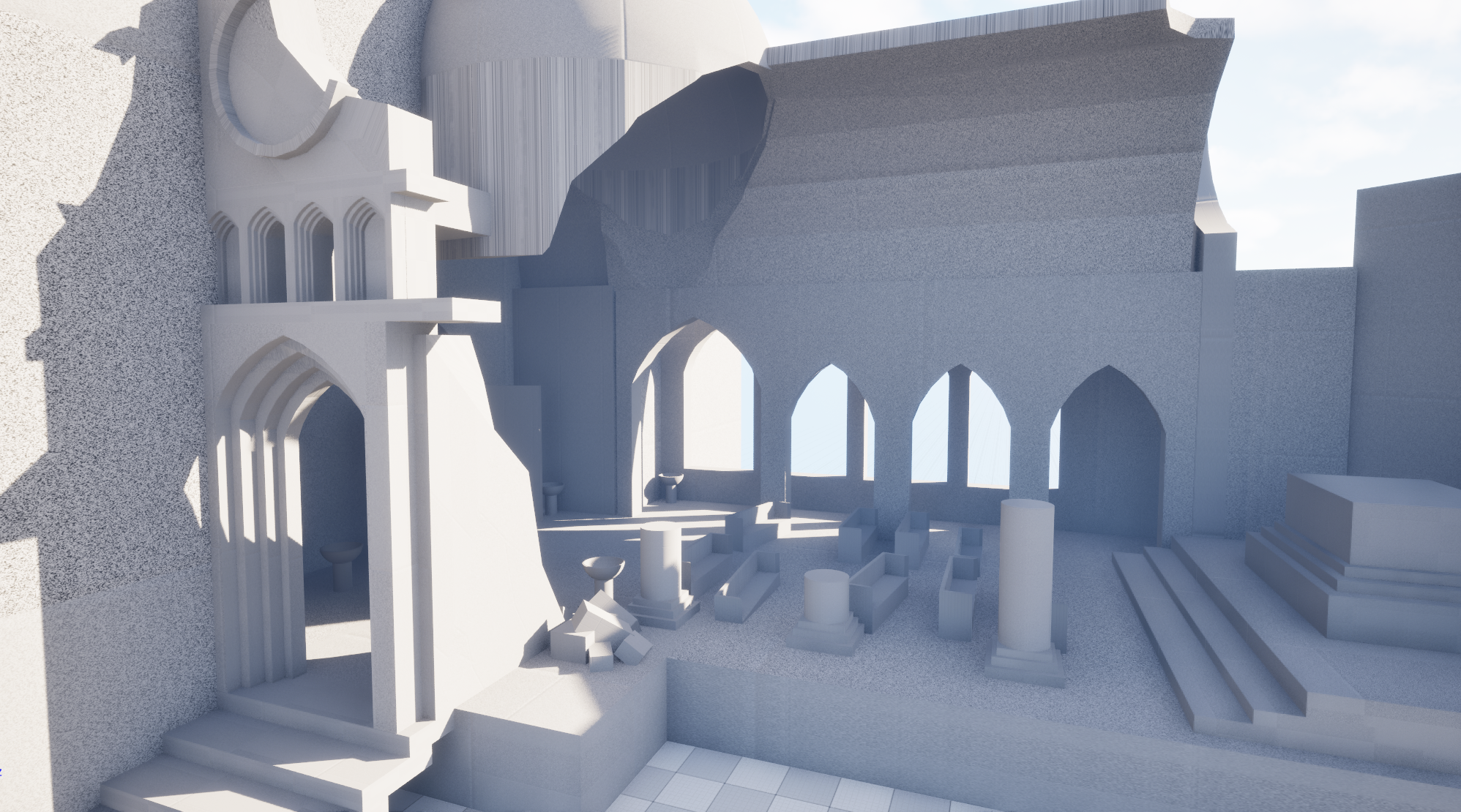
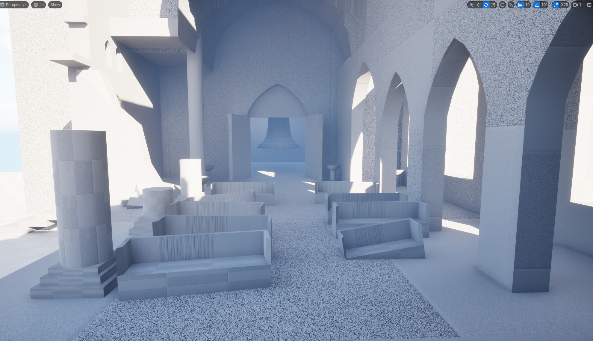
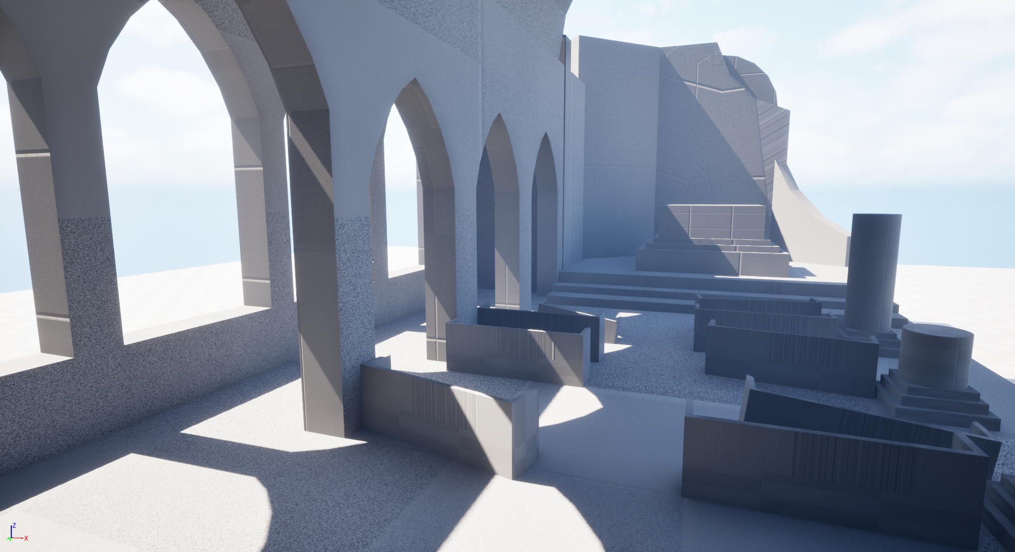
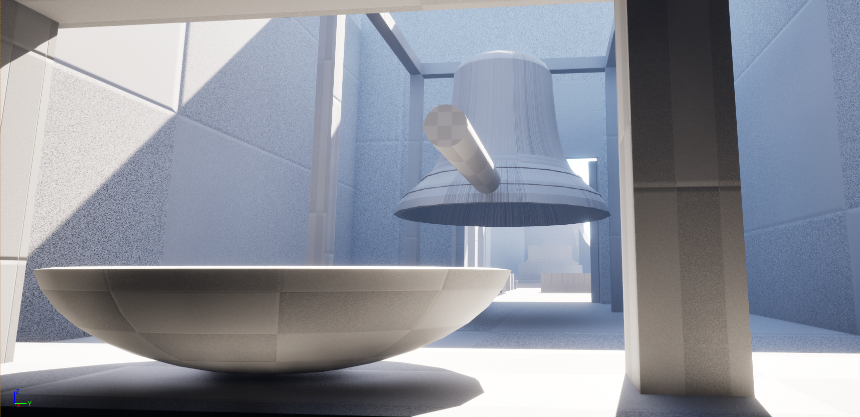
Hi guys. I just started studying Video Game Art production and picked a project that I am trying to create a diorama for. I've done some blockouts for my art-bible and it is essentially a church, which is part of a monastery that was built inside a mountain, so the church is protruding out from the cliff side. I though I create a background story as it is a medieval church that was donated to monks, so I mix the gothic elements with some Taoist decoration and a traditional bell (bonsho) chamber. Here are the blockouts for the concept and later on I will post part of the actual modelled kits that I've got so far. I'm only posting this to get some feedback on my progression and some ideas and advises for the project. I have to finish the entire scene by the end of June.
Hi guys. I spent some time to progress in the project, so i created my trim sheet and modelled some of my assets, to just put them into UE and see how it will look like. I probably will only focus on the church area with the cameras and the lighting leading the eye to the pedestal. This is how far i got. It’s not lined up perfectly just yet, it’s only in the test phase, i think i scale up my rose window and add some god-ray from it to the pedestal.
You might want to separate out the large tiled textures, like the brick, into its own dedicated sheet texture, so you can reduce tiling artifacts. You could also add a second wall texture and mix it with the brick (using vertex color or noise) to reduce repetition.
The columns have a bit of this problem, but you could perhaps brighten the dark patch in the texture to hide the repetition better?
How did you create the white curves in the vaults? It's odd that the brick doesn't line up with these elements, since in real life the curves would be actual stone pieces, and the bricks would be hand-fitted into the spaces between the lines.
Hi @Eric Chadwick . Thank you for the feedback. I was planning to use like some decals or a decal atlas like leakage and some grunge projected onto the wall to break up that repetition, and some damage decals onto the pillars, but the second wall texture with vertex colour does sound great. I also planning to use parallax occlusion on the big slabs in the corridor floor and maybe on the bricks just to give a bit of an extra depth to them.
The white lime stone curves are kind of a separate mesh connected to the vault. I thought I would adjust the trim section of it to add a bit more dirt to the cavities and show more the edges of those stone bits, as it is too clear and white. Should I try to line the uv's up with the gaps in between the bricks? This is how the vault and the curve decoration mesh looks like:
You could try lining up one rib with the brick mortar. Thankfully you have lots of quads, so you can slip & scale each one to be either a whole brick (incl side mortars) or two bricks, or more. Then you could just copy the UVs to the next rib, rinse & reeat, with some offsets to hide repetition. Could be really neat.
Hi @Eric Chadwick. I have tried to re-do the uv's the way you suggested and this is what I've got. In one hand it does look better and the white curved ribs are a bit more emphasised but in the other hand my texel density is all over the place and due to the stretching towards the bottom of the ribs the spacing in between the ribs are thinner. I had to do it brick by brick pretty much because I could not line up my uv strips because when i made my trim sheet I've tried to break up symmetry to sooth the eye by off-setting the bricks slightly and they are different sizes. Do you think it is better like this despite the stretching?
Hmm well let's back up a bit. Do you have a particular photo reference for this site? It would help to have the guidance of a real-world location to help you achieve realism & believability.
Here's an example of a stonework vault:
The stones between the ribs don't just tile along under the ribs, they're integrated together.
Another approach could be to use plaster between the ribs, but it's maybe a bit plain looking.
Thank your for the quick respond @Eric Chadwick My main reference was the Salisbury Cathedral in England, but I only used it for mainly the colour palette, the pillars and loosely for my arches. For the vaults I didn't use a particular reference, but I guess in my mind it was more like a plaster design combined with the one on the pictures bellow:
Oh, wow, that looks insanely good. It is amazing how much photo geometry or 3d scan can achieve nowadays. It could be a great reference for me. Thank you.
Hi guys, It's been a month since I've checked in on the project, but I have advanced a little further. I pretty much overhauled the scene, remodelled the arched windows, the stairs. I scaled up the rose window and also created new textures and trim sheets, and added a second floor with a slightly different pillars and new arches. Ah, and @Eric Chadwick thank you for the advise for the vaults. I ended up using plaster instead of the bricks as it fits in better with my new stone walls.
I added my statue which I created using photogrammetry in a nearby cemetery and put it together in Reality Capture, then sculpted over it in ZBrush, and textured it nicely. Also added some props, like pews and candle stands, stone bench and a pedestal for my statue. I also introduced new key shot camera angles.
I haven't touched lighting yet, but I will leave that for last. My next thing is going to be vertex painting and adding decals. Any suggestion on what kind of decal to use and where would it fit?
On lighting I was thinking a night scene where the moon light outlines the statue's silhouette and soft candle light would fill the environment.
Hi everyone. I'm in need of some suggestions, I kind of finished my decals, vertex painted everything and done my first lighting pass for my night time scene. What do you guys think, what should I tweak (if any) or should I highlight anything else? I also added some "narrative" with the book left behind, and tried to highlight my "hero" asset, the statue with some carefully placed fake rim lights. I had to fake loads of bounce light not to loose so much depth, but I wanted to keep this atmospheric contrasted lighting with the high contrasts and the play with a blueish hue, playing with the warm candle lights. I have to start doing my camera sequencing for a 1min long showcase video. Do you guys think that I should do a day light scene as well and also what suggestions you guys have for my camera sequences for the shots?
Thank you.
The first picture is only to show some of those decals and vertex paint in a lit scenario that is how much it changed since my last post as I added some built up smoke patches on the arches/ceiling added some additional geometry to some of my slabs, fixed some of my uv's and colours on the arches ect...
This looks really cool. But it's very very dark, hard to see all the hard work you put into it. Generally I like to avoid pure blacks, since it's really just filling the frame with a whole lot of nothing. You can still get dramatic lighting without crushing all the shadows into nothingness.
I'd suggest adding a soft skylight with AO, and toning that way down to get your dark areas. Color grading can help a lot here too.
Hi @Eric Chadwick. Thank you for the advise, I started working on it, adjusted the intensity of the skylight a bit, and added some additional point lights without casting shadows just to get back the wall that disappeared in the back. Added some additional light catcher puddle with some animated ripple on it. Still very much work in progress. Trying to find the right balance for lifting the shadows without overexposing the whole scene, but I think this corridor is better now. What do you think? Would you keep only the silhouette of the statue with the rim lights or would you lit it up slightly with by faking the candle lights from bellow with a spotlight?
@Z0ltBa you have a great start to a scene! With the right lighting this will really shine.
2 big things that I think are working against your right now:
1. The biggest contrast steals the focal point. 2. There are a lot of different types of contrast. In your case the relevant ones are Value (brightness) and Color. Currently neither of your dominant contrasts are supporting your focal point.
Check out this image of how Guillermo Del Toro does a shot similar to yours: His color contrasts are creating a warm-toned guiding line from bottom right third to center with the statue. That is lighting with purpose and supporting the geometry of the scene. You need something similar - your values and color should lead the eye toward the focal point.
Another point is that if you want to justify having intense godrays here you will need to justify it by making the moon the brightest light possible. Movies fake it all the time by placing strong lights outside windows at night so the audience is generally used to it and expects it. You just need to be aware, that your internal light sources (like torches) can't appear brighter than the moon light. They'll need to be more subtle. Let me know if you'd like to dig in more into any of this, but I believe you'll need to either commit to the godrays or the warm color contrast here. Each could be really cool 😎 Best of luck!
@d1ver Wow, Thank you for the amazing advice and the comparison pictures. It does really help me visualise what changes and tweaks I should make to bring the most out of my scene. I'm definitely going to try out different lighting setups for both of these approaches and will decide which one I commit to. I only have limited time left before I have to submit it, but I will try my best to implement all those changes. I will post the updates as soon as I'm done with tweaking the lights. Huge thanks again.
The pillar/pillar ceilings and the walls being of different materials feels like its throwing me off a lot. The pillars look marble and the walls look old castle stone.
@Ashervisalis thank you for your comment. Unfortunately i don’t have time to go back and retouch texturing before submitting it. In regards of the marble and stone texture: the original reference that i used are not so far off and it’s made of purbec marble for the pillars and i believe limestone for the bricks. Originally I made the texture with bricks but my teachers advised me to change it for stone.
…My main reference was the Salisbury Cathedral in England, but I only used it for mainly the colour palette, the pillars and loosely for my arches…
Ahhh brick makes more sense. The stone material just looks like old castle stone, and would have made more sense to be more polished brick stone like in the reference image.
Hi guys. So I finished it and presented the short showcase video, which I link down below. I would really appreciate your thoughts on it. At the end I ended up creating two different lighting setup and I took your advise @d1ver and made my god rays/moonbeam a bit more prominent with a strong light source from the rose window, however I adjusted the lightings slightly depending on the camera shots in the video. I obviously have a lot that I could still polish and change, but I am happy with the way it turned out. Thank you so much for all your support and help. I will be back soon with an other WIP project, once I started the concept of it. I hope you guys like the outcome. https://www.youtube.com/watch?v=3n4lSAGODWk
Replies
You might want to separate out the large tiled textures, like the brick, into its own dedicated sheet texture, so you can reduce tiling artifacts. You could also add a second wall texture and mix it with the brick (using vertex color or noise) to reduce repetition.
The columns have a bit of this problem, but you could perhaps brighten the dark patch in the texture to hide the repetition better?
How did you create the white curves in the vaults? It's odd that the brick doesn't line up with these elements, since in real life the curves would be actual stone pieces, and the bricks would be hand-fitted into the spaces between the lines.
The white lime stone curves are kind of a separate mesh connected to the vault. I thought I would adjust the trim section of it to add a bit more dirt to the cavities and show more the edges of those stone bits, as it is too clear and white. Should I try to line the uv's up with the gaps in between the bricks?
This is how the vault and the curve decoration mesh looks like:
I had to do it brick by brick pretty much because I could not line up my uv strips because when i made my trim sheet I've tried to break up symmetry to sooth the eye by off-setting the bricks slightly and they are different sizes.
Do you think it is better like this despite the stretching?
Here's an example of a stonework vault:
The stones between the ribs don't just tile along under the ribs, they're integrated together.
Another approach could be to use plaster between the ribs, but it's maybe a bit plain looking.
My main reference was the Salisbury Cathedral in England, but I only used it for mainly the colour palette, the pillars and loosely for my arches. For the vaults I didn't use a particular reference, but I guess in my mind it was more like a plaster design combined with the one on the pictures bellow:
Austrian church 3d scan: https://code.playcanvas.com/sogs-church/index.html
I added my statue which I created using photogrammetry in a nearby cemetery and put it together in Reality Capture, then sculpted over it in ZBrush, and textured it nicely. Also added some props, like pews and candle stands, stone bench and a pedestal for my statue. I also introduced new key shot camera angles.
I haven't touched lighting yet, but I will leave that for last. My next thing is going to be vertex painting and adding decals. Any suggestion on what kind of decal to use and where would it fit?
On lighting I was thinking a night scene where the moon light outlines the statue's silhouette and soft candle light would fill the environment.
Thank you.
The first picture is only to show some of those decals and vertex paint in a lit scenario that is how much it changed since my last post as I added some built up smoke patches on the arches/ceiling added some additional geometry to some of my slabs, fixed some of my uv's and colours on the arches ect...
And here is the lighting that I currently have:
I'd suggest adding a soft skylight with AO, and toning that way down to get your dark areas. Color grading can help a lot here too.
For example, check out Sasha Honcharova's project. https://80.lv/articles/creating-the-abandoned-church-using-substance-3d-designer-and-unreal-engine
2 big things that I think are working against your right now:
1. The biggest contrast steals the focal point.
2. There are a lot of different types of contrast. In your case the relevant ones are Value (brightness) and Color. Currently neither of your dominant contrasts are supporting your focal point.
Check out this image of how Guillermo Del Toro does a shot similar to yours:
His color contrasts are creating a warm-toned guiding line from bottom right third to center with the statue. That is lighting with purpose and supporting the geometry of the scene. You need something similar - your values and color should lead the eye toward the focal point.
Another point is that if you want to justify having intense godrays here you will need to justify it by making the moon the brightest light possible. Movies fake it all the time by placing strong lights outside windows at night so the audience is generally used to it and expects it. You just need to be aware, that your internal light sources (like torches) can't appear brighter than the moon light. They'll need to be more subtle.
Let me know if you'd like to dig in more into any of this, but I believe you'll need to either commit to the godrays or the warm color contrast here. Each could be really cool 😎 Best of luck!
Best of luck and have fun with it 😊