VRChat world - Furry Grotto - need help with design
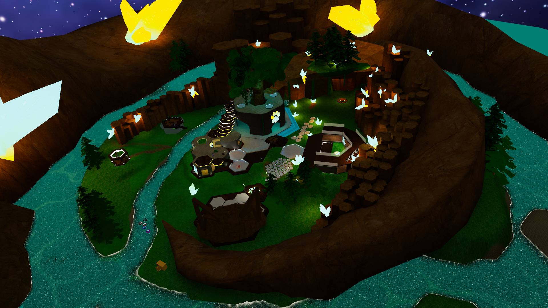
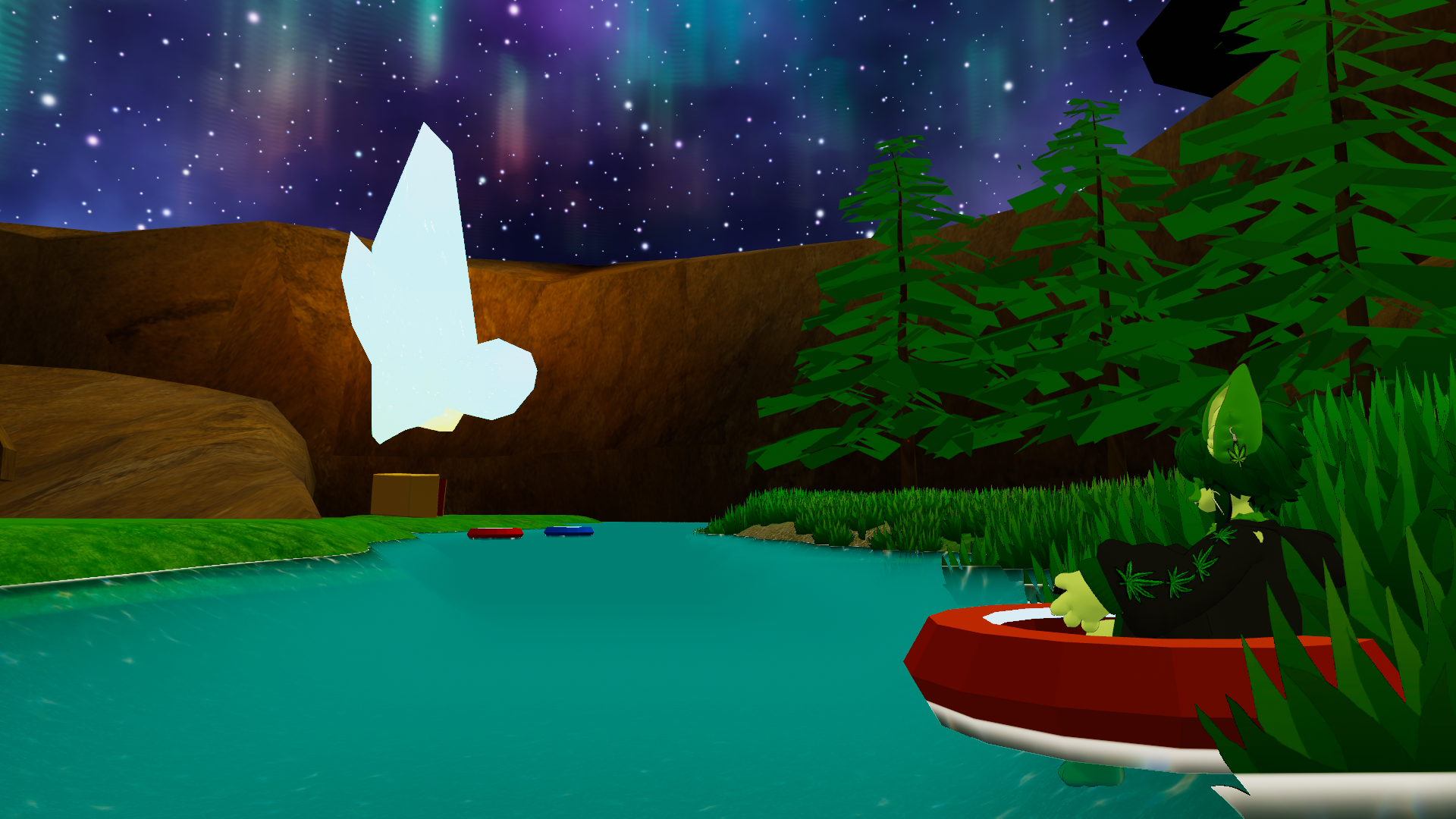
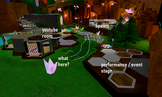
I am seriously cooking with this, and people who bother to come see it really seem to like it, but there is just something unfinished and missing about it. This whole center area is strange, and I am just having a hard time making things look good. I need help. Thank you in advance for any critique or advice.


Replies
I thought this blog post from Riot Games about League of Legends was really insightful, about the usefulness of carefully designing the color palette for a world:
http://wiki.polycount.com/wiki/Defining_the_Rift’s_Visual_Style#Increasing_Clarity