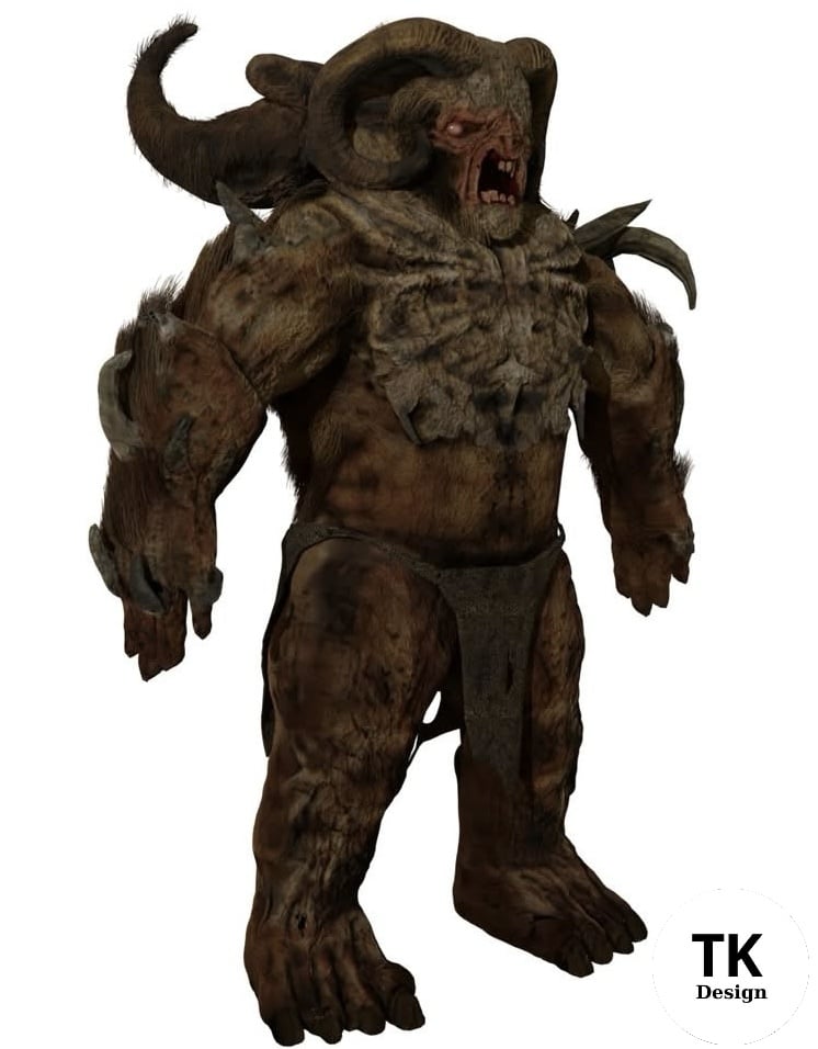
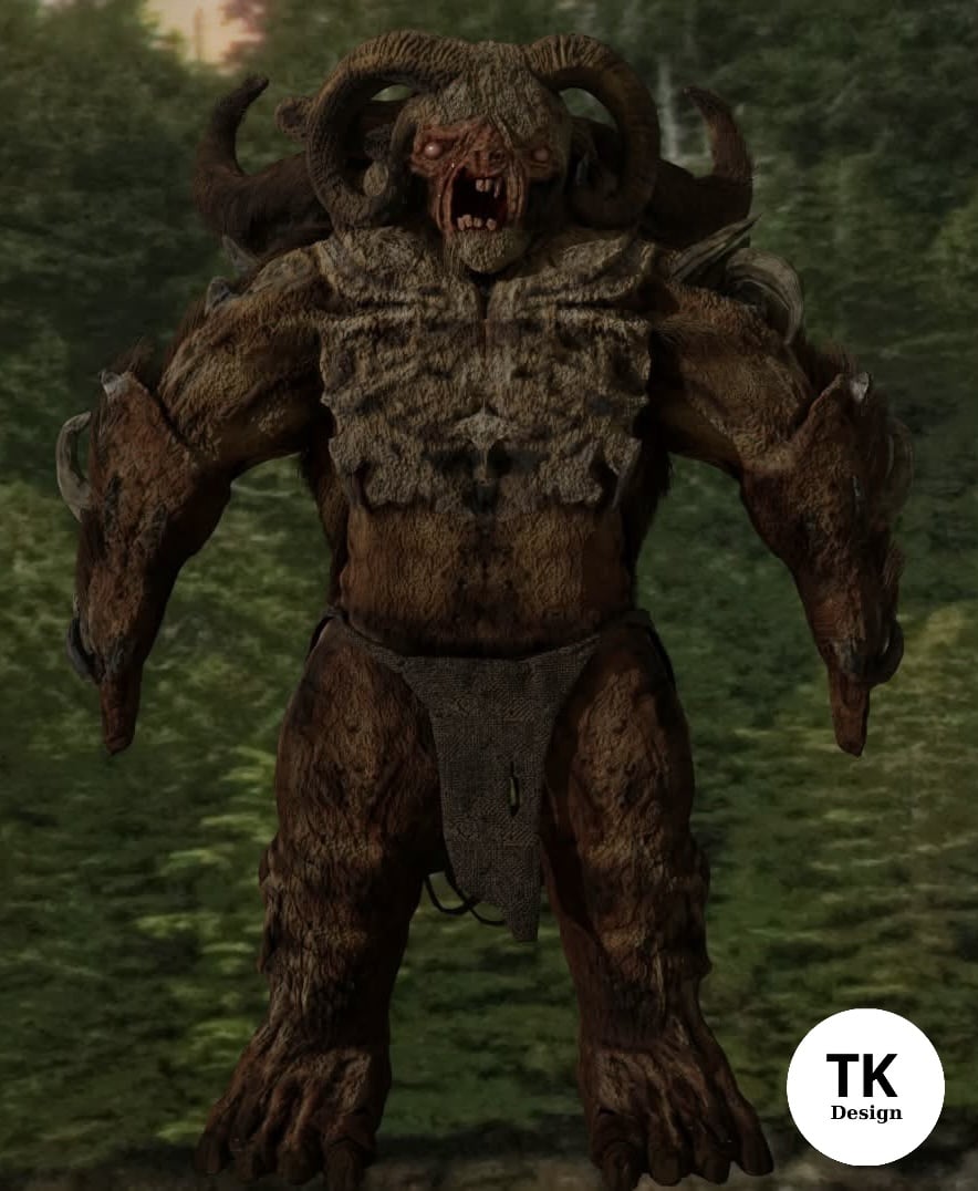
Presentation-wise, I think currently the lighting doesn't help to sculpt the model's features. Perhaps start with a 3 point lighting setup. When choosing the background, I'd be careful with contrast and think about how it affects the character lighting. I think white background has too much contrast making the character look cut out, the other background merges too much with the creature. The logo contrasts hard against the image, drawing attention away from the model. It would be nice to have a more natural pose for the presentation.
Design-wise, other than some horns, I don’t see much bull-features. With an original design, I would extract defining features from references and think how to integrate those. Another way of course would be to later change the name to something that aligns more with the final result (idk, "horned undead beast")
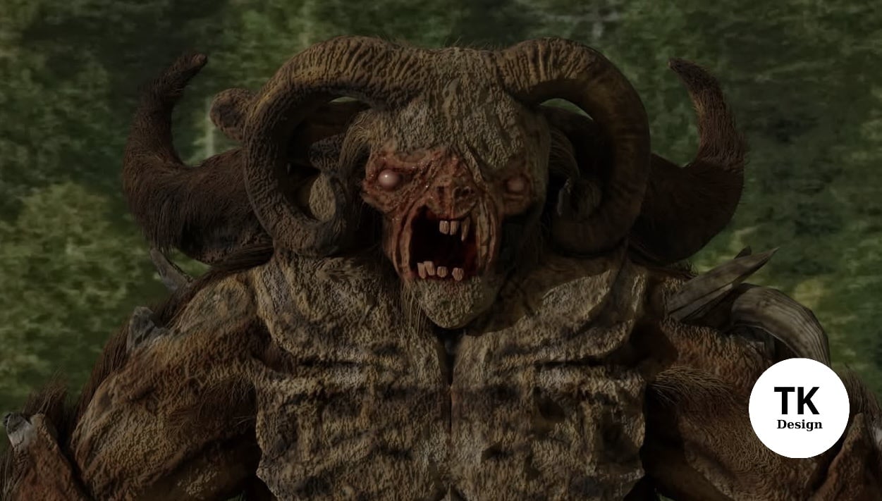
Execution-wise, it reads a bit noisy and overly bumpy. With textures, I would make sure there's some variance in the details and they're distributed reasonably, based on surface type (bone/ horn structures more smooth, less bump). Perhaps the texturing covers some anatomical weaknesses and lack of definition of the base model. To get feedback on those aspects, it might help to share a clay render of the sculpt as well.
Gnarly. I don't have anything to add, really, other than that I actually thought this was 2D for a moment when scrolling down, due to the mentioned flat lighting and the rather strong and homogenous looking noise overlay.
Presentation-wise, I think currently the lighting doesn't help to sculpt the model's features. Perhaps start with a 3 point lighting setup. When choosing the background, I'd be careful with contrast and think about how it affects the character lighting. I think white background has too much contrast making the character look cut out, the other background merges too much with the creature. The logo contrasts hard against the image, drawing attention away from the model. It would be nice to have a more natural pose for the presentation.
Design-wise, other than some horns, I don’t see much bull-features. With an original design, I would extract defining features from references and think how to integrate those. Another way of course would be to later change the name to something that aligns more with the final result (idk, "horned undead beast")
Execution-wise, it reads a bit noisy and overly bumpy. With textures, I would make sure there's some variance in the details and they're distributed reasonably, based on surface type (bone/ horn structures more smooth, less bump). Perhaps the texturing covers some anatomical weaknesses and lack of definition of the base model. To get feedback on those aspects, it might help to share a clay render of the sculpt as well.
You can use an app like Daz3D for reference. Also if the character is a bull you could use the bovine hind leg.
Also the texturing is kind of even overall with little variation to help describe the character, like one material with a displacement map over everything. Check out character work here and at Artstation to see some super texturing ideas.

Replies
Presentation-wise, I think currently the lighting doesn't help to sculpt the model's features. Perhaps start with a 3 point lighting setup. When choosing the background, I'd be careful with contrast and think about how it affects the character lighting. I think white background has too much contrast making the character look cut out, the other background merges too much with the creature. The logo contrasts hard against the image, drawing attention away from the model. It would be nice to have a more natural pose for the presentation.
Design-wise, other than some horns, I don’t see much bull-features. With an original design, I would extract defining features from references and think how to integrate those. Another way of course would be to later change the name to something that aligns more with the final result (idk, "horned undead beast")
Execution-wise, it reads a bit noisy and overly bumpy. With textures, I would make sure there's some variance in the details and they're distributed reasonably, based on surface type (bone/ horn structures more smooth, less bump). Perhaps the texturing covers some anatomical weaknesses and lack of definition of the base model. To get feedback on those aspects, it might help to share a clay render of the sculpt as well.
Keep it up!
I don't have anything to add, really, other than that I actually thought this was 2D for a moment when scrolling down, due to the mentioned flat lighting and the rather strong and homogenous looking noise overlay.