[WIP] Workshop Isometric Diorama
Been a hot little minute since I posted on here, but I'm back in the swing of 3D things for my final year of game art studies  One of my resolutions for the year is to actually start maintaining personal projects alongside university work, which I arguably should have started doing sooner, though my confidence at the time barred me from a lot of things :")
I've found working on "fun" stuff alongside projects defined as "work" in my head (final uni project AAH) has done wonders for my mental state and motivation (shocking I know). I'm trying to make sure I don't get too distracted by stuff I do on the side, but I'm still giving them a similar organisational approach to how I plan out my uni work with soft deadlines for different stages of the process.
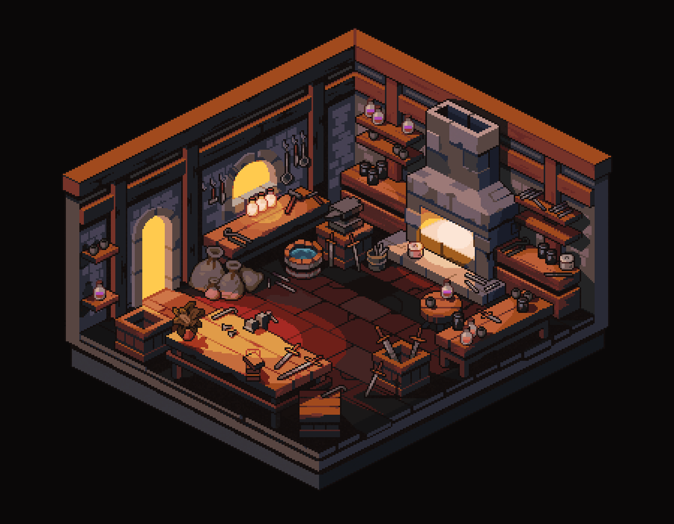
On that note here is a blockout of this lovely little isometric pixel art scene by @/Entairon_Kizon (Aconite_poison) on Twitter/X I made Monday night! I was prompted to have a go at making a diorama by the Dintober 14-step diorama challenge; whether I finish this within the month is debatable but I appreciate the steps and guide the challenge provides.


The lights still need some work, I referenced the artist's initial sketch/blockout for my own blockout and tried to mimic the shadow lighting but I'll probably delete that now that I've compared my scene with the final piece :P
I've found working on "fun" stuff alongside projects defined as "work" in my head (final uni project AAH) has done wonders for my mental state and motivation (shocking I know). I'm trying to make sure I don't get too distracted by stuff I do on the side, but I'm still giving them a similar organisational approach to how I plan out my uni work with soft deadlines for different stages of the process.
On that note here is a blockout of this lovely little isometric pixel art scene by @/Entairon_Kizon (Aconite_poison) on Twitter/X I made Monday night! I was prompted to have a go at making a diorama by the Dintober 14-step diorama challenge; whether I finish this within the month is debatable but I appreciate the steps and guide the challenge provides.


The lights still need some work, I referenced the artist's initial sketch/blockout for my own blockout and tried to mimic the shadow lighting but I'll probably delete that now that I've compared my scene with the final piece :P

Replies
I'd agree that the blockout needs some more work before you progress.
This seems to be very obvious, but I don't know why the character would be in there otherwise. So just in case: Not knowing anything else about the piece, the scale seems way off, even if we assume the character stands for a creature with different proportions like a dwarf or a stubby pixel art figure (but I guess only an actual standin with the target proportions would allow for a final judgement). With pixel art, some smaller elements might be depicted a bit bigger to allow for them or their details to be readable at all, and the size of the character might actually be different (usually bigger, though), so you might have to adjust some of it, but you seem to have veered from your inspiration in ways that don't immediately make sense to me. Maybe to accomodate the small character? Or it's remnants of sticking to the first sketch initially.
You also seem to have misinterpreted some of the elements, like the base of the fireplace being a raised counter in your version (which might also mess with its 3D position). I can't quite make out if the little table (the disk in front of the fireplace) is resting on the ground in your scene. Maybe I'm seeing some contact AO, maybe it's just a shadow that creates the illusion.
The camera looks good, but it's not isometric, in case that matters.
I've made a little bit more progress on the blockout with adjustments based on your comments as well as some extra things I picked up on thanks to them
Attaching the old version here for direct comparison:
Scale blindness is something I'm still struggling with in general so I appreciate that being pointed out! I lowered the height of the wall and scaled down the floor a little, then rearranged and rescaled things where needed. Trimming them down definitely made more of the cosy feel I want to replicate from the concept as well as correcting the scale. Some of the props I blocked out in Maya and dumped in here are also a little too big now, so while they've been rescaled in Unreal for the time being, I will modify their dimensions in Maya later.
The fireplace was a really good catch, I genuinely didn't see it xD I thought it was on the same level as the tables in the scene so I made it as a counter. But it makes more sense lower down now that I've changed it. As for the little table, I was just lazy at the time and didn't bother to model the legs in lol
Good point about how pixel art is approached as well, I'll keep it in mind as this project progresses.
For the camera, I'm probably not going to make it truly isometric only because I've tried doing that for a university project based on what information I could find online about pulling one off and the lighting turns out flat-ish/with no shadows, since the camera gets set up from very far away I think. Until I can debunk that I'll probably just work with a camera that's close enough haha