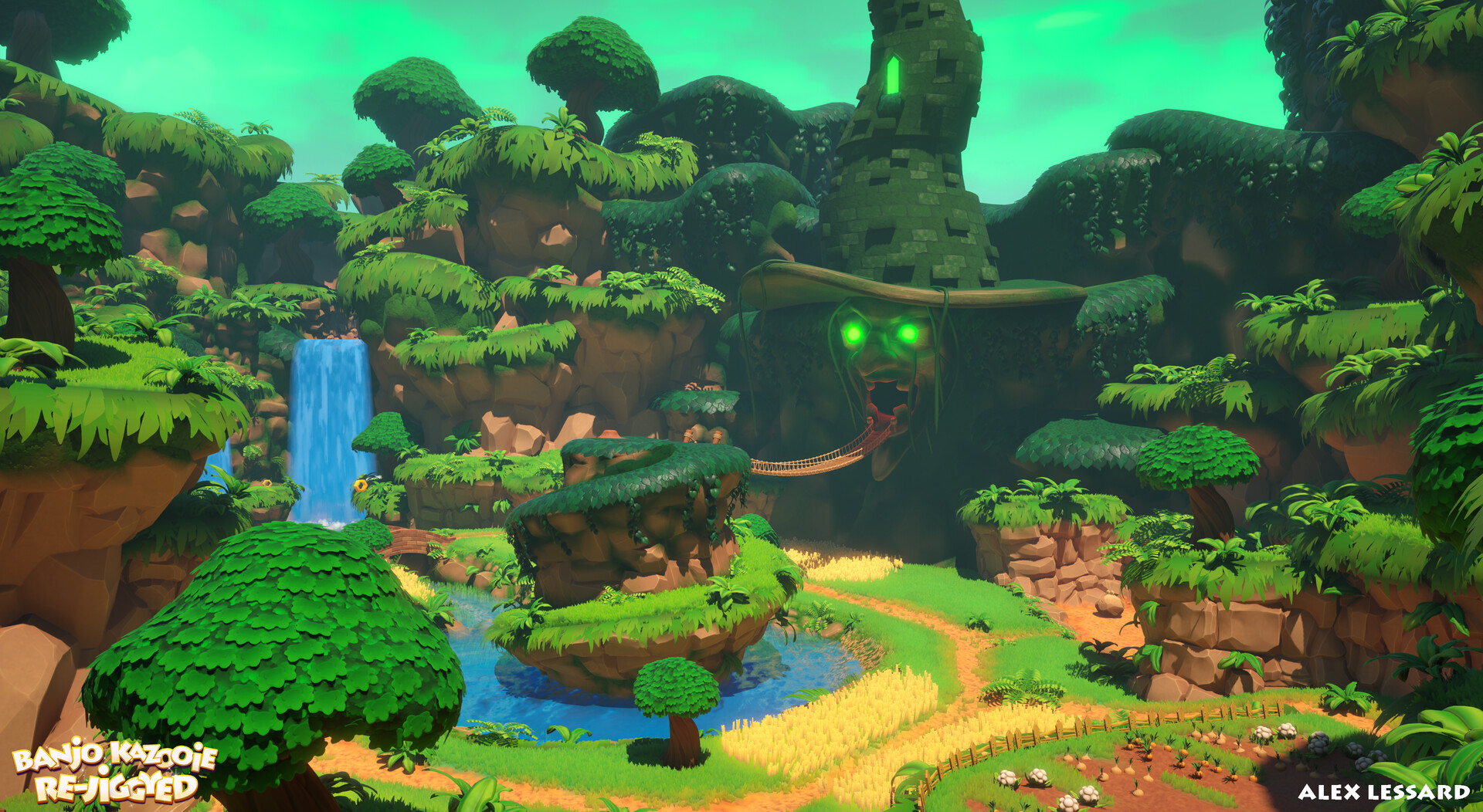
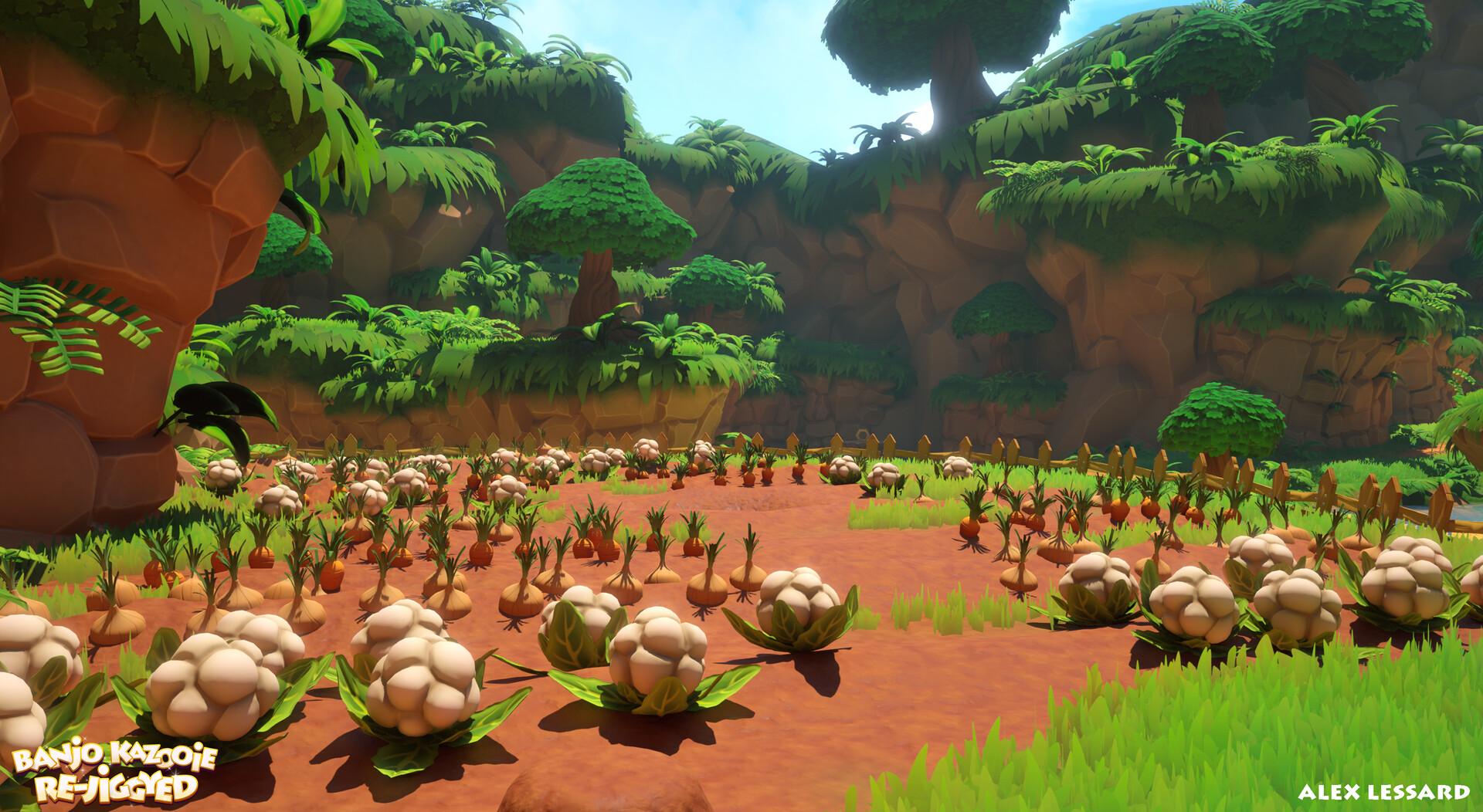
Banjo-Kazooie Re-Jiggyed: Spiral Mountain
Hi everyone, first time posting here.
I was suggested to post here for a project that I just finished.
After my last project, I was wondering what I could do. One of my previous teacher suggested that I could revamp a level from a game that hasn't been made in a long time and I chose Banjo-Kazooie. I gathered informations on how people would like it to be remade and what came up a lot was that they wanted it to be a remake/remaster by Toys For Bob (Crash 4, Spyro Reignited Trilogy). After gathering references and building an art bible of their work.
I used multiple softwares such as 3DS Max, Substance Painter 3D, Designer, Sampler, Photoshop (mostly for the grass), Zbrush and Unreal Engine, the same engine that Toys For Bob used for Crash 4 and Spyro Reignited Trilogy.
Roughly one month before the end of my project, I contacted Grant Kirkhope, the composer of the game and asked if I could use a remake version that he made for a video showcasing my environment, which he accepted. The logo is made by Del Northern.
Feedbacks are more than welcome


To avoid creating a long post, you can find more here.
You can also find the link to the video here.
I was suggested to post here for a project that I just finished.
After my last project, I was wondering what I could do. One of my previous teacher suggested that I could revamp a level from a game that hasn't been made in a long time and I chose Banjo-Kazooie. I gathered informations on how people would like it to be remade and what came up a lot was that they wanted it to be a remake/remaster by Toys For Bob (Crash 4, Spyro Reignited Trilogy). After gathering references and building an art bible of their work.
I used multiple softwares such as 3DS Max, Substance Painter 3D, Designer, Sampler, Photoshop (mostly for the grass), Zbrush and Unreal Engine, the same engine that Toys For Bob used for Crash 4 and Spyro Reignited Trilogy.
Roughly one month before the end of my project, I contacted Grant Kirkhope, the composer of the game and asked if I could use a remake version that he made for a video showcasing my environment, which he accepted. The logo is made by Del Northern.
Feedbacks are more than welcome


To avoid creating a long post, you can find more here.
You can also find the link to the video here.
Replies
i dont have any feedback on the art, but it might be cool to see a side by side comparison of with the original if you had time for that (the video especially). Seems like before/after style videos are always received pretty well.
If I had to point at one thing to improve, it would be some of the fluffy/voluminous vegetation (tree tops) currently looking tad too busy, the cards not blending with the large shape. To address this (maybe you already did some of it?), you could try transferring vertex normals from large shapes to small cards, disable shadow-casting for small parts and use some subsurface scattering. Also some foliage seems to use normal map, others don't (the grassy overhangs have a very even shading across all blades).
Thank you!
Since I wasn't sure that Grant would be down with a comparison shot, or Rare would be okay with it, I avoided that. If you want, you can find comparison of each shots above below:
I had a huge difficulty to blend the cards with the bigger shapes. I don't really know how to disable the cast shadows from the small cards without disableing the shadows of the whole mesh sadly.
In regard to the grassy overhang, the blades have their cast shadow turned to off, since it was the same thing in Spyro Reignited Trilogy. It doesn't look too bad with them being activated but I just wanted to be sure.
I know it sounds like a lot of deflecting regarding your feedback but I totally get what you're saying.