Knowing how important it is to keep honing my skills as an environment artist and 3D modeler, I spent my free time over the last few months building this retro, Mid Century-inspired secret laboratory. Although I have years of experience in Unreal, I wanted to keep expanding my knowledge of its systems, especially the ones that are getting rolled out in newer versions of Unreal Engine 5. This article is a breakdown of how I created this room and the techniques and technologies I used.
Here is the link to the project:
Part 1 - Trim Sheets
In order to optimize gameplay performance and be efficient with my own productivity, I divided up the entire room into modular pieces that could be copied logically. That started with the creation of my main trim sheet. Trim sheets are a technique for texturing 3D assets. If you want to know more about trim sheets, this article below from Artstation breaks it down well.
https://www.artstation.com/blogs/felyxmcgarry/yd4Q/jenns-guide-to-trim-sheets
A lot of this environment leans on trim sheets. All the metallic surfaces in this room use a single set of textures from a single trim sheet, and the rest of the surfaces use tileable textures. The only uniquely baked prop in this room is the chair.
Some meshes are given 2-3 material slots to hold different material instances of the trim sheet so that I could control factors like colors, dust coverage amount, and emissive levels via parameters built into the master material. I also have the ability to control roughness and metallic values with these parameters, so that some areas could have precise surface control. While having 2-3 slots per mesh does affect draw calls, this prevents the main shader which is used for a large portion of the environment to be too complex and expensive. Moreover, since these consoles are larger props, I surmised that the cost was worth it for these assets.
You can see here just how much of the environment and the props uses a single trim sheet by noting the amount of purple.

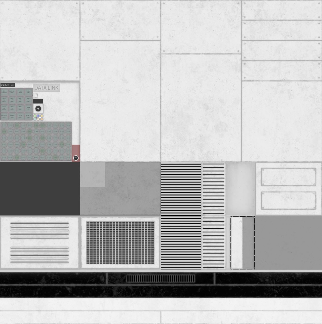
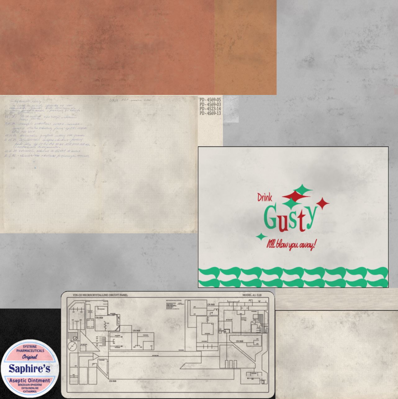
Here is a snapshot of the trim sheet. The smaller paper and junk props also use a trim sheet for optimization, where I would put parts of a texture for a props into corners or spaces in the 0 -1 grid. You can see this trim sheet below:
This required a lot of foreplanning, as I had to know what the room would look like design and detail wise in the final version, and then identify which parts could be copied and re-used so that they could be made onto the trim sheet. The modular walls used a bulk of this pre-planning. The terminals were built with using the trim sheet in mind, with me experimenting how I could use the trim sheet creatively as I was building it. For smaller props, this also meant I needed a headcount of what props I needed.
Part 2 - Materials & Shaders
To achieve dust on all surfaces using trims and tileables, the master shader has a dust overlay function that uses world space normals to put dust on top of objects, with numbers to control the falloff on other sides. While I’ve worked with world space normal shaders before, it had been quite some time, so I refreshed my memory with Youtube tutorials regarding the subject.

The dust overlay texture and nodes are tied to a second UV channel on the assets, so that the dust is uniform and doesn't cut or stretch with trim sheet UV mapping. The highlighted squares are where the dust nodes lie.
Now let's get into the moving bits.
Part 3 - Visual Effects
Rather than using Niagara for effects, I built my VFX in material shaders using scrolling texture functions and sprite sheets.
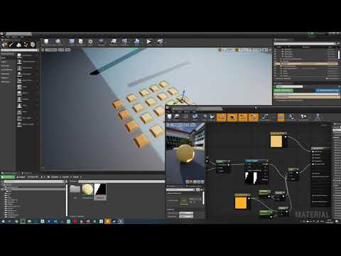
The blinking buttons are controlled with a scrolling black and white mask with different horizontal lengths tied to a 2nd UV channel. These different lengths give the on/off strength different speeds. So by putting the button's UVs on the second channel in different black and white strips, I’m able to simulate different blinking speeds! I picked this tip up from a great Youtube tutorial.
 https://www.youtube.com/watch?v=1Y6jifhhESk
Here is a snapshot of the shader for those blinking buttons:

The dials are controlled via a sprite sheet, with different positions, or frames, put on a grid.
This sprite sheet offers an alpha mask to mask out the dials. I found the sprite sheet to be the most efficient way for these dials as there were so many. Because they are UV mapped onto a plane, that meant I could rotate these planes in my modeling software so each dial started in a different position, even though they use the same animation.
On the left of this image you can see the sprite sheet, and on the right we have the shader using it.

The portal VFX is made from several layers of material shaders mapped onto planes. Their setup is simple, using various noises/textures tied to a Panner node and masks set to UV channels. One UV channel mask is to hide the borders of the plane, and the other mask tied to another UV channel is to mask the noise itself.

The monitors use a texture of static tied to a panner node.

The swivel lights use a simple mesh blueprint with a RotationComponent inside. The computer tapes, on the other hand, are a skeletal mesh with a looping animation.

That covers the important bits of everything. If you would like to know more, feel free to leave a comment!
