Home 3D Art Showcase & Critiques

My portfolio is weak, send help please

Offline / Send Message
Pinned
Hello everyone! I am extremely glad I found this forum because local residents seem very welcoming and I feel a little bit lost in my journey of becoming a character 3d artist. Currently, I am planning to improve my skills and portfolio in my free time, but I don't know in which direction should I go. Should I make full pipeline game res characters or should I do busts that are much more enjoyable for me or should I take any design classes? 

I am extremely thankful for you reading this and I would be insanely thankful if you helped me with my little trouble. Thank you very much! 
https://pokatak.artstation.com/

p.s. I am a new user here so I apologize in advance if I am breaking any rules. I just couldn't find the rule list. 
Orc headValkyrieOrc wipFemale elf portrait

Replies

  • ThisisVictoriaZ
    Offline / Send Message
    ThisisVictoriaZ polycounter
    Hi! I really like your style, and I think your portfolio is very interesting, but what you add to it really depends on what you want to get out of it. If you're interested in working in games, then showing some full pipeline characters would defiantly be helpful, or if you're just doing 3d for fun just keep doing the busts that you enjoy. I would love to see more full body characters, but again it just depends on your end goal! 
    I would also, say as far as presentation, I would make a different thumbnail for the Valkyrie project so that it is cohesive with your other projects. As of right now on your website that thumbnail sticks out and looks very out of place 
  • pixelpatron
    Offline / Send Message
    pixelpatron polycounter
    Hello Sandjar,

    Some decent progress, I think you've got the basics but you've got quite a journey ahead. Here we go. 

    Thumbnails on artstation, need to be feature your models better. Overall you should work towards getting a 3 point light setting scene setup in Unity/Unreal. Or you could if you're only doing characters look at the presets in sketchfab. I use a tweaked default 3 point lighting setup and it works great! Experiment with the different HDR skies.

    Models themselves. Anatomy needs more work:

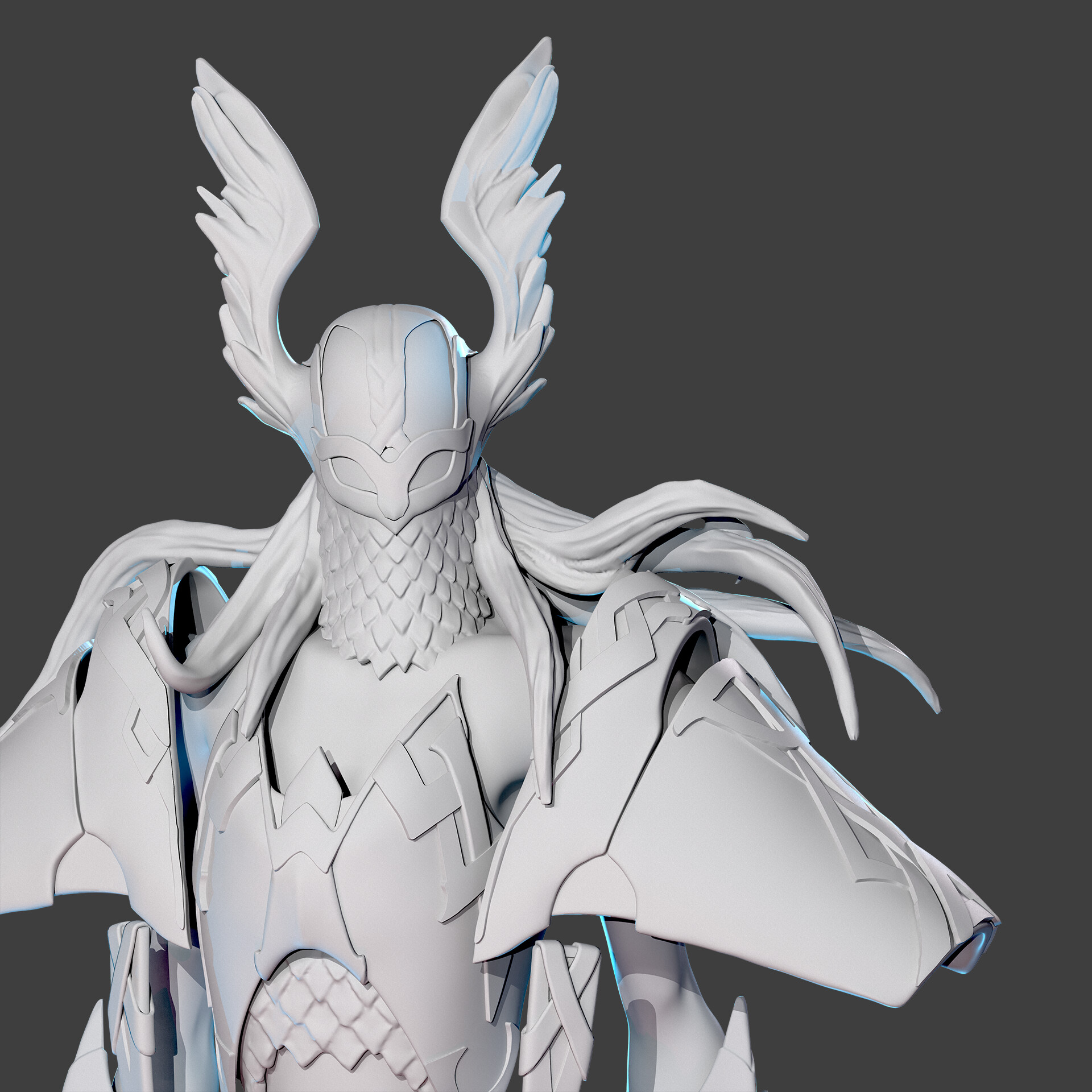
    Valkyrie: ass not very appealing, looks like you cheated and didn't want to model the face/eyes...this might be due to the concept, although if you're trying to impress a studio they'll want to know you can model a face/female. Looks like you rushed the crotch and didn't look at anatomy for the legs/arms. I'd suggest working on a bunch of female sculpts to get more familiar with the anatomy. 

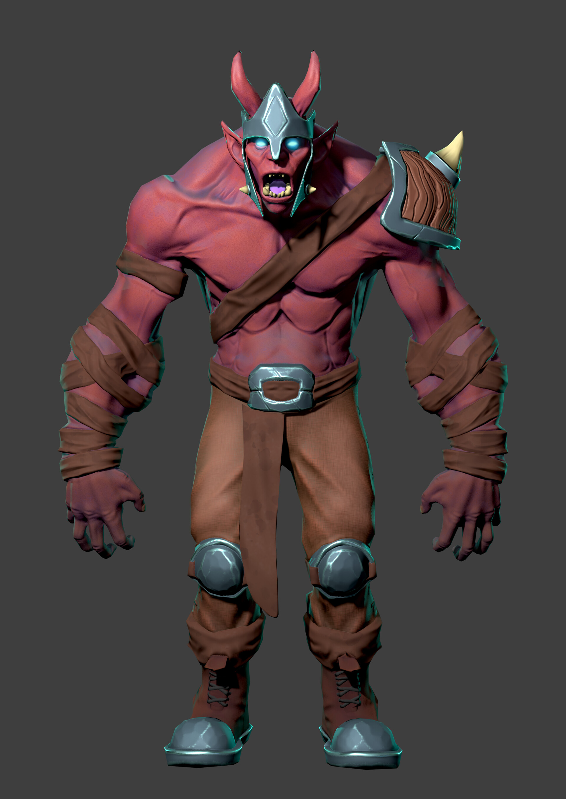
    Red Orc: ass not very appealing, doesn't show understanding of it's forms. Hands look blobby disproportioned to model/anatomy (tiny fingers). Materials for wood/metal/skin/cloth could be more convincing. Boots/pants/sash/belt all blend into mush, I'd look at contrast and value changes between the skin and these other elements to give the audience some visual separation. Torso anatomy looks underdeveloped or unfinished and also like it's melting. Back, and hunched neck do not look convincing or modified from believable anatomy as a foundation. Subsurface scattering? Could fake it with coloring.

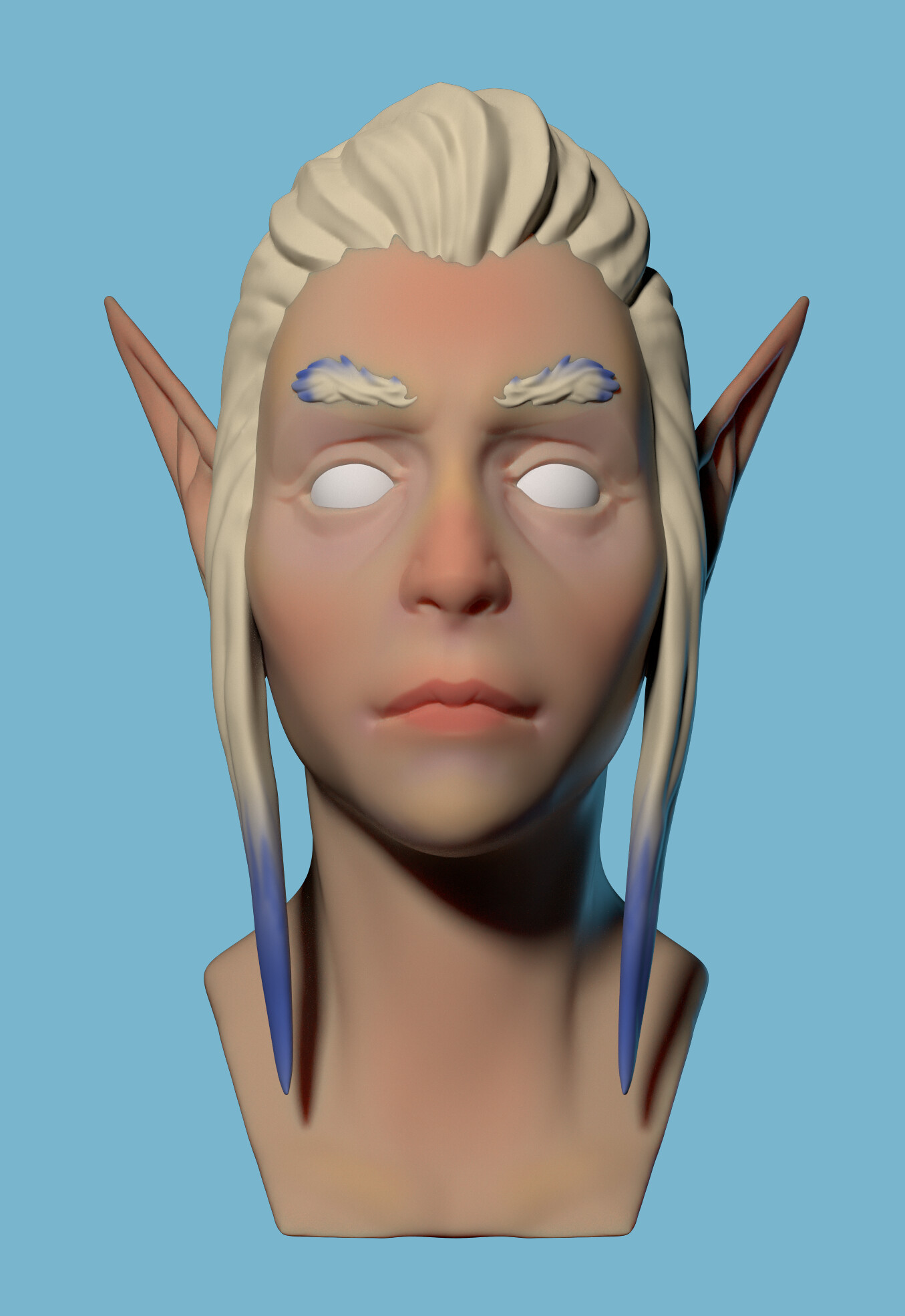
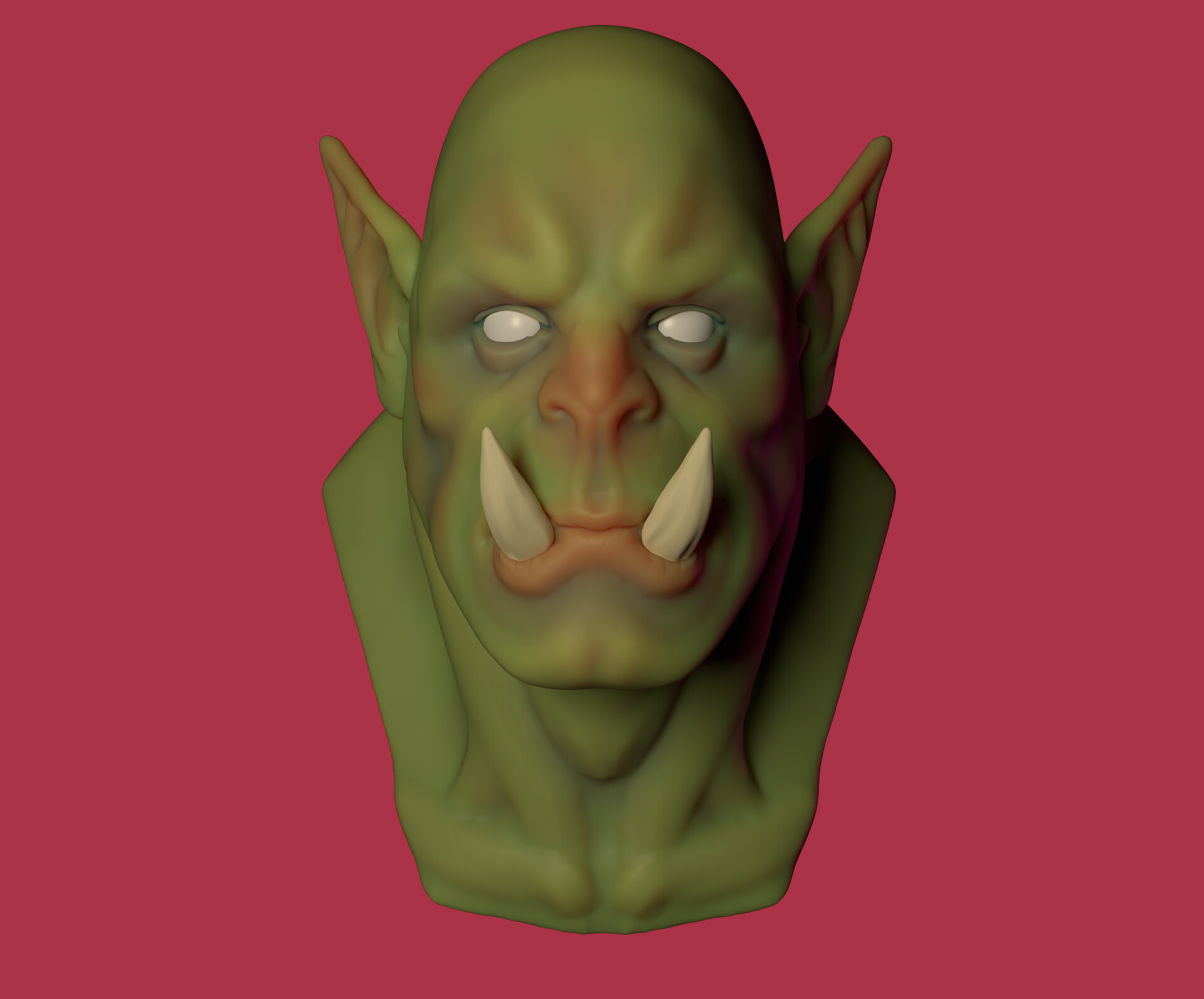
    Orc and Elf: too early to be included as part of portfolio as they feel very wip and unfinished. Remember your portfolio is only as strong as your weakest piece. Less is more and if you have something that looks lower quality, unfinished, and possibly lowers the overall quality of the portfolio, it's best to cut it. 

    Good luck.

    I'd suggest you focus on doing exercises before tackling more full characters. Do 50 heads male/female, 50 torsos male/female, 50 legs/feet, 50 hands. 


  • Pokatak
    Hi! I really like your style, and I think your portfolio is very interesting, but what you add to it really depends on what you want to get out of it. If you're interested in working in games, then showing some full pipeline characters would defiantly be helpful, or if you're just doing 3d for fun just keep doing the busts that you enjoy. I would love to see more full body characters, but again it just depends on your end goal! 
    I would also, say as far as presentation, I would make a different thumbnail for the Valkyrie project so that it is cohesive with your other projects. As of right now on your website that thumbnail sticks out and looks very out of place 
    Thank you very much for your answer! My current end goal is to work as a character artist, even though I already work as an environment artist. I started doing busts because they are much less energy consuming then full pipeline characters (couldn't finish my valkyrie ), but I guess they are good only for personal entertainment after all) I really appreciate your time spent on me! Thank you very much again.
  • Pokatak
    Hello Sandjar,

    Some decent progress, I think you've got the basics but you've got quite a journey ahead. Here we go. 

    Thumbnails on artstation, need to be feature your models better. Overall you should work towards getting a 3 point light setting scene setup in Unity/Unreal. Or you could if you're only doing characters look at the presets in sketchfab. I use a tweaked default 3 point lighting setup and it works great! Experiment with the different HDR skies.

    Models themselves. Anatomy needs more work:

    Valkyrie: ass not very appealing, looks like you cheated and didn't want to model the face/eyes...this might be due to the concept, although if you're trying to impress a studio they'll want to know you can model a face/female. Looks like you rushed the crotch and didn't look at anatomy for the legs/arms. I'd suggest working on a bunch of female sculpts to get more familiar with the anatomy. 

    Red Orc: ass not very appealing, doesn't show understanding of it's forms. Hands look blobby disproportioned to model/anatomy (tiny fingers). Materials for wood/metal/skin/cloth could be more convincing. Boots/pants/sash/belt all blend into mush, I'd look at contrast and value changes between the skin and these other elements to give the audience some visual separation. Torso anatomy looks underdeveloped or unfinished and also like it's melting. Back, and hunched neck do not look convincing or modified from believable anatomy as a foundation. Subsurface scattering? Could fake it with coloring.

    Orc and Elf: too early to be included as part of portfolio as they feel very wip and unfinished. Remember your portfolio is only as strong as your weakest piece. Less is more and if you have something that looks lower quality, unfinished, and possibly lowers the overall quality of the portfolio, it's best to cut it. 

    Good luck.

    I'd suggest you focus on doing exercises before tackling more full characters. Do 50 heads male/female, 50 torsos male/female, 50 legs/feet, 50 hands. 


    Thank you very much for your answer!
    What did you mean by feature the model better? Does it meant that I should tweak the scale more? 
    I actually used to believe that I am decent with anatomy, but I guess I have to study a bit more) 
    I really appreciate your time spent on such a detailed answer, it really gave me a reason to reconsider my artistic level, but I also feel much less lost since I know where I should focus now.
    I am extremely grateful for your responsiveness!
  • Gannon
    Offline / Send Message
    Gannon interpolator
    Red Orc: ass not very appealing
    I second this, that orc ass needs saving otherwise nobody will hire you.

    Seriously though, you're not off to a bad start but these aren't portfolio level works as much as they are studies.

    Portfolio work should be comparable to the companies you aspire to work for. Avoid anything called "WIP" in your portfolio section. This should be reserved for something that an art director would sign off on. 

    I'll forego repeating the Anatomy study feedback and instead say you need to work on your presentation. High poly, low poly, UVs, lighting that compliments the character and their personality. A studio will want to see your assets broken down, not just beauty shots. The thumbnail of the valkyrie is a good example of what not to do. You're putting an emphasis on an area of a model that's not the strongest part of the piece as a whole.

    The sculpts in general feel muddy/unclear. This is because you're sculpting a lot of medium/large details on one subtool and they lose their separation. the feathers and chainmail of the mask are examples of this. The clothes/armor look like they were extracted and then sculpted on, which is fine - but that's not quite the full process. You can extract clothes and then sketch designs to figure stuff out for surface details but at some point you need to retopologize those extractions, otherwise you end up with wobbly sculpts. It's possible to polish them sometimes but you'll get a better result 100% of the time if you do a retopo pass.

    Best of luck and keep us updated!
  • Pokatak
    Hello Sandjar,

    Some decent progress, I think you've got the basics but you've got quite a journey ahead. Here we go. 

    Thumbnails on artstation, need to be feature your models better. Overall you should work towards getting a 3 point light setting scene setup in Unity/Unreal. Or you could if you're only doing characters look at the presets in sketchfab. I use a tweaked default 3 point lighting setup and it works great! Experiment with the different HDR skies.

    Models themselves. Anatomy needs more work:

    Valkyrie: ass not very appealing, looks like you cheated and didn't want to model the face/eyes...this might be due to the concept, although if you're trying to impress a studio they'll want to know you can model a face/female. Looks like you rushed the crotch and didn't look at anatomy for the legs/arms. I'd suggest working on a bunch of female sculpts to get more familiar with the anatomy. 

    Red Orc: ass not very appealing, doesn't show understanding of it's forms. Hands look blobby disproportioned to model/anatomy (tiny fingers). Materials for wood/metal/skin/cloth could be more convincing. Boots/pants/sash/belt all blend into mush, I'd look at contrast and value changes between the skin and these other elements to give the audience some visual separation. Torso anatomy looks underdeveloped or unfinished and also like it's melting. Back, and hunched neck do not look convincing or modified from believable anatomy as a foundation. Subsurface scattering? Could fake it with coloring.

    Orc and Elf: too early to be included as part of portfolio as they feel very wip and unfinished. Remember your portfolio is only as strong as your weakest piece. Less is more and if you have something that looks lower quality, unfinished, and possibly lowers the overall quality of the portfolio, it's best to cut it. 

    Good luck.

    I'd suggest you focus on doing exercises before tackling more full characters. Do 50 heads male/female, 50 torsos male/female, 50 legs/feet, 50 hands. 


    Thank you very much for your answer!
    What did you mean by feature the model better? Does it meant that I should tweak the scale more? 
    I actually used to believe that I am decent with anatomy, but I guess I have to study a bit more) 
    I really appreciate your time spent on such a detailed answer, it really gave me a reason to reconsider my artistic level, but I also feel much less lost since I know where I should focus now.
    I am extremely grateful!
  • kanga
    Offline / Send Message
    kanga quad damage
    Great advice above. Seriously, you can't pay for this stuff.
    You need anatomy practice. You can use Daz 3D as a free reference:
    Your sculpting looks unfinished so you need more definition. Try the pinch brush both positive and negative.
  • Pokatak
    Gannon said:
    Red Orc: ass not very appealing
    I second this, that orc ass needs saving otherwise nobody will hire you.

    Seriously though, you're not off to a bad start but these aren't portfolio level works as much as they are studies.

    Portfolio work should be comparable to the companies you aspire to work for. Avoid anything called "WIP" in your portfolio section. This should be reserved for something that an art director would sign off on. 

    I'll forego repeating the Anatomy study feedback and instead say you need to work on your presentation. High poly, low poly, UVs, lighting that compliments the character and their personality. A studio will want to see your assets broken down, not just beauty shots. The thumbnail of the valkyrie is a good example of what not to do. You're putting an emphasis on an area of a model that's not the strongest part of the piece as a whole.

    The sculpts in general feel muddy/unclear. This is because you're sculpting a lot of medium/large details on one subtool and they lose their separation. the feathers and chainmail of the mask are examples of this. The clothes/armor look like they were extracted and then sculpted on, which is fine - but that's not quite the full process. You can extract clothes and then sketch designs to figure stuff out for surface details but at some point you need to retopologize those extractions, otherwise you end up with wobbly sculpts. It's possible to polish them sometimes but you'll get a better result 100% of the time if you do a retopo pass.

    Best of luck and keep us updated!
    Understood, Thank you very much!kanga said:
    Great advice above. Seriously, you can't pay for this stuff.
    You need anatomy practice. You can use Daz 3D as a free reference:
    Your sculpting looks unfinished so you need more definition. Try the pinch brush both positive and negative.
    Great piece of advice thank you!
Sign In or Register to comment.