My Graduation Project (Character and prop WIP)
Hey, I'm working on a Payday character and 2 props (a duffle bag and a gun). I want to learn and understand the proper way of doing character art (and likeness sculpts) in video games. So it would be great to receive any sort of feedback.

This is my quality target and character I will be remaking

This is my current reference board (this is week 4 of the project at the time of posting this)

Week 1
Progress - Started my likeness sculpt (did multiple paint over comparisons, looked through planes of a face to make sure I didn't miss any anatomical landmarks).

I also started with the gun prop and the shoe

Week 2
Progress - More Likeness! started adding more secondary details to the face (went up in subdivision)
- Worked more on the gun and started with duffle bag
- Created cloth base in marvelous


Week 3
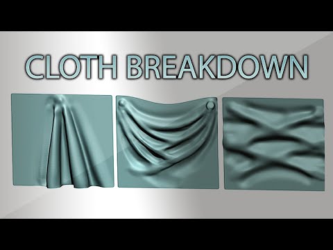
Progress - Did a study on cloth and folds(my sources) - https://www.youtube.com/watch?v=gNx4v0WVVHo
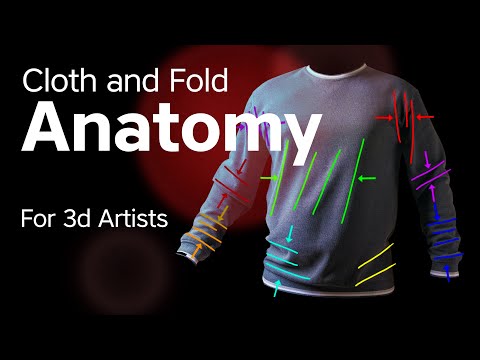
 https://www.youtube.com/watch?v=imp3j7l6V1U&t=1415s
- More likeness sculpting, slowly moving towards tertiary details, I went on to finish the face sculpt (placed hair blob and eyebrows and did final face adjustments)

Week 4
Progress - HAIR! this went on for the entirety of week 4, getting a volume sculpt for hair, I restarted multiple times, tested different brush strokes, I just couldn't manage to get it to look like hair.
- Did some work on the clothes, studied how different types of materials fold.

Breakthrough - eventually it started to look like hair, it was progress. But it didn't look like my reference hair

But by next week, it started to look much better as a volume sculpt, and it was time to move on

Week 5
Progress - currently starting week 5 (as of posting this), managed to complete highpoly of character and props, moving towards retopology


This is my quality target and character I will be remaking

This is my current reference board (this is week 4 of the project at the time of posting this)

Week 1
Progress - Started my likeness sculpt (did multiple paint over comparisons, looked through planes of a face to make sure I didn't miss any anatomical landmarks).

I also started with the gun prop and the shoe

Week 2
Progress - More Likeness! started adding more secondary details to the face (went up in subdivision)
- Worked more on the gun and started with duffle bag
- Created cloth base in marvelous


Week 3
Progress - Did a study on cloth and folds(my sources) -
 https://www.youtube.com/watch?v=gNx4v0WVVHo
 https://www.youtube.com/watch?v=imp3j7l6V1U&t=1415s
- More likeness sculpting, slowly moving towards tertiary details, I went on to finish the face sculpt (placed hair blob and eyebrows and did final face adjustments)

Week 4
Progress - HAIR! this went on for the entirety of week 4, getting a volume sculpt for hair, I restarted multiple times, tested different brush strokes, I just couldn't manage to get it to look like hair.
- Did some work on the clothes, studied how different types of materials fold.

Breakthrough - eventually it started to look like hair, it was progress. But it didn't look like my reference hair

But by next week, it started to look much better as a volume sculpt, and it was time to move on

Week 5
Progress - currently starting week 5 (as of posting this), managed to complete highpoly of character and props, moving towards retopology


Replies
Progress - Took this week to retopo my character and gun, also started to texture my gun in substance painter
started with hair textures. I'm using Xgen for the hair, and baking it in substance designer, i made a simple node setup to get the following maps - albedo, root map\ gradient map, value map, opacity map, AO and height\depth map.
My cards are divided as follows - Base cards x2, thick cards x3, middle cards x4, thin cards x4, flyaway x3, single strand x1, eyebrow\eyelashes x2
I have started placing the base blockout around the head, and also started to place the thick and middle cards.
I constantly go back and edit the strands and rebake the textures and I remove and place cards again. (new to hair so I do things over and over again to get better and to understand the hair better)
This is my substance graph
Worked a bit more on the gun texture
- I spend a majority of this week working on hair (hair is hard), I have not placed all the cards yet, also went onto to make a scalp felt like it would make the transition to hair cards more seamless.
- I followed a post by Ben Mathis to create the flow map for the hair, I still need to test it out to see how it looks.
- With some extra time I had I completed the gun and bag texturing, need to see how the colours look in engine.
Merry Christmas! this week was slow due to the holidays, but this is what I managed to finish.
- Started texturing the clothes, here is the current progress, also showing the albedo and roughness on the right side
Also started with eyebrows and eyelashes, both require more tweaking
- Started with texturing the skin using XYZ texture pack and substance painter, also doing some test renders the past week, to get the material to look right
- Trying out different lightings as well
- back and forth on skin and clothes textures
Will be working more on textures and lighting again the coming week
This week I did more adjustments on lighting, textures and camera angles
I would take a render everyday and put it next to each other to see how and what I improved (left to right), I also wrote on the side of the images on what to test out and improve on the next render
These are my final renders (not sure if ill make more changes to them while I do documentation)
I'll preface by saying i'm not a character modeller. Things I noticed that can help push the final render, mostly by comparing with your quality benchmark piece here https://www.artstation.com/artwork/KekQgW
presentation: I'd pay more attention to the format of his presentation, which includes a default/ T pose, and a posed character turnaround. We don't really see the back of your character in your renders.
posing: I would referencing the posed image of the person you're looking at to make the posing feel bit more natural. Pay special attention to the shoulders tilt and how it is moved slightly back, the tilt of the head. and the contrapposto. And how the trenchcoat/ clothing deform to help sell the contrapposto. For the poses, I'd also have the eyes look more determined/ in a certain direction, ie. what's the story of the character when she's posed? where is her attention at and how can you sell that story?
Lighting: looks like you have a there's a police siren lighting going on from left to right, but the casted light is white. the background color is somewhat saturated and imo distracting from the model. Overall I would try to find a reference a lighting look you're going for, thinking about what the lighting is achieving/highlighting/hiding.
Good luck! and keep on rocking
Hey thank you so much for the very detailed feedback, these are my renders for artstation, it also consists of a turn table video where you can see the back, I looked at portrait photography and was able to get even better lighting, I made sure to add rembrandts triangle on the face to get a more human look.
I will make sure to add the shoulder tilt and look more closely to the contrapposto (new word i just learned) to get the weight of the pose better, and also have another look at the background saturation.