(WIP) Historical house recreation
Hello everyone!
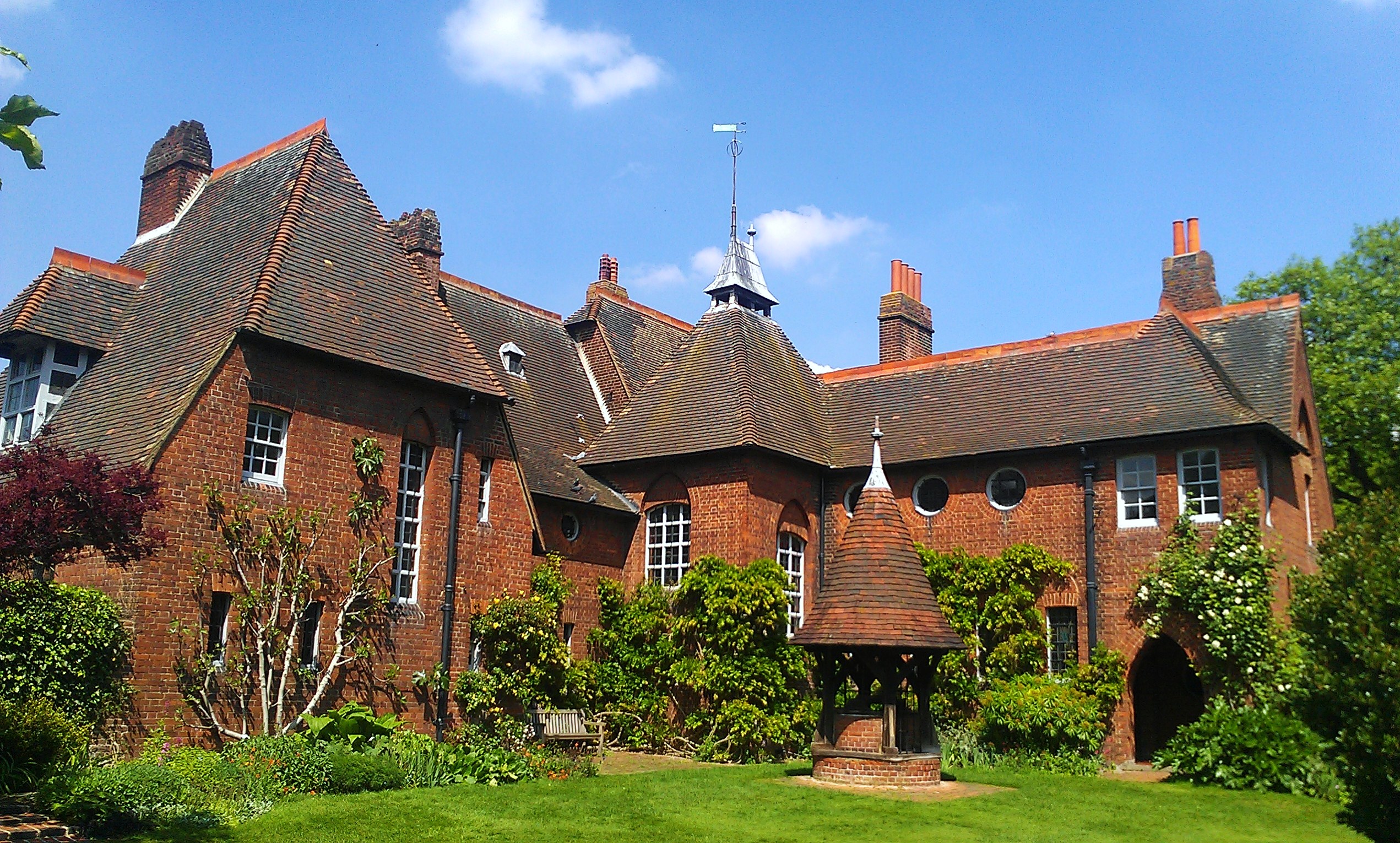
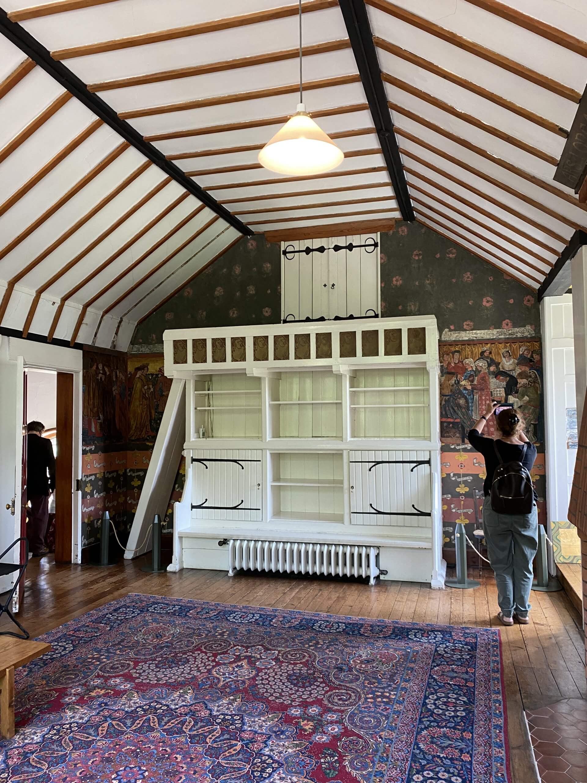
I am an MA student completing my capstone project and was wondering if anyone could give me feedback on a historical house I am recreating. I am recreating the following house, the Red House in UK.


And below is the current state of my project. I am trying to figure out best ways to reduce repetition in the roof tiles, would like some ideas on how to improve the roof meshes and the tiles.


Thanks again for looking at my project and for any feedback/critiques you have!
I am an MA student completing my capstone project and was wondering if anyone could give me feedback on a historical house I am recreating. I am recreating the following house, the Red House in UK.


And below is the current state of my project. I am trying to figure out best ways to reduce repetition in the roof tiles, would like some ideas on how to improve the roof meshes and the tiles.


Thanks again for looking at my project and for any feedback/critiques you have!
Replies
Now I'm not sure exactly how far along you are--and therefore what you already have in the works--but the first things I noticed missing from the roof are:
It also looks like the tiles were originally laid to be a uniform color, but in your material you've made them have slight color variations to simulate the grunge buildup over time:
I think the better way of going about this would be to tone down the color variation in your roof tiles' basecolor, and then set up a shader to overlay a grunge over the entire roof space with different tiling than the tiles themselves. This one is much harder to explain if you haven't made a basic shader before, but you can find lots of tutorials online for how to set this up.
One other thing is I think the bricks on your current exterior look much smaller than the ones on the real house. It kind of gives the illusion that your house is enormous, but if you just count how many bricks tall one of the small windows is in your reference, it should help you tile the bricks in your project better as well.
Hope that helps!