Home 3D Art Showcase & Critiques

[WIP] Hellboy Fan Art Critique

Fraktayne
polycounter lvl 5
Offline / Send Message
Fraktayne polycounter lvl 5
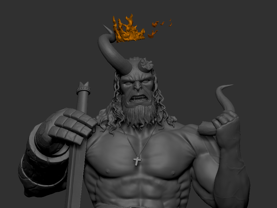
Hello, so I have started making a fan art for Hellboy to learn how to capture the "look" of a character since its important if I want to join the industry. But now I'm stuck, I'm not sure how to progress or figure out what is wrong  or missing and I would like to ask for some feedback to help me finally complete the project since I've been doing it for about 2 months now.

My theme is a medieval Hellboy, I haven't detailed the body much yet.
I have no idea what to put below his right foot since the angle is weird. 


Here I also have no Idea how to merge the fingers to the rest of the body without it looking mutated.


Update:

I took a few days of working on this to maybe refresh my eyes and here are a few updates on this.


At the moment I still have no idea how to fix my fingers issue, trying to figure out how to hide it somehow atm.
Replies

  • Fabi_G
    Online / Send Message
    Fabi_G high dynamic range
    Hi! I think the pose currently looks too stiff and lacks narrative (what's happening here?). Maybe take a step back from the highpoly, and blockout/ sketch different poses with focus on expression and narrative, look at miniatures and statues for inspiration. Could act out different pose yourself, see how it feels and looks. Good luck!
  • Fraktayne
    Offline / Send Message
    Fraktayne polycounter lvl 5
    Fabi_G said:
    Hi! I think the pose currently looks too stiff and lacks narrative (what's happening here?). Maybe take a step back from the highpoly, and blockout/ sketch different poses with focus on expression and narrative, look at miniatures and statues for inspiration. Could act out different pose yourself, see how it feels and looks. Good luck!
    Hi, thanks but can you explain what narrative is, I googled it and it says art that tells a story. Do you have examples? I dont understand.
  • Fabi_G
    Online / Send Message
    Fabi_G high dynamic range
    Hi! "Art that tells a story" sounds about right: What has happened, where is he, what's his state? Beat up and exhausted from battle, angry and ready to fight or has just come out of a fight victorious and feeling pumped? Such scenarios can be communicated with pose, so that it comes across in the silhouette. I think not having this story layer expressed through the pose, will weaken a work, even if its anatomy and details are top. With the upper body hunched over and the damaged horn, I would interpret it as him being damaged and exhausted from battle. What was your idea?
  • Fraktayne
    Offline / Send Message
    Fraktayne polycounter lvl 5
    Oh, I didnt have a scenario in mind. I just thought it would look cool. Thanks for explaining. I'll have to look into those things
  • Fraktayne
    Offline / Send Message
    Fraktayne polycounter lvl 5
    Update:
    I added a few accessories and tried a bunch of things to make the work look interesting, in the end I decided to make it so he slayed something, not sure what yet but a snake thing maybe. Thinking about these things is really difficult and frustrating, I dont know how you guys do it.

  • zetheros
    Offline / Send Message
    zetheros sublime tool
    maybe open the pose up a bit more; imo he's too closed in. The dead snake will be a good amount of work (you're doubling the amount of characters now), think carefully if it's within the scope of this project. Add terrain, rocks or similar, as filler on your pedestal so you know where everything goes

    You can look at raf's artstation for inspiration https://www.artstation.com/grassetti


  • Fraktayne
    Offline / Send Message
    Fraktayne polycounter lvl 5
    Thanks, Im not too sure about the scope but I tried some stuff like making it look like the excalibur is embedded in rock or standing ontop of tomb stone to make the scene?/pose make sense like what the other guy said. I thought that adding a dead thing might make more sense, but yes im not too sure about adding another character since I dont have an Idea of what its supposed to look like.
  • Fraktayne
    Offline / Send Message
    Fraktayne polycounter lvl 5
    Hi! another update,
    I opened up the pose and added a small wyvern for the background.
    It does look better with the pose not so closed in, thanks! 


    Here is what it looks like put together.


    I wanted to make dragon because I believe hellboy is related to king Arthur and I think there was a dragon in that story, but I didnt want to sculpt scales so I decided to make it like a leathery wyvern mainly because I get really bad hand cramps recently and a lot more frequent than before.

    So what do you think? any feedback is appreciated.
  • pxgeek
    Offline / Send Message
    pxgeek greentooth
    One issue I have with the sculpt is that his face is angled down and you can't really see it unless you use an odd angle that takes the majority of sculpt out of frame, which is a shame. Since it very much looks like a sculpt for a figurine or collectible, I would have chosen to have his face and expression more clearly visible to the "camera".

    Something that may help in the future for sculpts like these is to do a rough block-out beforehand with all the main elements so that you don't put yourself into a corner and be forced to design around it like you have here. And in that case, it would be a good idea to have at least one key camera frame/angle as a keyframe composition that you can build around, and it'll help with posing too.

    Regarding merging the fingers, I don't think there is a way to do it while also keeping all the digits separated. Generally we avoid this by blocking out the hand in a more neutral pose first, then merge and remesh, then pose the fingers and sculpt.

    Keep at it, it's looking good!
  • Fraktayne
    Offline / Send Message
    Fraktayne polycounter lvl 5
    Thanks! I shall start doing that for future projects. I agree that working around the pose was not easy and that coming up with things to add in the middle of the process was not good, it makes the project take longer to complete.

    pxgeek said:
    Regarding merging the fingers, I don't think there is a way to do it while also keeping all the digits separated. Generally we avoid this by blocking out the hand in a more neutral pose first, then merge and remesh, then pose the fingers and sculpt.
    I see, thanks for this.
  • Fraktayne
    Offline / Send Message
    Fraktayne polycounter lvl 5
    Hello! I finished my Hellboy model finally and here's few images of what it looks.


    and here is the render and the comp but just the front view.


    I know now that I should have put more focus on his face and should have made him a better pose.
    Thank you for the time you gave to give feedback and critiques, I learned a lot and I hope for your help in the future as well.
  • Fabi_G
    Online / Send Message
    Fabi_G high dynamic range
    Hey, congrats on finishing the project! I agree about fleshing out the idea in a blockout phase as much as possible. To prevent burning out when doing personal projects that keep growing, I think rescoping is another option, for example finishing a bust at first.

    Much success for the next one!
Sign In or Register to comment.