Home 3D Art Showcase & Critiques

How can I achieve a nice blockout?

MRALO
polycounter lvl 2
Offline / Send Message
Pinned
MRALO polycounter lvl 2
My issue with making blockout is that I feel never get the proper proportion to match the concept. I've worked on this and made some improvement, but I still think there's something off. I don't think it's as good as the concept.
I used wood and rock floor as start, but when I added a pillar and other stuff, it appeared far away.
Can somebody give me any tips or advice so that I can have a good blockout?

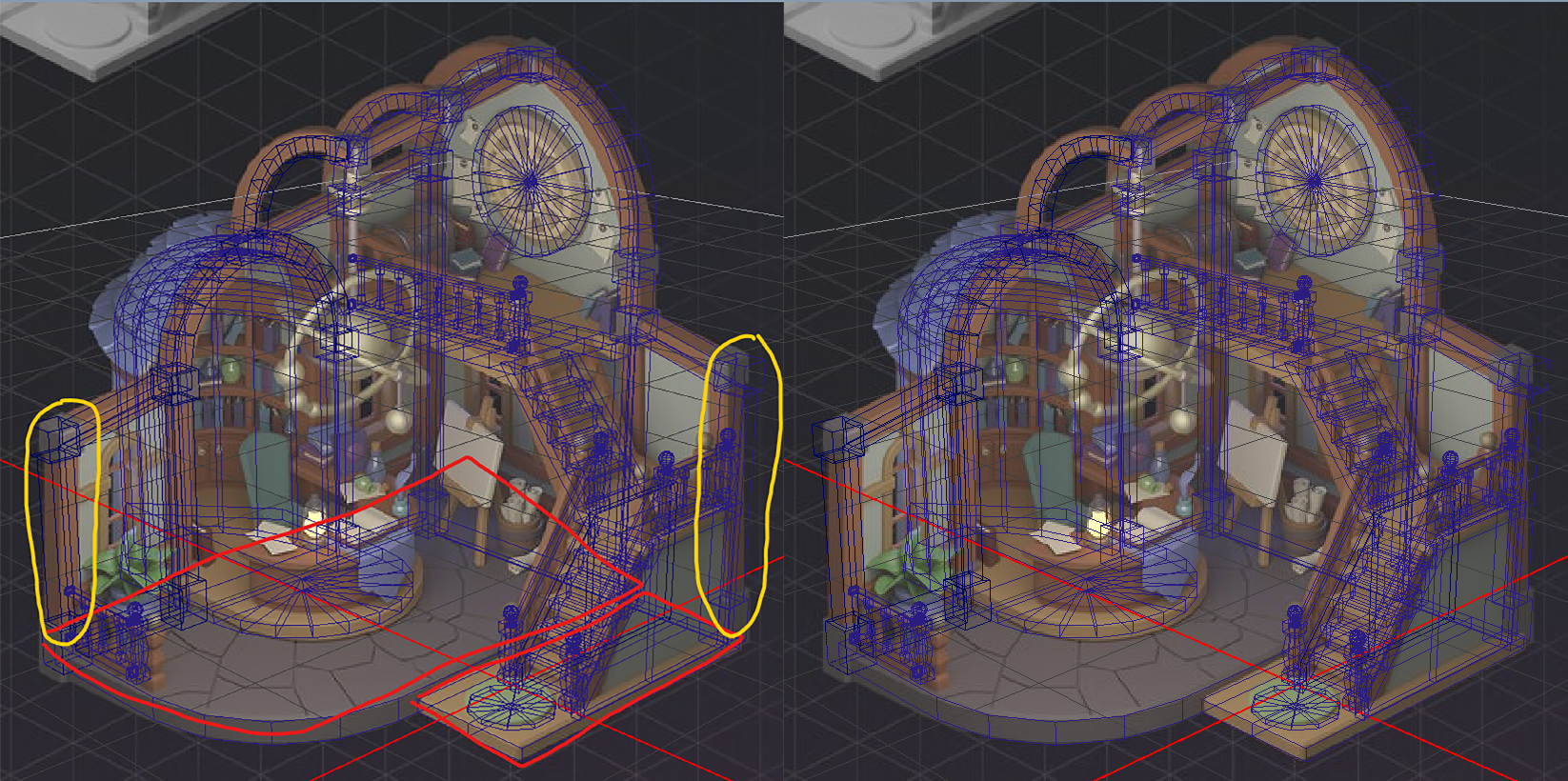
Reference

Replies

  • Fabi_G
    Offline / Send Message
    Fabi_G high dynamic range
    I think trying to match a 2D concept exactly is futile (in most cases? Unless it's a technical drawing/ blueprint). Being a 2D image, the concept artist could have just distorted the perspective or did some freestyle adjustments to make it more expressive. I would focus on the intend behind the concept instead. In this case it might have been that the building is crooked, old, slightly chaotic, not all straight (a reflection of its inhabitant?). If you wanted to get the shape closer to the concept, you distort the finished model a bit using deformers.
  • Vertrucio
    Offline / Send Message
    Vertrucio greentooth
    I've used fspy to set the camera and block in a concept of an apartment that looked like it was exact perspective, and even then I found many areas that were altered to better fit the narrative.

    So don't sweat if it doesn't match. Your goal as environment artist is to get it to fit in the game, not to match the concept perfectly.
  • Alex_J
    Offline / Send Message
    Alex_J grand marshal polycounter
    I think with something like this you just have to match reasonably close in the same method that you did, and from there just make small tweaks by eye. The important thing being to match the feeling of the concept rather than trying to match millimeter measurements that can't actually be made.

    I also think its worthwhile to blast ahead to the later steps and get some color and lighting going on before you get very nitpicky. Color and lighting will change how it looks and feels a lot, so its better to base your evaluations off of that so that you dont get stuck noodling needlessly at an early stage. Also be aware that if you are rendering in some other environment that can change things further still. There is pretty big difference in camera setups between programs so I like to just get to the final render environment and then send in-progress updates there for evaluation.

    In short, I think you are doing great, just keep going and then once you have a "finished" model with all the lighting and textures, it will be more fruitful to carefully compare if you are matching the concept or not. If you feel like this is dangerous or would involve redoing a ton of work, that indicates bad workflow! With some practice you'll learn how to setup your environment so that you can easily revisit any part of the project and make amends without it being overly destructive. Easier to describe how to do that on case-by-case basis though .
Sign In or Register to comment.