UE4 - Chicken Cottage House
ArtStation Link: https://www.artstation.com/artwork/DvYJR9
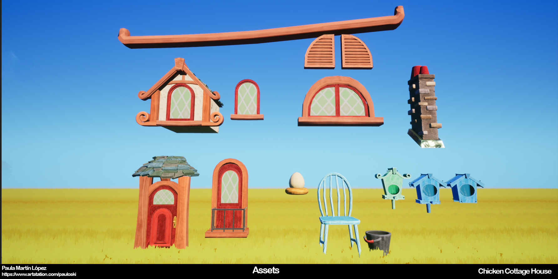
I always wanted to post a Cottage House made with a Modular Set. I feel like every environment artist must have that type of environment on their portfolio (like a meme) and this is my second Environment that I'm very proud of.
This Environment is inspired by the Concept Art "the bird house" by Thibaud Purplanche.


Thank you so much to Gerard Martínez Sánchez to create both characters. This Environment feels more alive thanks to the chickens and the character and it's all thanks to him. He already posted on ArtStation the character, so you can go and check it!


Made with Unreal Engine 4, 3DsMax, Maya, Substance Painter, Substance Designer, and ZBrush, this environment was a learning curve for me: from creating different modular pieces and sculpting tileable textures on ZBrush to improving on the Vertex Paint technique and the landscape.


I always wanted to post a Cottage House made with a Modular Set. I feel like every environment artist must have that type of environment on their portfolio (like a meme) and this is my second Environment that I'm very proud of.
This Environment is inspired by the Concept Art "the bird house" by Thibaud Purplanche.


Thank you so much to Gerard Martínez Sánchez to create both characters. This Environment feels more alive thanks to the chickens and the character and it's all thanks to him. He already posted on ArtStation the character, so you can go and check it!


Made with Unreal Engine 4, 3DsMax, Maya, Substance Painter, Substance Designer, and ZBrush, this environment was a learning curve for me: from creating different modular pieces and sculpting tileable textures on ZBrush to improving on the Vertex Paint technique and the landscape.


Replies