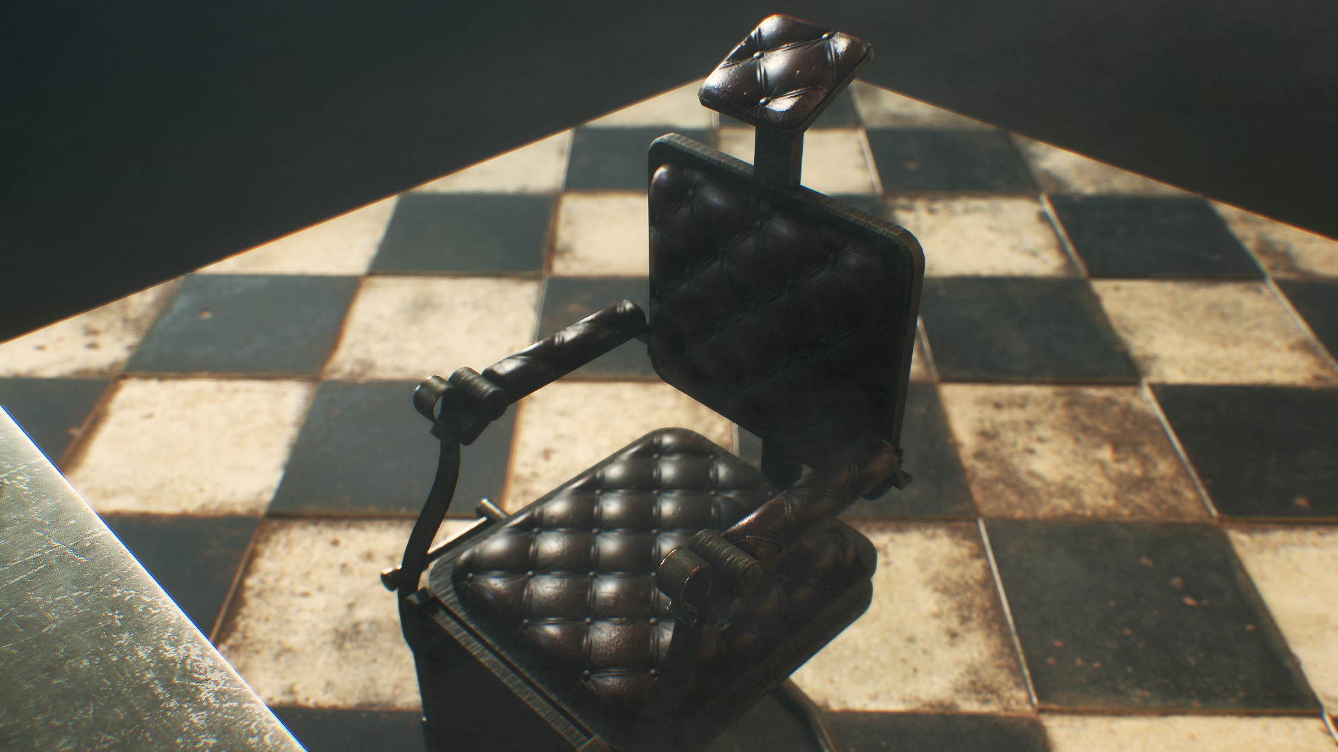
[WIP] Antique Barbershop Mini Scene - Marmoset Toolbag 4 (need feedback)
Hey guys!
This is my first post here, heard a lot of good things about Polycount and I thought I would post my work here to get some feedback and also see all of you guys' awesome work!
I'm currently working on a Marmoset scene depicting an abandoned antique barbershop. It was initially a way for me to add assets I previously made whilst modding Fallout 4 to my portfolio. The assets were inspired in great part by Red Dead Redemption 2 and Bioshock Infinite.
My main reference is Blackwater's barbershop in RDR2, and I sprinkled some stuff I've seen in Bioshock and on pinterest/artstation.
Since those are two year old assets, I also decided to make some new ones inspired by various sources of inspo like The Outer Worlds.
Ok so here's the WIP scene, any feedback will be greatly appreciated! Everything was and will be modeled in Blender.
Everything was done by me except the textures on the floor, which are from Megascan. The texturing was done in Substance Painter and was quite tricky cause I'm trying to adopt a more game ready workflow. There are two versions of the main barber station: one using three, uniquely baked texture sets and one with my first attempt at making a trim sheet.
This is the trim sheet version
It's my first time making a trim sheet so it's far from perfect (had a hard time figuring out texel density and lost quite a few details from the uniquely baked mesh). Any help is welcomed for sure! Have a tough time really understanding the trim sheet workflow.
Here's the uniquely baked one. All the other props share the same texture sets. The gramophone and the barber chair have two texture sets each.
So yeah, again, any feedback is greatly appreciated. I feel like something's missing somewhere lol. I'm obviously not done, got tons of assets to make but I already have issues like optimizing my textures (not a problem at all for my pc but I really wanna use the game workflow) and getting a nice render in Marmoset. Lighting is very frustrating, can't figure out a nice lighting setup. The more I look at this, the least I like it. So I'm taking any tips to improve!


Replies
Managed to make the desk fit in one texture set so that's less draw calls (yay!), added a few more props that all share the same texture set. I can't seem to make the gramophone fit into one texture set. What would you guys recommend? Trim texture? Smaller texel density for some elements?
Still very much looking forward to some feedback!