Bluey Interior Environment - Nearly complete, feedback wanted
Hey there.
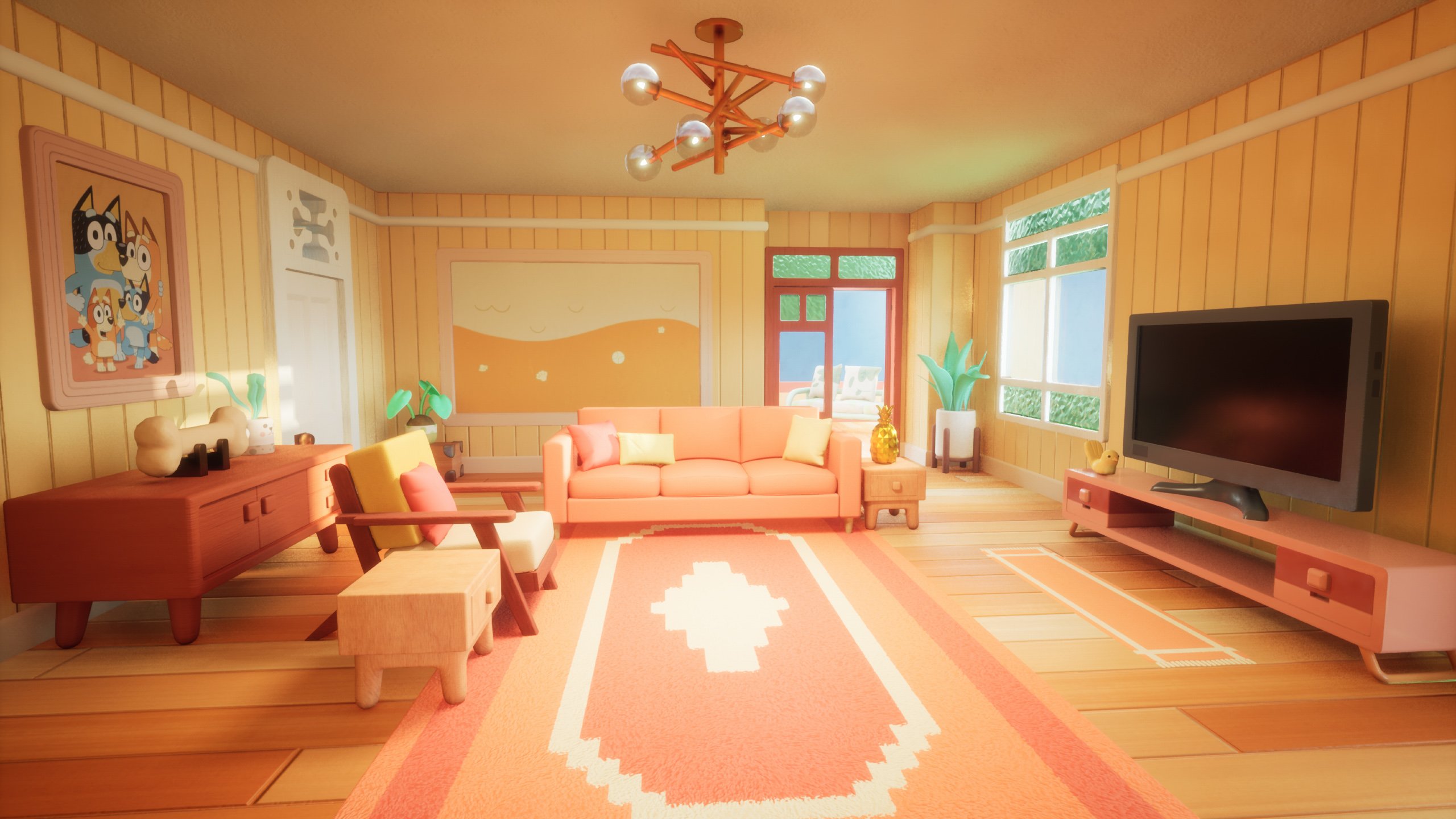
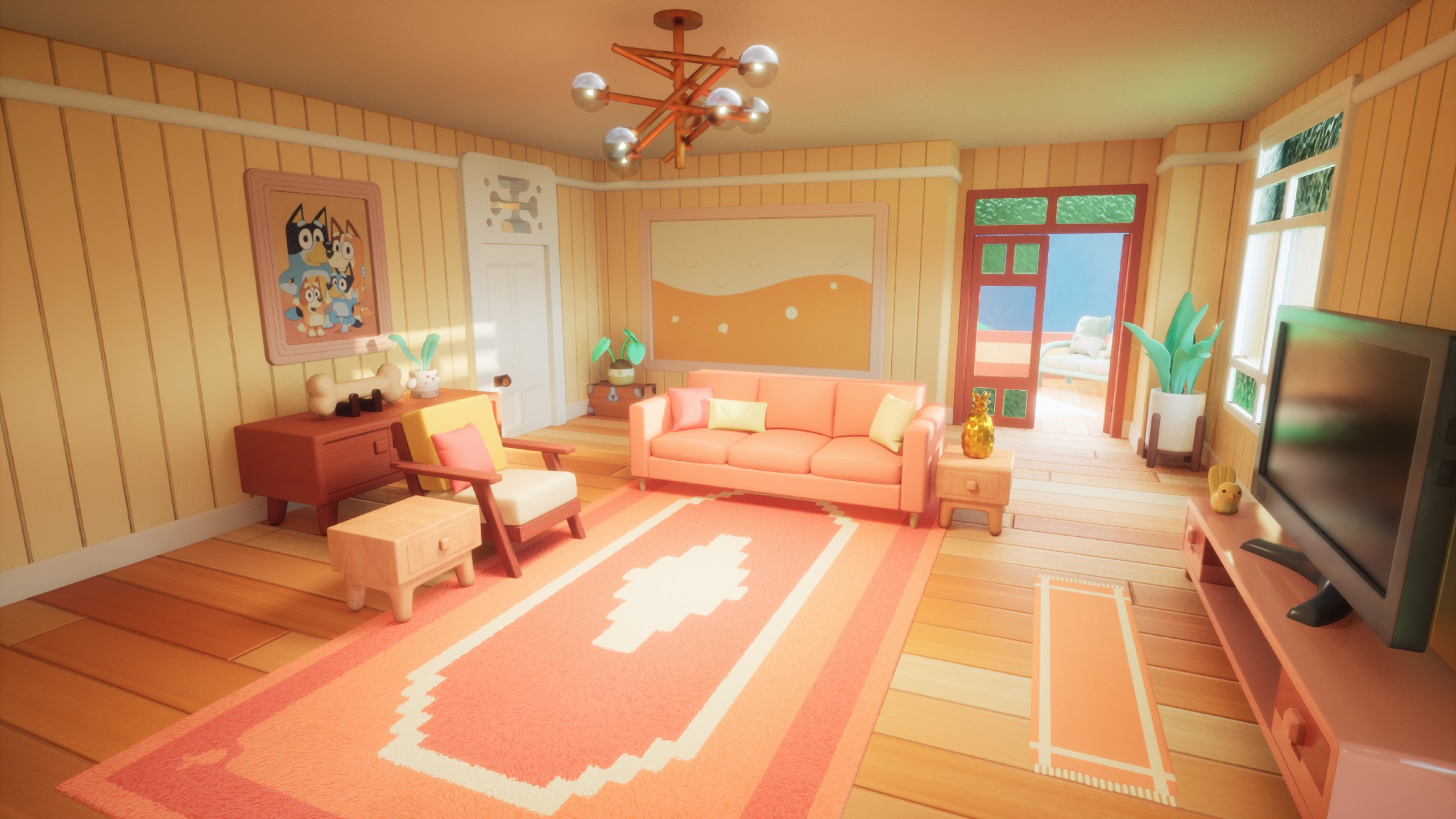
I'm getting pretty close to finishing this scene based on the Australian children's show, Bluey.
Still have a few smaller props to do, but I'm looking for feedback on things to improve. Anything stand out as particularly needing attention? Anything in the post processing you'd recommend I tweak or change?
Thanks a bunch.


Replies
Hi! This is pretty nice, I like the soft and cosy atmosphere you got going!
The only thing that jumped at me was the greenish windows. I think it's mostly because the noisy normals contrasts too much with the softness and absence of noise of the rest of the scene. I'm not familiar with the show so I made a quick google search:
You can see they only used slight strokes to indicate that this is a rough glassy surface and I wonder if it wouldn't better fit the rest of your environment to work on using simple pattern as this one to indicate texture, rather than using a complex texture right away.
Hi, thanks for replying!
Yeah, I wasn’t too sure about the glass myself. The depiction in the cartoon is so simplified it’s hard to tell what it’s supposed to look like in real life. I’ll try some other looks though, it’s just a normal map, will be easy to try some variants.
Here's an update. I think I'm ready to call this finished unless anyone has any suggestions.