[WIP] Purgatory Knight
Hey guys,
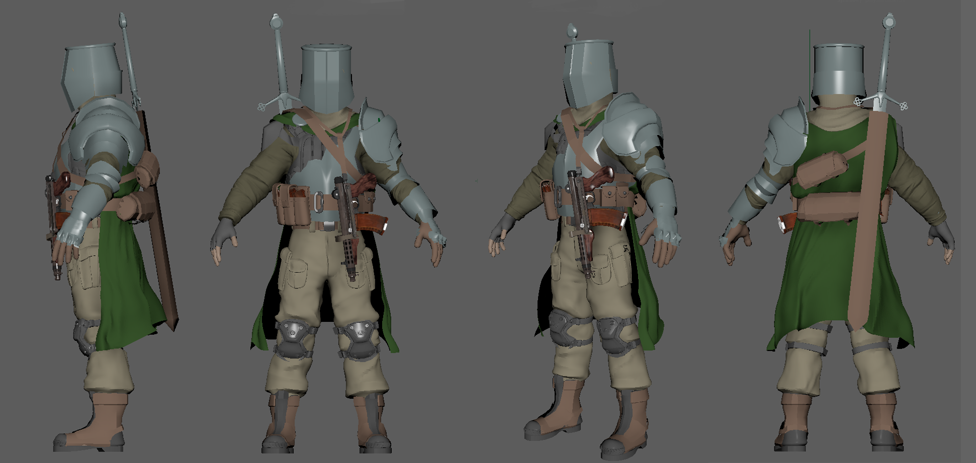
I'm looking for feedback / crit on a character I'm working on. The idea is he's a knight that's been trapped in a timewarp / purgatory fighting monsters and other soldiers for a long time. He's stuck in his ways and won't give up his sword and armor even though it is falling to pieces but he's learned how to use guns (sort of) and replaced the missing parts of his armor with Kevlar.
Kind of a goofy concept but I want to try and lean into it!
Here's what I have so far:


Replies
That's actually a pretty interesting mix of ideas ! I like it :) Modeling wise it also looks quite good already !
I would even go further and develop the concept a bit more, it might give you ideas/pointers for the overall design:
○ When I think about purgatory I think about the temperature of the environment (fire or ice depending on the lore): like if you would go for a fiery purgatory, the metal parts of his armor could be melted/charred by fire. That would make sense. The clothes burned here and there etc... You get it.
○ He could also have been partly "corrupted" by the purgatory itself or it's denizens which could be seen on the character design.
○ The thing that I think can be hard to is work on the "merge" of the knight armor and the more tactical soldier gear. Like as it is now (which is quite logical don't get me wrong) the to styles feels like they are "clashing" with each other rather than "mixing" fluidly. I don't know if my explanation is quite clear though :p
What you could do, but that would obviously require a bit of work, is using the kevlar and more modern cloth as under armor, and keep the metal parts on top of it. Like you did for the helmet, breastplate etc.. But do that for the greaves and tasset too maybe.
Just a bunch of ideas popping up with your concept, which again is pretty cool ! XD
Thanks for the detailed feedback @Bhasara ! You are reading my mind 😁
In this pass I added some tattered chainmail. I'm hoping that will both blend the armors better and speak to the rough environment. I'm not 100% sure of it though. I also reworked a lot of the armor and added some dents / scratches.
I've been thinking too about not overloading the design. I'm thinking of removing the breast plate in an effort to simplify. Its already such a busy design even without it.
I'm trying to think of a good way to tatter his cape. I'm not sure if I should try it in ZBrush or just use opacity in the textures later.
lol parry this you filthy casual
I did a study of Elden Ring's armours. basically they spam the heck out of hair cards. Maybe the same method can work well here. https://www.artstation.com/artwork/Le60zr
btw the boots look a bit small
I made a little progress on this guy, mostly working on making the pants and armor better. I'm really trying to get the folds of the pants right, which is really tricky. Not 100% happy but its better than my previous cloth sculpts. For the armor I'm trying to get it to look weathered and dinged up without losing its hard surface quality.
@zetheros Thanks for the tips, and btw your work is AMAZING