Portfolio & CV review for an aspiring environment artist
Hi guys ! Hope you're all doing great and having the time of your life !
I'm humbly posting here hoping for you people from far and wide to take a couple of minutes of your precious time to give me your opinion on my previous & new CV version but also on my portfolio. I don't know if that's something that can be done on Polycount, I hope it's okay.
I'm currently in that period of time where you have been working your ass off on art and retrying to apply for a job in this competitive industry. So without further ado, here we go:
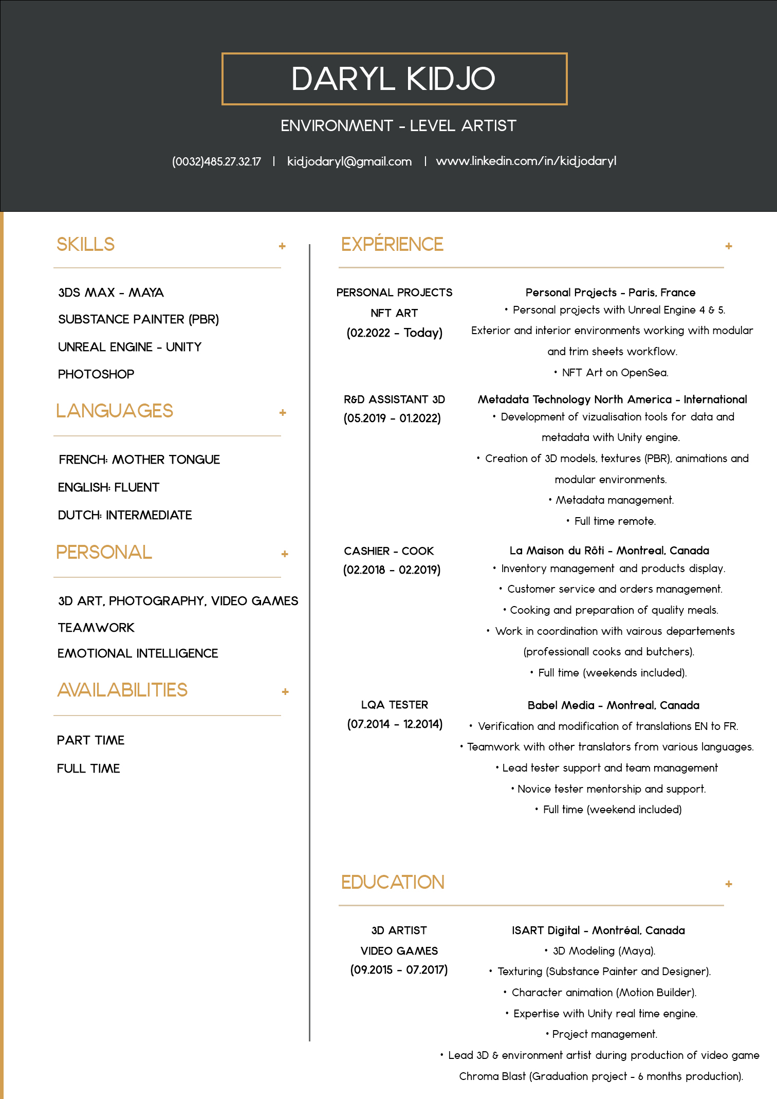
○ My previous CV:
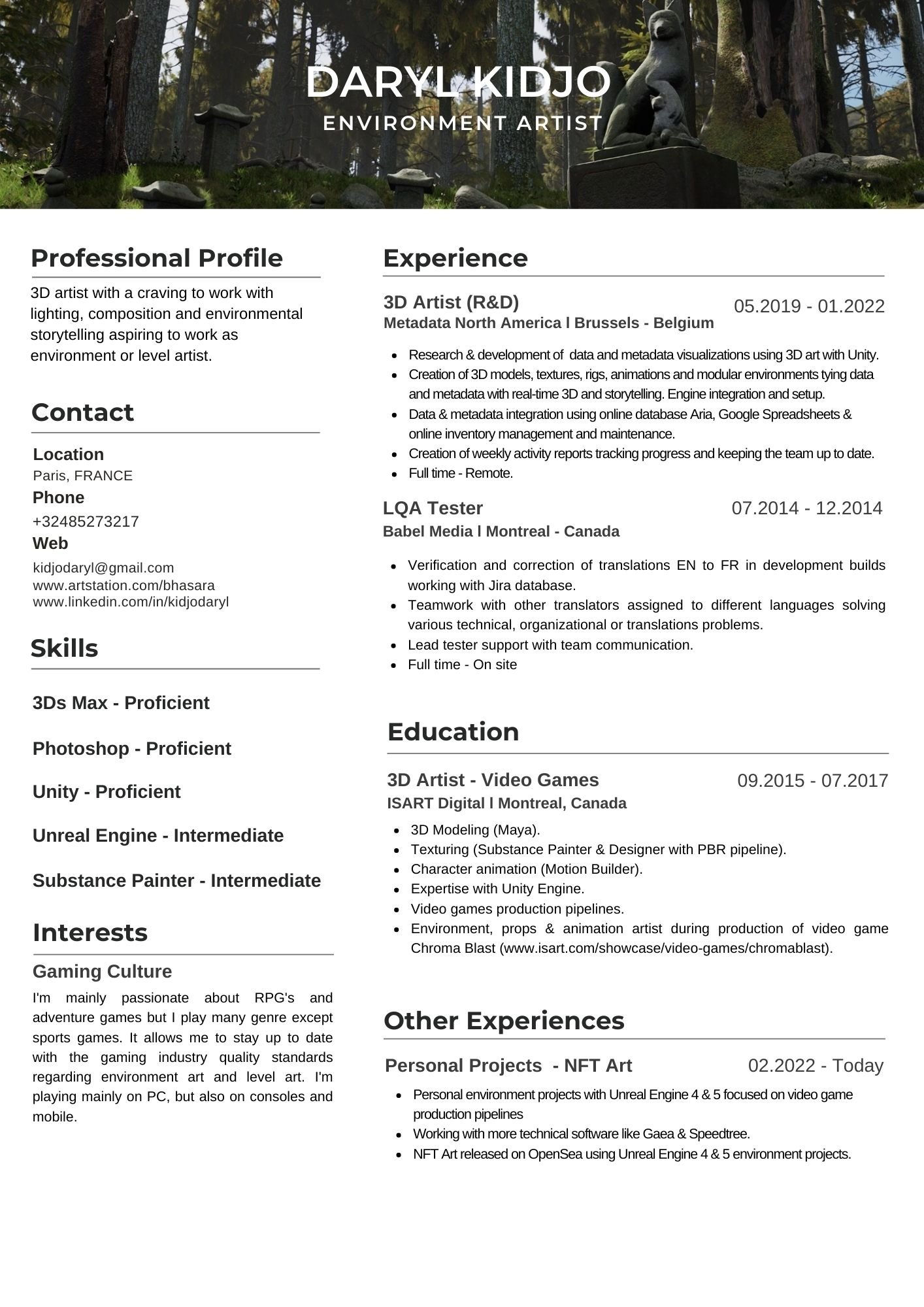
○ The new and reworked version:
Not sure about all the sections for the new one, what should I add, remove, improve. All critics welcome be it being shot at with a 9mm or a scud missile, SHOOT :)
For the link to my portfolio: https://www.artstation.com/bhasara
Here are some personal insight also on where lies my strengths and weakness:
○ Good with atmosphere, composition and lighting overall (not insane level but good).
○ Weak to no technical skills with high poly sculpting and organic modeling. My portfolio displays fairly "simple" models.
○ Low to average texturing skills even though I'm quite comfortable working in Photoshop & Substance Painter.
Thanks and have an awesome week ! 😎


Replies
I think your portfolio looks good at first blush and you have a good sense of your strengths and weaknesses. This is the one that stood out to me the most:
Weak to no technical skills with high poly sculpting and organic modeling. My portfolio displays fairly "simple" models.
It would also be cool to see the prop work extended to a more complete scene. It can be a tight vignette. Build out the NES controllers a old school CRT display, etc... The ottoman is nice, but where's the sofa / chair to accompany it? Maybe a new piece with some complex forms / compound curvature if you don't want to revisit old pieces.
The second resume is more readable to me, but I like the simple header of the first. I personally don't like 'interests' on a resume as that's good fodder for an interview when it gets more informal / feeling out personality / team fit. I'd also keep the multi-lingual bit on there.
Good luck!
Thanks for the feedback jStins ! Really appreciate you taking the time to do so.
You're feedback is duly noted. Especially on the portfolio part, I'll put that into work for my following projects, and your ideas are great pointers. I'll have to make new projects, since unfortunately, I lost the files for the NES and the Ottoman a while ago. Putting props work with a larger context would definitely add value to my portfolio.
It's also good to know that I'm accurate on the assessment of my skills, I think it's pretty important to be able to do so.
I agree with you for the interests part where I talk about my gaming culture in the resume. Though it seems after extensive research that it is valued by recruiters in that particular industry, but I can be mistaken.
I'll keep also keep the language part as you suggested when I think it can be relevant or that it doesn't overcharge my resume I guess. Don't know it you feel that would be a good compromise.
Again, many thanks for your feedback and I wish you the best !
Take my feedback on the resume content with a grain of salt. I don't review a lot of resumes so better to trust the advice of folks that do!
Roger that ! :)
Portfolio looks good if we ignore sharpest corners on that console and that temple need more lights
Thanks carvuliero for your feedback XD best review ever haha 10 out of 10 !
I've made an updated version with your feedbacks and modifying the descriptions and content a bit. Since I don't have any experience in the gaming industry, I tried to add relevant experiences that could add value to my profile. I'll potentially add "more corporate nonsense" on top when I can :)
And thanks for sharing your thoughts on my portfolio !
Here's the updated version if you have time to take a peek:
If you like to keep both columns equally important try to match them whenever you can other wise there is too much zigzagging or you could make one more important while trying to keep relatively equal steps
Maybe it's just me, but I don't see the value in stating your knowledge level with a software package. What is exactly is proficient vs intermediate, and how does specifying that skill level benefit you? Seems totally subjective to me? Worst case scenario, you could say that you're an expert in something and then set yourself up for debate during an interview. That's just my opinion.
Thanks for your feedback neil & carvuliero !
@neilberard I also agree with you. It's kind of subjective. Some people might find it useful while other not especially. It may give pointers on where the applicant feels like his/her level is, but it would be mostly the portfolio/interview process and art test that would really demonstrate the skills in X or Y software. I could potentially just remove the levels and let my portfolio speak for itself.
Also it could put less read time for a recruiter and make it more readable. So I'll ponder over that :) When you think that the average time a recruiter spends reading a CV is 6 seconds before making a decision, it's quite important to get to the point fast with it :p
@carvuliero what can work with your suggestions about "self starter/team player" etc... is that I will have to modify my CV depending on key words from the application description. What I mean is that many big studios use ATS's or Applicant Tracking System which sorts potential candidates through their resumes keywords before validating the application and forwarding it to a real person. Usually these keywords are those found in the job posting description. So I can add those in the professional profile section as you suggested :)
Yeah, nobody likes seeing applicant's "levels" in software. Just writing that you use x to make your art is sufficient. I think your portfolio link should be at the top of everything, right under your name. Good looking resume though :)
Thanks Asher for the feedback :) I removed the skill levels in the cv. It just felt more "wrong" than anything in the end as we all discussed :p
I was thinking the same with the portfolio link, I just thought also that it could feel "inconsistent" in structure if I did that, but it could be better though. Will try and see how that feels :)
And completely unrelated, but I just rediscovered the Beyond Skyrim project and the Arcane University through your website and resume and just joined the discord. Looks like loads of fun and a good place the learn while having the chance to help develop that awesome project ! (been as many a fan of the elders scrolls for a long time).