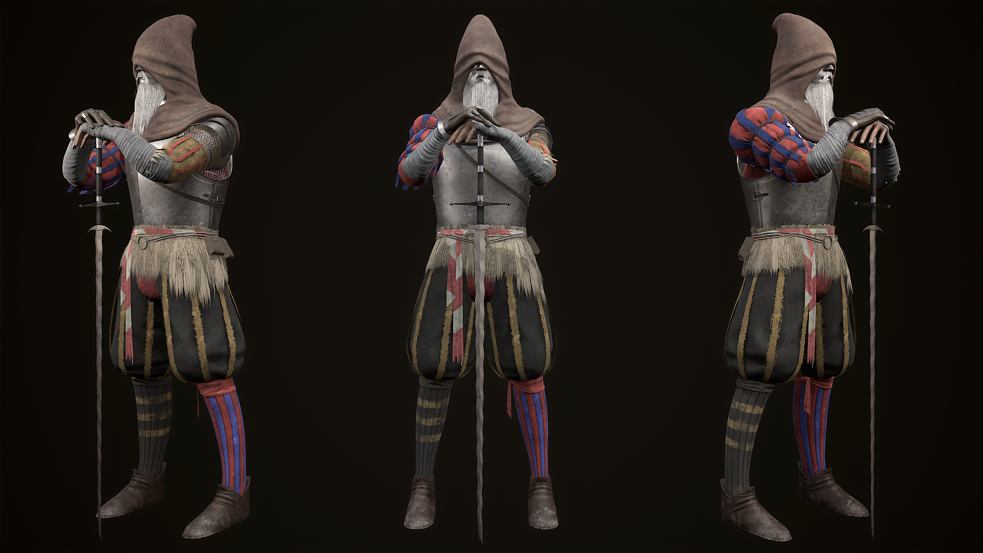
Witch Hunter Jerren (Elden Ring fan art)
I choose to made this character because of his design, it's well balancing between knight and showman (RADAAHNS FESTIVAL) and moderatly difficult, as shown through some asymmetrical elements.
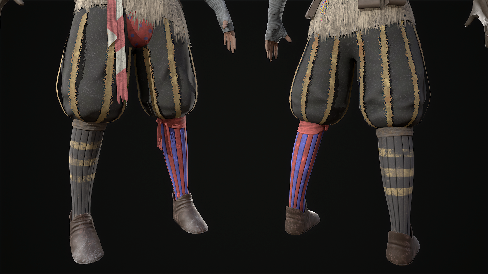
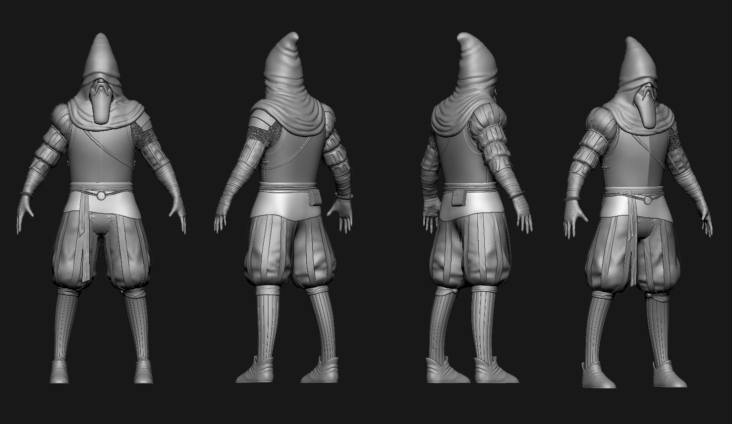
Some parts didn't turn out very well, such as the hood and beard, and the yellow ribbons on the legs are too thin. because at the sculpt stage i didn't take into account that i will "tear" them, and there are simply not enough of them.
If you have something to criticize, i'll be glad to read
https://www.artstation.com/artwork/mz41Oy


Replies
Hey, it's a cool character. I think your textures are reading as really flat and killing a lot of the potential of the sculpt. I would recommend checking out some tutorials on texturing in Substance and looking into building good contrast and colour theory. You didn't share any images of your textures so it's kinda hard to see how you approached it but I think adding a black and white filter over your character can help show what areas need contrast.
Here you can see that there's no massive tonal shifts over the whole character apart from his very white beard.
Your sculpt looks pretty cool, I'd love to see a full face from you :)
You right, I was afraid to go too far with contrast, then the textures would look cheap, here's another one render and textures, didn't add it in the post for some reason. And he has no eyes)