[WIP][UE5] - Roman Inspired Enviro
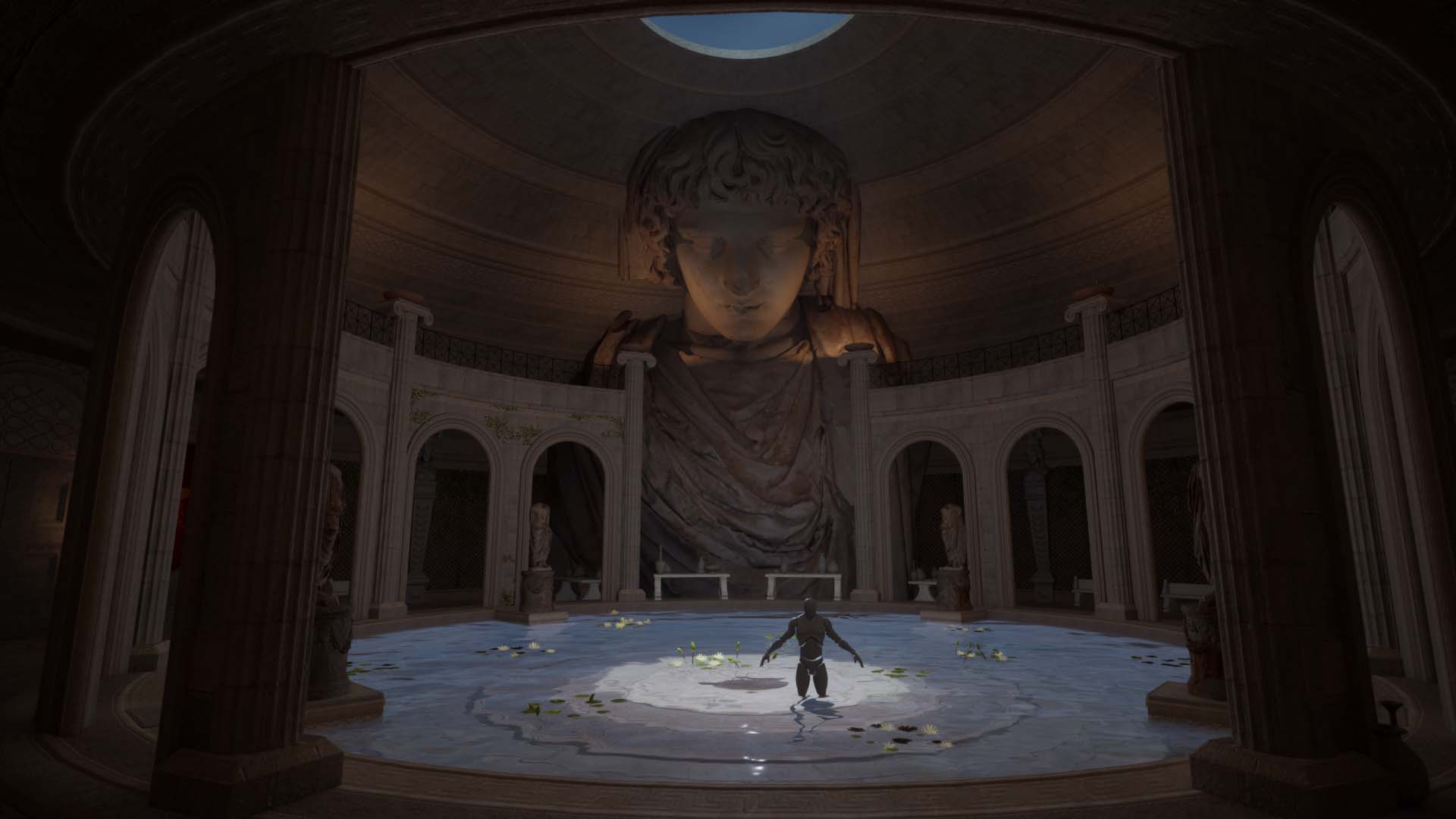
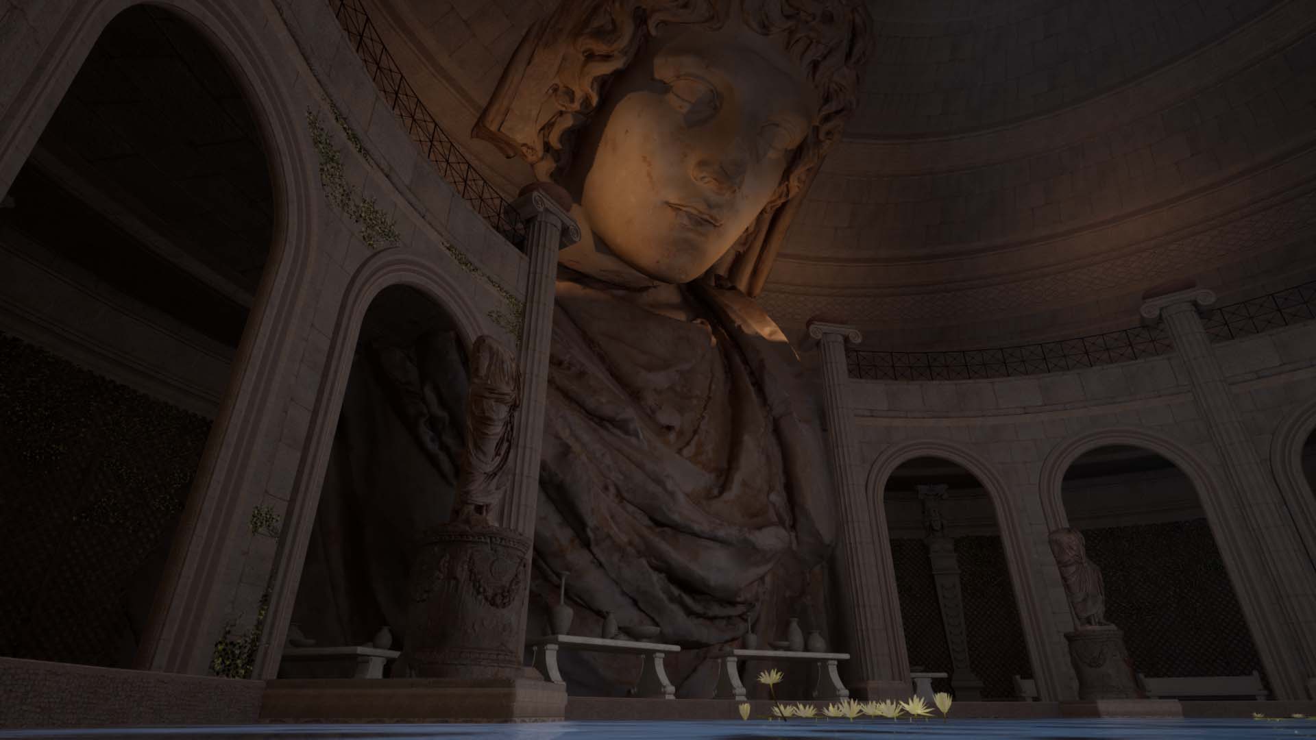
Hi guys, sharing my present project in hope of critique and feedback ! My objective here is to train with the modular and trim sheet workflows. I struggled at first with the composition of the scene to get where I'm at at present, but I feel I'm getting somewhere good.
Still need to correct texel density on a couple of assets since for instance the roof is quite big in the scene, add more details since it feels a bit too clean for my taste (with decals and whatnot) and improve the small assets which are still placeholder as of now.
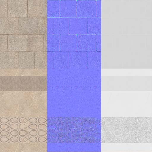
I'm using one 4K trim sheet for most of the environment and the trim istelf can still be improved I feel. I took a couple of materials from quixel library and really quickly tweaked them in Painter to get the sheet.
And of course at last I need to do a lighting pass to get all of that nice and goody goody :)
Here's a couple of screens and what the trim sheet looks like for the moment. Will post more updates the project progresses !


Replies
Reworked the trim sheet a bit (still working on it though) and began adjusting the lighting a bit.
The thing is I don't know how I'm going to better "merge" the huge statue with the rest of the enviro. Any critics/feedback welcome :)
Still using mostly one 4K trim sheet for the whole enviro. I'll just do a unique unwrap for the doors and already done one for the vines holder in the back.
Since I wanted to experiment with trim sheets and being just a beginner, I aimed for 512/m texel density, but it's obviously quite tricky with my assets. I have to be very creative with my UV's unwrap and sometimes it seems I don't have much of a choice but to adjust a bit the shells to fit the pattern.
A lot of fun still :)
it might be cool to add archways on the second story leading to an outside balcony on each shoulder of this massive statue. it would look as if whomever were framed in the entryways were the angel / demon whispering into its ear.
That would indeed a cool idea @killnpc :) thanks for the tip ;) I could probably reuse the arches from downstairs to get that effect. It would need some rework of the second floor roof since it looks like that in max:
I'll also need to rework the uv of the roof part because it's quite nonsense as of now :p
Thought about the balcony for the second floor just to get some more natural light coming in.
(@killnpc) Did quickly try today composition wise what it would look/feel like with arches on the second floor, but idk it just feels a bit too much for my taste:
It could potentially be done with a bit more work; creating different arches, readjusting the sizes of walls etc... but don't want to spend too much time on that.
My goal now is to improve on what is already done with the actual composition :p
I just also readjusted the statues gaze and size a bit to focus more on the camera and it adds more weight to the image/composition:
Hey, nice atmosphere!
One detail that looks bit distracting to me is the way the pillars don't act as support. When I search for references this is typically the case.
rough paintover:
Reference search:
@Fabi_G thanks for pointing that out ! Thanks for taking the time to do a paintover, really helps :)
I noticed it while searching for refs too, but did a bit forget about it while modeling my placeholder meshes !
Still need to work out a couple of adjustments, especially the 2 pillars next to the statue, since I'd like to keep the lights on top near the statues head for lighting purposes, but it feels already a bit more natural and architecturally structured as you mentioned.
Still I feel the proportions of the pillars heads are a bit weird, or is it just me ? I did follow reference images to model those ones so it's maybe just in my head XD
Small update, began improving the greenery, adding vines on the arches (still need to break the repetition on those one), adding palm trees in pots and reworking a bit the side arches next to the statue.
Working on the texture of the pots, though since my lighting is quite dark, it does not come out right as of now. Not sure if I should increase the overall lux of the lights in unreal or getting my textures to fit the lighting.
For the part around the bath/basin, I plan to add roman benches below the walls with vines and improving that area all around, especially improving the doors themselves. Any ideas/feedback, welcome as usual :)
And I feel the light ray in the center might be too intense.
Some benches references:
I'm hesitating between the stone ones and the wooden ones. But I feel the wooden ones would add more character to the scene and be more visually appealing.
Hi Bhasara, so far I am liking your environment and how it's progressing.
Is vine able to grow if it has no connection to any soil? While I really like the green color in these spots maybe I would try it with ornaments or mosaic. If you want plants maybe moss is more logical. You could however have small plant beds in the ground underneath (not sure if that would make sense though).
For the lighting maybe try increasing the indirect lighting intensity of the middle ray? Or just in general get your indirect lighting stronger. The darker amphoras/pots truly look black.
The benches are a great idea. Both kinds would fit great - if you'd model round stone ones that have the same curvature of the basin it would look slick too.
I think the door wood is a bit too red. Maybe just changing the color of the frame around each double door to something less saturated could help.
Hey @SimonKl, thanks for the feedback. As you say, vines is not able to grow without soil :p It should for instance come from soil below the arches, grow around them and then reach the top to be logical. It indeed adds more color on top, but is quite illogical. I will try with decals and ornaments instead to try and add more color there and be more logical at the same time. For the vines on the wall, adding some sort of plant bed is a great idea ! I can I think easily modify the walls or create some sort of modular addon to implement that. Great tip there.
For the lighting I'm using a "fake" light to lighten the room (without casting shadows). it's tricky since it can break the logical occlusion shadows on the props if I increase it too much. Increasing the indirect lighting of the central ray is indeed a good idea that I tried, but the results don't feel good enough. That's the reason why the pots are looking so dark. I'll work on that and post some more screenshots of my scene and my light setting to give a clearer idea.
Thanks also for the feedback on the door, it's indeed over saturated. Will definitely try your suggestion.
Having curved benches would indeed look slick with the overall shape of the basin I think :p Thanks for confirming that :) Maybe using the wooden one with curvature also to get both. I'll do some tests tomorrow with basic shapes to get a rough idea of what looks the best and post some screens if I can :)
@Bhasara Glad I can help.
Some quick color change for the door screen you posted. I think having the frame in a different color helps a lot.
Edit: I think the nails on the door have the same material as the wood, maybe changing that to some metal or sth dark would help as well.
@SimonKl Thanks for the paintover ! Indeed it helps a lot :) And yeah the texture on the door is just placeholder. Took like 10 minutes to just change the gray default mat to something woody and a basic handpainted heightmap just to get a general feeling.
Here are some doors refs I gathered to show the kind of ideas I was aiming for:
The one at the bottom left is just visual bonus haha, it would be awesome but I don't have skills yet to properly model what is called "The Gates Of Paradise" if I'm not mistaken :p
Haha, well maybe for your next roman environment, the throne room of Gaius Julius Caesar.
I think the second door with the woman standing in front or the third (which is a bit like the one you already used as placeholder) fit nicely.
Almost final update on the enviro. Could spend many more hours on this one, but just going to work on the vine walls tomorrow to make it more natural and less blocky and call it done.
It was a nice modular and trim sheet exercise and I ended up working on a whole enviro hahah But I learned a lot and was a lot of fun. Thanks also to you guys for the feedbacks, it helped me a bunch.
If you have any small feedback that I could quickly do tomorrow before moving on to another project, you're more than welcome :)
If not, I'll share a link to the final post on my Artstation in the thread when it's done.
Huge thanks again for all the help guys !
Sup guys, just wanted to share with you some final screens and the link to the artstation post :) Redone the ivy in Speedtree in the end.
Thanks a bunch for all the help , couldn't have done that without your keen insights. Will do my best to help you back as soon as I can !
https://www.artstation.com/artwork/Qn6ADd