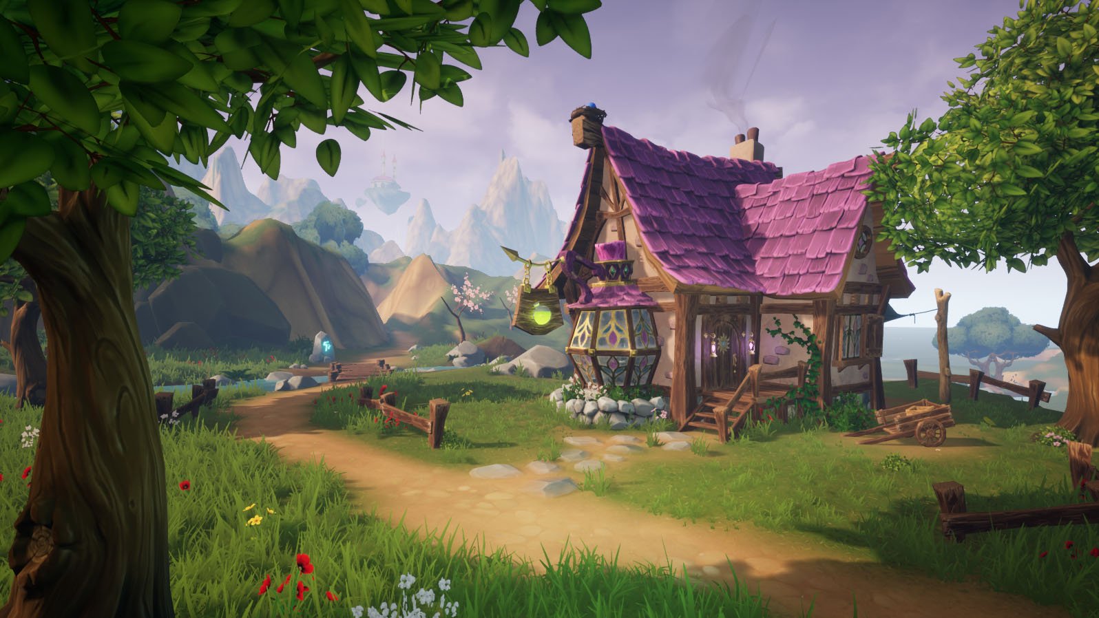
Feedback Needed! Stylized Environment (UE)
Hello all, I work on a personal project for some time now and I am in a point I can no longer make any meaningful decisions. I don't have much experience on stylized art so I would really need some feedback.
The original concept is from RYOxKJ: https://www.deviantart.com/ryoxkj/art/2019-FEB-22-786705639
Specifically I would like some feedback on the overall composition and I am having a hard time with trees, foliage and bushes.
In the pictures above the alpha planes on top of "leaf spheres" have their tangent normals disabled until I fix them to match the sphere normals. The "sphere trees" give me good stylized shapes especially from far away, but also give me bad unnatural shadows on the ground.
Below is a previous try of mine for the same tree:
I somehow feel the trees & bushes create a lot of "noise" by having too much detail, while I need a more minimalistic approach. But I fear that a simple texture won't match the rest of the environment.
Here are the landscape textures & foliage props:


Replies
Hey, this enviro is sick, good job :) I don't have much critique. I do think the hills in the background that run along the path are a bit barren compared to the foreground. I also think the air feels empty... If you had some flying bugs, birds, falling leaves, dust effects, fairies, godrays, etc, it would bring a sense of life to the air around the house. Your first image has better composition than your second image because it has the tree on the right to frame the view, and puts the house more into a thirds part of the image (imo). Would be nice to see an animal, like a bunny or a deer, grazing in the background, I think that would vibe with the scene quite nicely. For a potion shop, I'd like to see a few pieces of colourful collected foliage sitting in the wagon, to make it look like the shop owner just got back from foraging.
The asset creation is solid. I think once you fix the normals for your trees, they'll look nice and soft. Good work on this!
Thank you for your feedback. The environment is far from complete...You are right, in the first picture I have taken into account all the things you mentioned (rule of thirds, natural vignette etc). The second pic is because I need some feedback on the silhouette and texture of the tree. I have already some vfx for leaves dropping and butterflies flying which I now notice that they are not apparent in the editor screenshot. As for the crates, I have already created some elixirs and empty bottles to fill them, but I ll add them in the end since they will be interactable items instead of props. I will definitely use your advice for more detail on the air/sky and get back with a new pic. I was thinking of adding a squirrel or bunny on the ground, but I got discouraged by the time needed to model, texture, rig & animate it and do its AI on top of it...I may have to do it eventually...After all, if I do it once, I can use it all over the map :P