Need critique for my prop
polycounter lvl 3
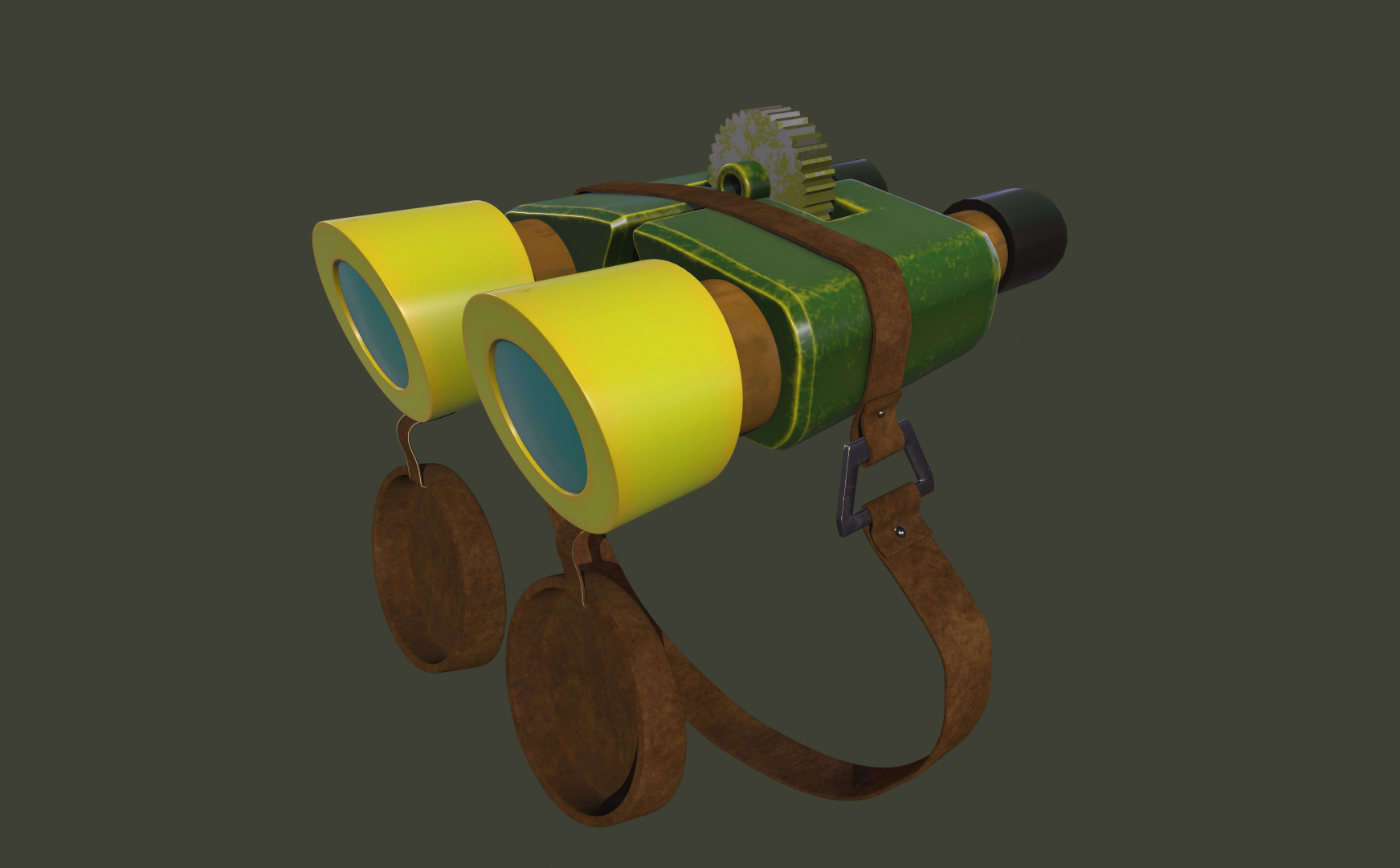
Hello, I have been learning 3D for some time now. So, I created a prop recently (it's based upon Mikael Yusifov's concept art), but I need critiques to improve myself, especially for texturing. Please do not hesitate to be brutal :)
Replies
I may not have been proven yet to be qualified enough but here are my two cent: The original has more the exaggerated comic style look which do depend on shape form to read.. (it may also be the differenet camera position). The green part looks best (with some nitpicking 😉 ).. see here:
The occular caps also seems to be darker on the inside to have more contrast and so the geometry is more visible (and the form more pronounced) and the strap seems to be thicker. The front seems to have more rounder edges but the cogwheel is correctly too big 😁.
Anyway: Thank you i learnt something just by watching at this (now i just have to do this one my own things 😅).