[UE4][Finished] 18th century warship in the Caribbean Sea - Critique needed
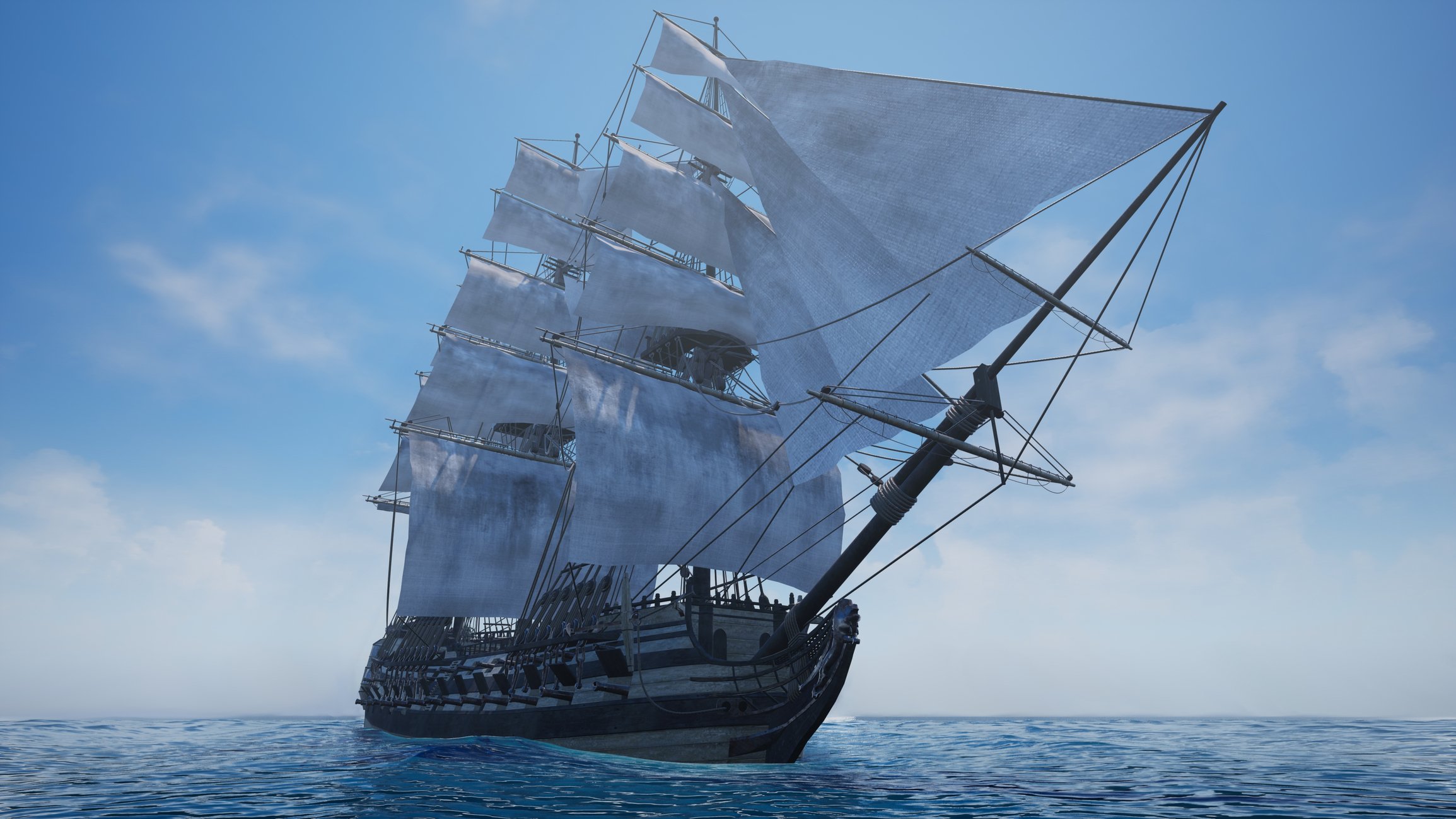
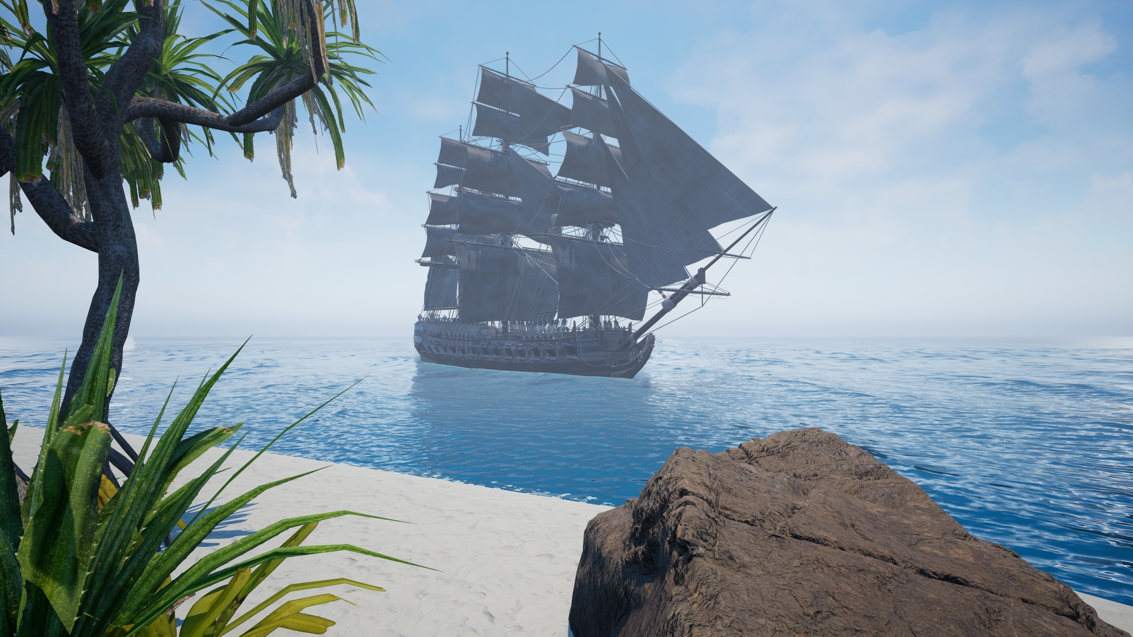
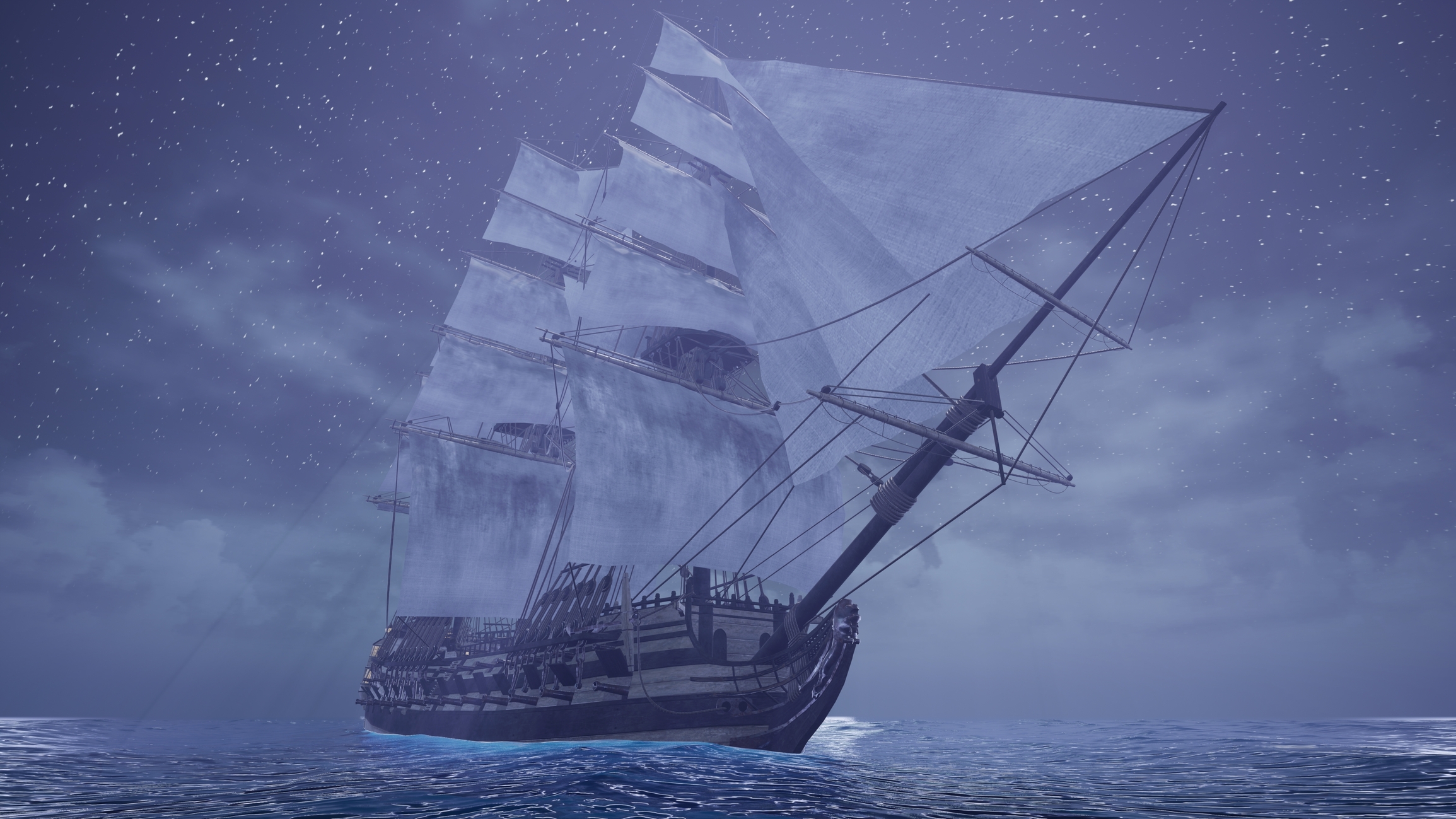
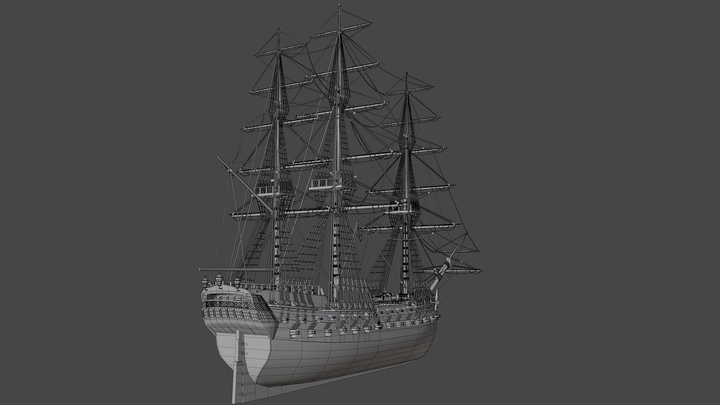
Hi everyone! Here's a project I worked on for my portfolio. It's the first project I've done with real-time graphics in mind so I'm not very sure what kind of approach I should have taken and I would really appreciate any tips and critique! The ship was modeled in Blender and rendered in Unreal Engine 4.
Textures for the ship are from Ambientcg, Polyhaven and textures.com. Textures and meshes for the scene: UE marketplace, Quixel Megascans, Ambientcg. For lighting I used lighting presets from Polygon Academy with minor modifications.
Ship trig count: 459k
What do you guys think about this model from a game art perspective? Does it have too many trigs or it's ok for such large objects? To save some texture space, I created one trim texture that covered the whole ship, except for windows and sails that were left as separate textures. So overall, the model has 3 textures. For the dark version of the ship I used a different metal texture and changed the color of planks to black in GIMP as well as added some grime to the rope.
I'd really like to hear any ideas and feedback you may have! Also how do you think it's better to import such big object, as a single object or in multiple parts?
Thank you for taking your time!


Replies
very nice display of technical modeling.
although plenty ambitious as is, i think it'd be pretty cool to see you up the fidelity on this asset for a closer game cam and try to introduce some irregularities in the geo to break up some of the straight edges in its geometry here and there.
this is a bundle of cord that i think illustrates what i'm talking about.
good work, very cool model.
When I look at all of the images broadly, the lighting and color grading could use some work. Seems like everything is washed out, like there's not much contrast. Sort of like the images were taken with the flash on from the camera.
Here's some good examples from google images, supposably from UE 5.
shorturl.at/dinBG
shorturl.at/nwB49
shorturl.at/lzWZ4
I know the focus is on the ship model, but lighting and rendering is one of the most important things, and it's the easiest to tweak change. You can make a sub par model look good just from lighting alone.
Make this
Look more like this
Great work