UE4 Weird Lighting Issue
Hi all,
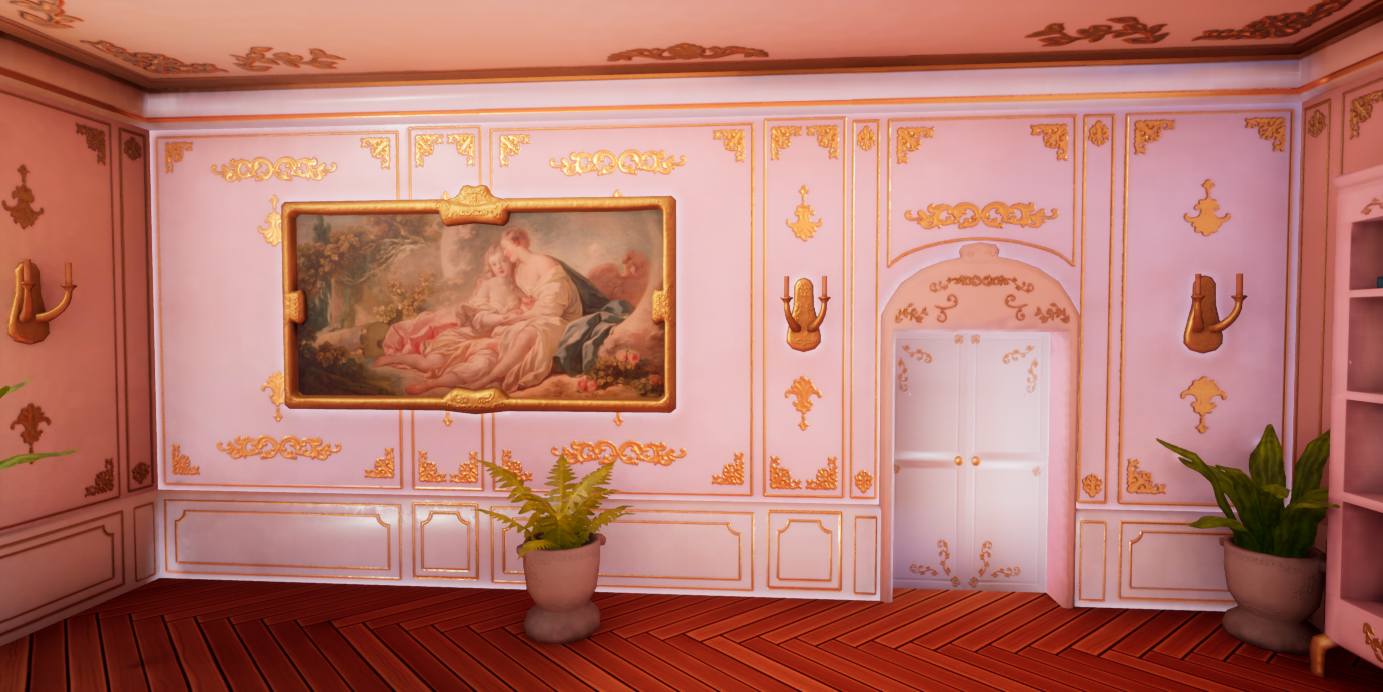
I'm working on a project and I've run into this annoying lighting issue with one of my walls:
This one wall is brighter than the others and it has this glow around the edges and around any intersecting assets like the door and painting.
The walls for the building are all one mesh (not the best choice I know) and there's a room the other side of the wall.
The lightmap and normals are fine, no different from any of the other walls that have no issues.
The walls intersect with the floor and ceiling well too so no light is bleeding in that way
The room behind the wall is pretty bright and I wondered if this was the issue.
I tried blocking off the light by placing a cube in the wall, but no effect.
Then tried turning the indirect lighting from my directional down from 6 to 1 and the issue became less noticeable but was still visible (and ruined my lighting too).
Tried changing the wall mesh to moveable and this fixed it but obviously that's not ideal for static walls (also messed up my lighting and the walls don't show up in my reflection captures).
Wondering if anyone has and other ideas on how I can fix this?


Replies
Hey! Can you attach the mesh for testing?
Hey @Fabi_G, sure!
That's the wall, floor and ceiling mesh.
Hi @SopheeJay!
Tested the meshes in U4.27 in a default Third Person Level (using UV01 as lightmap UVs).
I think the issue is caused by the shading/vertex normals of the meshes (smooth corners?) combined with the angle of the directional light.
Baked Light in Production quality, Static Lighting Level Scale 0.5, Num Indirect Lighting Bounces 10, lightmap res of 512
Result with original wall mesh:
Adjusted wall mesh - shading (hard edges), lightmap UVs, pulled down outer walls
Based on that, I would ensure the meshes are shaded neatly (hard edges or tighter gradients).
Regarding the lightmap UVs, Unreal gave a warning that there is minor overlap. "Use Error Coloring" in the build drop down might help to identify those areas. Looking at the Lightmap UVs, I would recommend to pack larger chunks together (like a wall) - this will potentially save some space (more islands means more pixels for padding in total).
Some other things I would note:
Here is a version of the wall mesh with hard shading and Lightmap UVs, so you can check on your side:
Good luck with your project!
@Fabi_G
I've been trying to solve this for days and the hand in is Friday 😂 Thank you so much!! 😭 No one else has been able to help me!
I knew my lightmaps had overlaps but that's just the exterior walls that aren't seen, the rest I assumed was okay. I'd checked the normals in engine and thought they were alright, but I guess not! 😅 So I'll have a look at that.
Thank you again, I really appreciate it! 🙂