[$PAID$] StarCraft 1 Marine Armor [COOLEST JOB ON THE FORUM ATM!]
Greetings fellow artists,
I am looking for a professional 3D artist to produce the original StarCraft 1 Marine (gun not included). Fell free to use whatever tools you like; but keep in mind that this model is intended for animation and therefore I can not accept a Zbrush high density model. It will need to be in quads with optimal topology and with a polygonal density conducive to animation. Think more vertex budget than a video game but less than movie quality. Not much more than necessary to produce pleasing angle free contours please.
I am truly looking for a top notch job from an experienced artist with a portfolio that is evidence of the capability and confidence to exceed expectations on this task.
You will be provided here with a very extensive collection of reference images and video to assist you. I am not looking for an exact 1:1 replication; but rather a fairly true to source replication with a few key modifications suiting my preference in design; namely it may be apparent to you that this model was made in the 90s and that some parts of the model don't make a tun of sense outside of "yeah, that's an armored arm/leg". That is to say it could use some "fleshing out" or "refining" around the joints, feet, hands. It could also be adjusted slightly to bring the shoulders in a tad to make it somewhat more anatomically correct (not perfectly correct). As you can see the shoulders are a bit wide and most humans would actually not really fit inside. I want you to stay true to the original design, but feel free to do some pushing and tugging and if some part of the model doesn't make sense to you. Refine that design. Imagine it this model were a real thing, how would it work? How would that joint make sense? Etc.
PS. The light and gas tank attachments are cool! Toss those in. Small Bonus if you model me an awesome cigar!
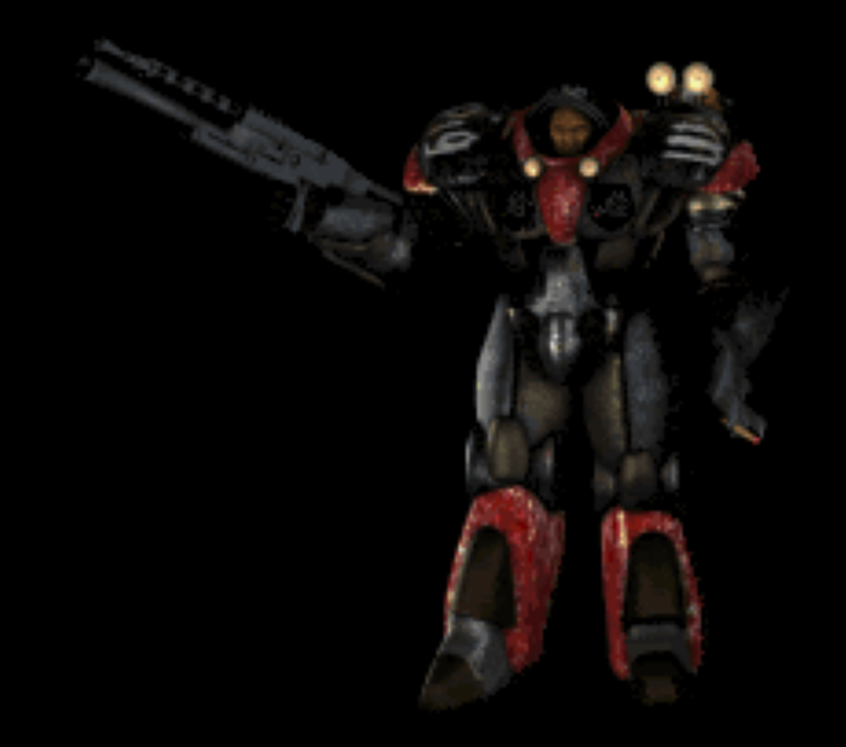
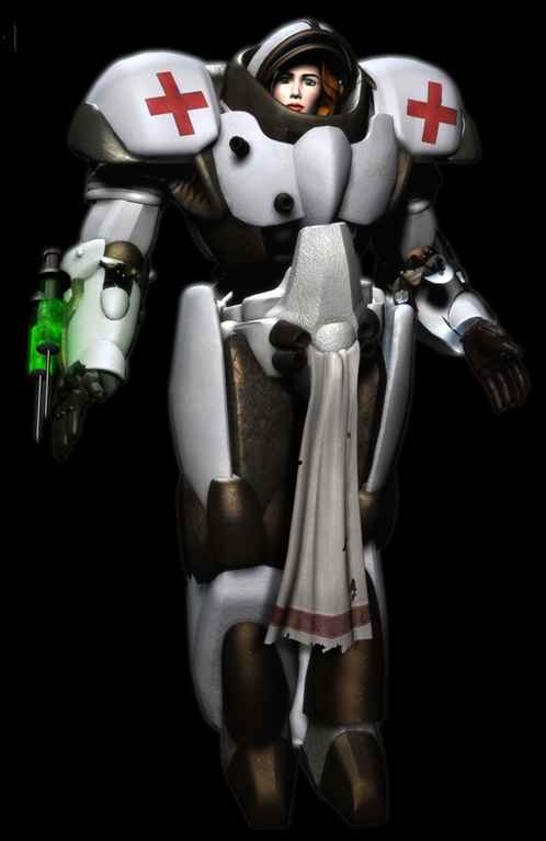
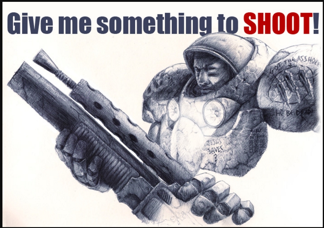
Here are the best original source reference images.
Here are a couple videos featuring the model. Made a long time ago lol.
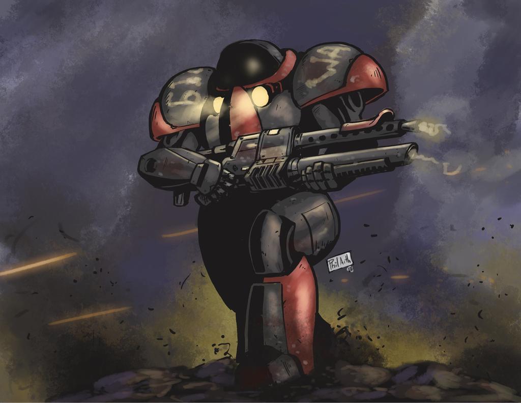
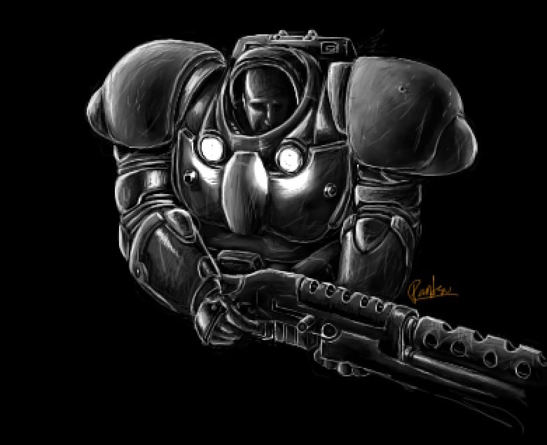
Here below is some additional artwork from which you can pull some ideas to help you refine the design.
^I like the arm/forearm on the above image. Great image!!! Captures the essence!
^Perhaps this might help give you ideas about the arms and legs of the marine (ignore the two on the right). Also one of the best images I have to lend some idea as to the design of the back of the marine. The area around the helmet is a very appealing take I think. Worth an iteration. It varies from the original design however as it's a bit more on the bulky side, more than I personally like. However, I think this is a top notch reference to give you ideas as how to refine the design!!! Truly. Value this image just a little higher than most.
^The bronze/copper looking aspect of this image look great and I think would help make the connection of the legs to the hips make more sense and more realistic. I like the slightly refined design on the leg. This image is fairly true to the reference as well! This has got to be in the top 3 reference images for sure!
^Interesting ideas for the arms and shoulders. Shoulders a bit big in this image, head too small.
^Very appealing proportions of the head and shoulders. Honors the source very well. Hands seem a bit big but that's not the main focus of this image. This is a very good reference!
^This is a bulky toy but it gives you an idea as to how the feet work. Decent look at the forearms and hands too, something to consider.
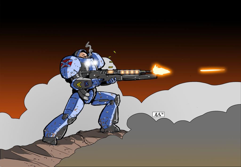
^On the right you see a simplified cartoon version of the marine with an appealing silhouette. Ignore the marine on the left side. I find that angled sweep of the lower leg above the feet but I'm not married to this idea. Worth an iteration perhaps? This image is not as important but I threw it in anyhow.
^Same artist as the last image. Notice the feet and forearm. I like the hands on this image.
^Here's an interesting toy version. Give some insight into the back. I like the pack of the lower leg/feet in particular. Also an interesting take on the shoulder pads.
^Really wish I could contact the person that made this, but I was never able to. I think this provides good insight into a slightly adjusted proportion more in line with actual human anatomy. It's an appealing design, however it is too angular and robotic for my taste. It's certainly an interesting departure from the source and I wanted to include it, you might get an interesting idea.
^This one above I modeled myself - adjusting a model I scoured the internet to find. It lacks refinement under the main points of the armor. The proportions and general shape are more in line with that I'm looking for. I like the design of the hands in this. Arms and legs are a bit too basic and I had trouble connecting them all together in a way that was satisfactory to me and I gave up due to lack of time and frankly my skill just isn't up to par. Area where the shoulder pads connects doesn't really exist and I wasn't really satisfied with my design of the shoulder pads. Obviously the shoulder pad should ideally have some degree of motion but at the same time should appear as a somewhat rigid part of the design of the torso of the armor if you catch my drift. I want basically the essence of my feeble attempt at recreating the essence of the original design greatly improved upon.
Clearly you need to be a bit of a skilled artist to digest all of this information but I hope that I have described well enough what it is I'm looking for? I debated including these images of my attempt because I don't want to pollute your ability nor do I want just a remix or remaster of what I've done already. If you want I will provide you with this model of mine as a 3D reference but I do expect most all of the parts to be remade and improved - perhaps from scratch?
FINALLY above is one example I do not like.
It's too "fat" or "bulky" and just a tad blocky under the helmet in the chest area... a little too Warhammer-esque. I'm not a big fan of how the legs attach to the hips. The feet are kinda ugly. the shoulder pads don't rise up much I dislike their shape too. Hands are too robotic and look too much like the SC2 marine. It is really not true to the source This one example I do not like. Though you might like a contrasting example.
---
PAYMENT
Payment for this commission will be discussed in private but I do expect to pay you in three installments starting before you begin and the last payment made when I have received the completed model. We will discuss the payment method. I'm fine with most anything that's like PayPal.
TIME ALLOWANCES
I am flexible. You may take as long as you need to complete this job to the highest of your quality standards. You tell me how long you estimate and you will have that long to work - within reason of course.
SUMMARY
I want only the model of the marine armor as described above. I do not need UVs, materials, textures, rigging, etc. I would like the model as an obj or blend file. Also refer to the PS about the lights and gas tanks and cigar which is placed near the top of this post.
Please private message me with your portfolio, your quote, and your timeframe.
I will accept a commission agreement if that is how you do your business.
I will sit on this for 3-7 days before I choose someone. I might propose a counter offer to your initial quote. Let me know what payment method you prefer.
You will be paid in three portions; the first upon agreement and then again in the middle of your work and then again when I receive and check the work. I would like regular updates, you decide what that means. This will sever us both and ensure I am happy and you don't do more work than is necessary.
I promise to be extraordinarily easy for you to get a hold of to address any questions you may have.
I've been sitting on an idea for this animation for years and this is the most important model! Expect your work to eventually be seen by many people! Don't be surprised if I call upon you for your skills again, there's a lot that I need to get done.

